In order for a screen reader to present a spoken UI to the user, meaningful elements must have proper labels or text alternatives. A label or text alternative gives an element its accessible name, one of the key properties to express element semantics in the accessibility tree.
When an element's name is combined with the element's role, it gives the user context so they can understand what type of element they're interacting with and how it is represented on the page. If a name is not present, then a screen reader only announces the element's role. Imagine trying to navigate a page and hearing, "button," "checkbox," "image" without any additional context. This is why labeling and text alternatives are crucial to a good, accessible experience.
Inspect an element's name
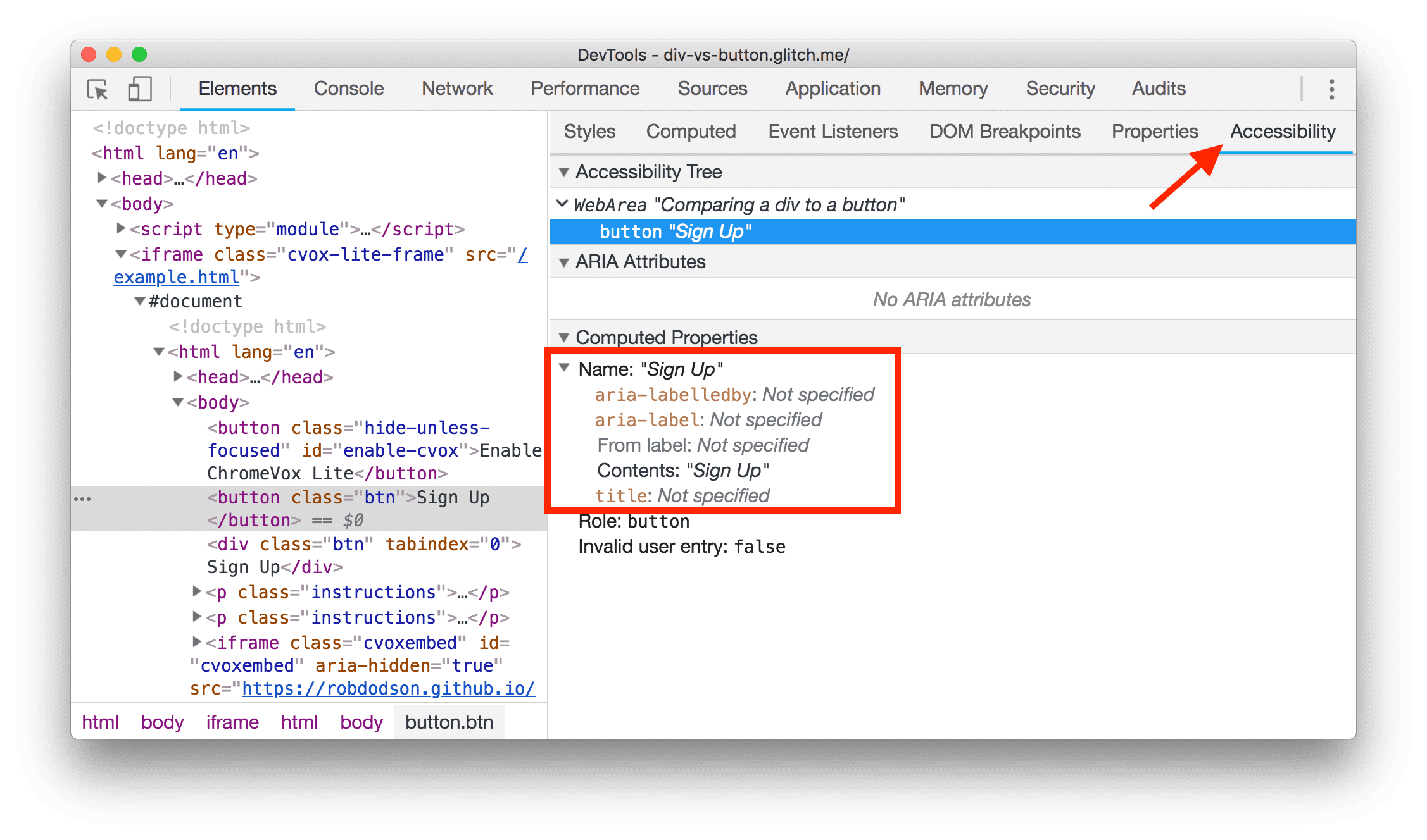
You can check an element's accessible name in Chrome's DevTools:
- Right-click on an element and choose Inspect. This opens the DevTools Elements panel.
- In the Elements panel, look for the Accessibility pane. It may be hidden
behind a
»symbol. - In the Computed Properties drop-down, look for the Name property.

Whether you're looking at an img with alt text or an input with a
label, all of these scenarios result in the same outcome: giving an
element its accessible name.
Check for missing names
There are different ways to add an accessible name to an element, depending on its type. The following table lists the most common element types that need accessible names and links to explanations for how to add them.
| Element type | How to add a name |
|---|---|
| HTML document | Label documents and frames |
<frame> or <iframe> elements
|
Label documents and frames |
| Image elements | Include text alternatives for images and objects |
<input type="image"> elements
|
Include text alternatives for images and objects |
<object> elements
|
Include text alternatives for images and objects |
| Buttons | Label buttons and links |
| Links | Label buttons and links |
| Form elements | Label form elements |
Label documents and frames
Every page should have a
title
element that briefly explains what the page is about. The title element gives
the page its accessible name. When a screen reader enters the page, this is the
first text that is announced.
For example, the page below has the title "Mary's Maple Bar Fast-Baking Recipe":
<!doctype html>
  <html lang="en">
    <head>
      <title>Mary's Maple Bar Fast-Baking Recipe</title>
    </head>
  <body>
    …
  </body>
</html>
Similarly, any frame or iframe elements should have title attributes:
<iframe title="An interactive map of San Francisco" src="…"></iframe>
While an iframe's contents may contain their own internal title element, a
screen reader usually stops at the frame boundary and announces the element's
role—"frame"—and its accessible name, provided by the title attribute. This
lets the user decide if they want to enter the frame or bypass it.
Include text alternatives for images and objects
An img should always be accompanied by an
alt
attribute to give the image its accessible name. If the image fails to load, the
alt text is used as a placeholder so users have a sense of what the image was
trying to convey.
Writing good alt text is a bit of an art, but there are a couple of guidelines
you can follow:
- Determine if the image provides content that would otherwise be difficult to attain from reading the surrounding text.
- If so, convey the content as succinctly as possible.
If the image acts as decoration and does not provide any useful content,
you can give it an empty alt="" attribute to remove it from the accessibility
tree.
Images as links and inputs
An image wrapped in a link should use the img's alt attribute to describe
where the user will navigate to if they click the link:
<a href="https://en.wikipedia.org/wiki/Google">
  <img alt="Google's wikipedia page" src="google-logo.jpg">
</a>
Similarly, if an <input type="image"> element is used to create an image
button, it should contain alt text that describes the action that occurs when
the user clicks on the button:
<form>
  <label>
    Username:
    <input type="text">
  </label>
  <input type="image" alt="Sign in" src="./sign-in-button.png">
</form>
Embedded objects
<object> elements, which are typically used for embeds like Flash, PDFs, or
ActiveX, should also contain alternative text. Similar to images, this text is
displayed if the element fails to render. The alternative text goes inside the
object element as regular text, like "Annual report" below:
<object type="application/pdf" data="/report.pdf">
Annual report.
</object>
Label buttons and links
Buttons and links are often crucial to the experience of a site, and it is important that both have good accessible names.
Buttons
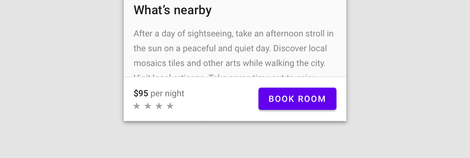
A button element always attempts to compute its accessible name using its
text content. For buttons that are not part of a form, writing a clear
action as the text content may be all you need to create a good accessible
name.
<button>Book Room</button>

One common exception to this rule is icon buttons. An icon button may use an image or an icon font to provide the text content for the button. For example, the buttons used in a WYSIWYG (What You See Is What You Get) editor to format text are typically just graphic symbols:
![]()
When working with icon buttons, it can be helpful to give them an explicit
accessible name using the aria-label attribute. aria-label overrides any
text content inside the button, letting you clearly describe the action to
anyone using a screen reader.
<button aria-label="Left align"></button>
Links
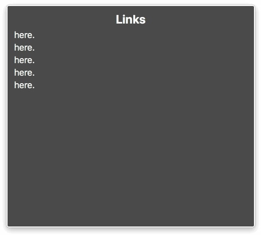
Similar to buttons, links primarily get their accessible name from their text content. A nice trick when creating a link is to put the most meaningful piece of text into the link itself, rather than filler words like "Here" or "Read More."
Check out our guide to web performance <a href="/guide">here</a>.
Check out <a href="/guide">our guide to web performance</a>.
This is especially helpful for screen readers that offer shortcuts to list all of the links on the page. If links are full of repetitive filler text, these shortcuts become much less useful:

Label form elements
There are two ways to associate a label with a form element such as a checkbox. Either of the methods causes the label text to also become a click target for the checkbox, which is also helpful for mouse or touchscreen users. To associate a label with an element, either:
- Place the input element inside of a label element
<label>
  <input type="checkbox">Receive promotional offers?</input>
</label>
- Or use the label's
forattribute and refer to the element'sid
<input id="promo" type="checkbox"></input>
<label for="promo">Receive promotional offers?</label>
When the checkbox has been labeled correctly, the screen reader can report that the element has a role of checkbox, is in a checked state, and is named "Receive promotional offers?" like in this VoiceOver example:


