Controlling macro and micro layout in a new era of responsive web design.
Responsive Design Today
Today, when using the term: "responsive design", you are most likely thinking about using media queries to change layout when resizing a design from mobile size, to tablet size, through to desktop size.
But soon, this perception of responsive design may be considered as outdated as using tables for page layout.
Viewport-based media queries give you some powerful tools, but lack a lot of finesse. They lack the ability to respond to user needs, and the ability to inject responsive styles into components themselves.
You can use global viewport information to style your components, but they still don't own their styles, and that doesn't work when our design systems are component-based and not page-based.
The good news is, the ecosystem is changing, and it's changing pretty rapidly. CSS is evolving, and a new era of responsive design is right on the horizon.
We see this happen about every 10 years. 10 years ago, around 2010-2012, we saw a huge change with mobile and responsive design, and the emergence of CSS3.

So it works out that, yet again, the ecosystem is ready for some pretty big changes to happen to CSS. The engineers at Chrome and across the web platform are prototyping, speccing, and starting the implementation for the next era of responsive design.
These updates include user-preference based media features, container queries, and media queries for new screen types, such as foldable screens.

Responsive to the user
New user preference media features, give you the ability to style web experiences that align with the user's own specific preferences and needs. This means that preference media features allow you to adapt your user experiences to your user's experiences.
These user preference media features include:
prefers-reduced-motionprefers-contrastprefers-reduced-transparencyprefers-color-schemeinverted-colors- And more
Preference features pick up on the preferences a user has set in their operating system, and help to build a more robust and personalized web experience, especially for those with accessibility needs.
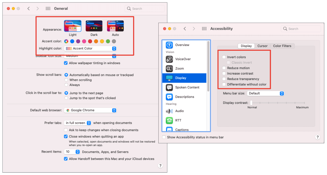
prefers-reduced-motion
Users who have set operating system preferences for reduced motion, are requesting fewer animations when using their computer in general. Therefore, it's likely that they wouldn't appreciate a flashy intro screen, card flip animation, intricate loader, or other flashy animations while using the web.
With prefers-reduced-motion you can design your pages with reduced-motion in
mind, and create a motion-enhanced experience for those who don't have this
preference set.
This card has information on both sides. The baseline reduced-motion experience is a crossfade to show that information, while the motion-enhanced experience is a card flip.
Prefers-reduced-motion shouldn't mean "no motion", since motion is so critical to conveying information online. Instead, provide a solid baseline experience that guides your users without unnecessary movement, and progressively enhance that experience for your users without those accessibility needs or preferences.
prefers-color-scheme
Another preference media feature is
prefers-color-scheme. This feature helps
you to customize your UI to the theme which your user prefers. In their
operating system, whether it's on desktop or mobile, users can set a preference
for light, dark, or auto themes, which change depending on the time of day.
If you set up your page using CSS custom
properties, swapping
color values is made straightforward. You can quickly update your color theme
values, such as backgroundColor and textOnPrimary to dynamically adjust to
the new theme within the media query.
To make it easier to test some of these preference queries out, you can use DevTools for emulation instead of opening up your system preferences each time.
Designing for dark theme
When designing for a dark theme, it's not just about inverting background and text colors or dark scrollbars. There are a few considerations you might not realize. For example, you might need to desaturate colors on a dark background to reduce visual vibration.
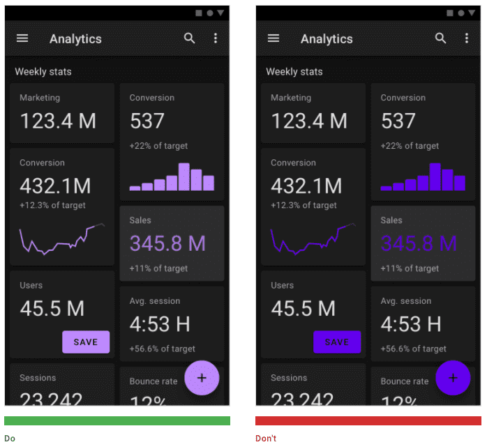
Instead of using shadows to create depth and draw an element forward, you may want to use light in the element's background-color to draw it forward. This is because shadows won't be as effective on a dark background.
Dark themes not only provide a more customized user experience, but they can also improve battery life significantly in AMOLED screens. Those are the screens we're seeing in newer high-end phones, and they're becoming increasingly popular across mobile devices.
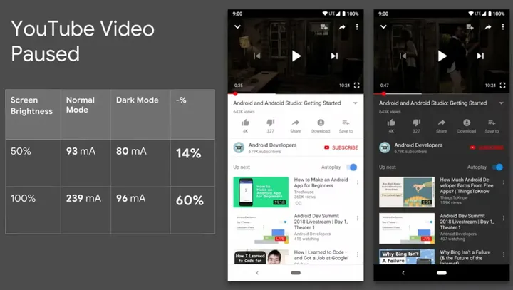
A 2018 Android study on dark themes showed a power draw savings of up to 60%, depending on the screen brightness and overall user interface. The 60% statistic came from comparing the Youtube play screen with a paused video at 100% screen brightness using dark theme for the app UI vs a light theme.
You should always provide a dark theme experience for your users whenever possible.
Responsive to the container
One of the most exciting emerging areas in CSS is container queries, also frequently called element queries. It's hard to understate what the shift from page-based responsive design to container-based responsive design will do to evolve the design ecosystem.
Here's an example of the powerful abilities that container queries provide. You can manipulate any of the card element's styles, including the link list, font sizes, and overall layout based on its parent container:
This example shows two identical components with two different container sizes, both taking up space in a layout created using CSS Grid. Each component fits its unique space allotment, and styles itself accordingly.
This amount of flexibility is something that is not possible with media queries alone.
Container queries provide a much more dynamic approach to responsive design. This means that if you put this card component in a sidebar or hero section or within a grid inside of the main body of a page, the component itself owns its responsive information and sizes according to the container, not the viewport
This requires the @container at-rule This works in a similar way to a media
query with @media, but instead, @container queries the parent container for
information rather than the viewport and user agent.
.card {
  container-type: inline-size;
}

@container (max-width: 850px) {
  .links {
    display: none;
  }

  .time {
    font-size: 1.25rem;
  }

  /* ... */
}
First, set containment on the parent element. And then, write a @container
query, to style any of the elements within the container based on its size,
using min-width or max-width.
The code above uses max-width, and sets the links to display:none, as well
as decreasing the time font size when the container is less than 850px wide.
Container query cards
In this demo plant website, each of the product cards, including the one in the hero, the sidebar of recently viewed items, and the product grid, are all the exact same component, with the same markup.
There are no media queries used to create this entire layout, just container queries. This allows for each product card to shift to the proper layout to fill its space. The grid for example, uses a minmax column layout to let the elements flow into their space, and re-layout the grid when that space is too compressed (which means that it hit the minimum size).
.product {
  container-type: inline-size;
}

@container (min-width: 350px) {
  .card-container {
    padding: 0.5rem 0 0;
    display: flex;
  }

  .card-container button {
    /* ... */
  }
}
When there is at least 350px of space in the grid, the card layout goes
horizontal by being set to display: flex, which has a default flex-direction
of "row".
With less space, the product cards stack. Each product card styles itself, something that would be impossible with global styles alone.
Mixing Container Queries with Media Queries
Container queries have so many use cases—one being a calendar component. You can use container queries to re-layout the calendar events and other segments based on the available width of their parent.
This demo container queries to change the layout and style of the calendar's date and day of the week, as well as adjusting the margins and font size on the scheduled events to help them better fit the space.
Then, use a media query to shift the entire layout for smaller screen sizes. This example shows how powerful it is to combine media queries (adjusting the global, or macro styles) with container queries (adjusting the container's children, and their micro styles).
So now we can think of Macro and Micro layouts within the same UI component to allow for some really nice nuanced design decisions.
Using container queries today
These demos are now available to play with behind a flag in Chrome Canary. Go to
about://flags in Canary and turn on the #enable-container-queries flag.
This will enable support for @container, inline-size and block-size values
for the contain property, and the LayoutNG Grid implementation.
The flag also enables the corresponding Chrome DevTools features. Learn how to inspect and debug container queries in DevTools.
Scoped styles
To build on container queries, use scoped styles with @scope to limit the reach of your selectors.
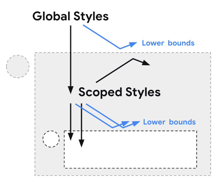
Scoped styles allow for component-specific styling to avoid naming collisions, something that many frameworks and plugins like CSS modules already enable us to do within frameworks. Scoped styles allow you to write encapsulated styles natively for components with readable CSS without the need to adjust the markup.
/* @scope (<root>#) [to (<boundary>#)]? { … } */

@scope (.tabs) to (.panel) {
  :scope { /* targeting the scope root */ }
  .light-theme :scope .tab { /* contextual styles */ }
}
Scoping lets you create "donut shaped" selectors, where you can specify
an upper and lower limit. Selectors contained in the @scope rule get matched
between those limits.
An example of this would be a tab panel, where you'd want the tabs to get the scoped styles but the panel within those tabs to not be affected by those scoped styles.
Responsive to the form factor
The next topic in our conversation about the new era of responsive design is a shift in form factors, and the growing possibilities of what we'll need to be designing for as a web community (such as shape-shifting screen or virtual reality).

Foldable or flexible screens, and designing for screen spanning is one example of where we can see a form factor shift today. And screen-spanning is yet another spec being worked on to cover these new form factors and needs.
An experimental media
query
for screen-spanning could help us here. It currently behaves like this: @media
(spanning: <type of fold>). The demo sets up a grid layout with two columns:
one has a width of --sidebar-width, which is 5rem by default, and the other is
1fr. When the layout is viewed on a dual screen that has a single vertical
fold, the value of --sidebar-width is updated with the environment value of
the left fold.
:root {
  --sidebar-width: 5rem;
}

@media (spanning: single-fold-vertical) {
  --sidebar-width: env(fold-left);
}

main {
    display: grid;
    grid-template-columns: var(--sidebar-width) 1fr;
}
This enables a layout where the sidebar, the navigation in this case, fills the space of one of the folds, where the app UI fills the other. This prevents a "crease" in the UI.
You can test out foldable screens in the Chrome DevTools emulator to help debug and prototype screen spanning directly in the browser.
Conclusion
Exploring UI design beyond a flat screen is yet another reason why container queries and scoped styles are so important. They give you the opportunity to silo component styles from page layout and global styles, and user styles, enabling more resilient responsive design. This means you can now design macro layouts using page-based media queries, including screen-spanning nuances. At the same time using micro layouts with container queries on the components, and add user-preference based media queries to customize user experiences based on their unique preferences and need.
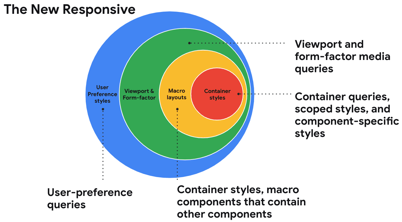
This is the new responsive.
It's combining macro layout with micro layout, and on top of all of that, it's taking user customization and form factor into account.
Any of these changes alone would constitute a considerable shift in how we design for the web. But combined, they signify a really big shift in how we even conceptualize responsive design. It's time to think about responsive design beyond viewport size, and start considering all of these new axes for better component-based and customized experiences.
The next era of responsive design is here, and you can already start to explore it yourself.
web.dev/learnCSS
And for now, if you want to level up your CSS game, and maybe revisit some basics, my team is launching a brand new, totally free CSS course and reference on web.dev. You can access it via web.dev/learnCSS.
I hope you enjoyed this overview on the next era of responsive design, and some of the primitives that will come along with it, and I also hope you're as excited as I am about what this means for the future of web design.
It opens up a huge opportunity to us as a UI community to embrace component-based styles, new form factors, and create user-responsive experiences.

