When we think of layouts, we often think of page-level designs. But smaller components within the page can have their own self-contained layouts.
Ideally, these component-level layouts will adjust themselves automatically, regardless of their position on the page. There may be situations where you don't know if a component will be placed into the main content column or the sidebar or both. Without knowing for sure where a component will end up, you need to make sure that the component can adjust itself to its container.
Grid
CSS grid isn't just for page-level layouts. It also works well for the components that live within them.
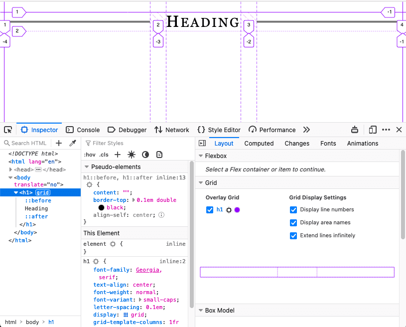
In this example, the ::before and ::after
pseudo-elements create decorative lines on either
side of a heading. The heading itself is a grid container. The individual
elements are laid out so that the lines always fill the available space.
h1 {
  display: grid;
  grid-template-columns: 1fr auto 1fr;
  gap: 1em;
}
h1::before,
h1::after {
  content: "";
  border-top: 0.1em double black;
  align-self: center;
}
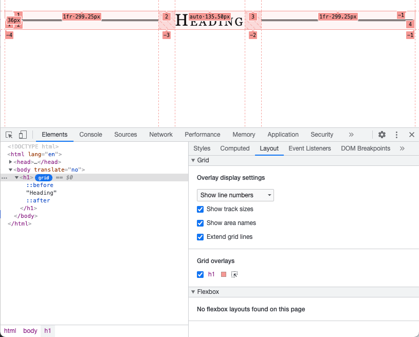
Learn how to inspect grid layouts in Chrome DevTools.
Flexbox
As the name suggests, you can use flexbox to make your components flexible. You can declare which elements in your component should have a minimum or maximum size and let the other elements flex to fit accordingly.
In this example, the image takes up one quarter of the available space and the text takes up the other three quarters. But the image never gets larger than 200 pixels.
.media {
  display: flex;
  align-items: center;
  gap: 1em;
}
.media-illustration {
  flex: 1;
  max-inline-size: 200px;
}
.media-content {
  flex: 3;
}
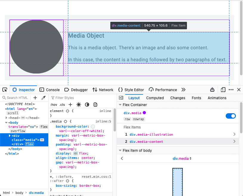
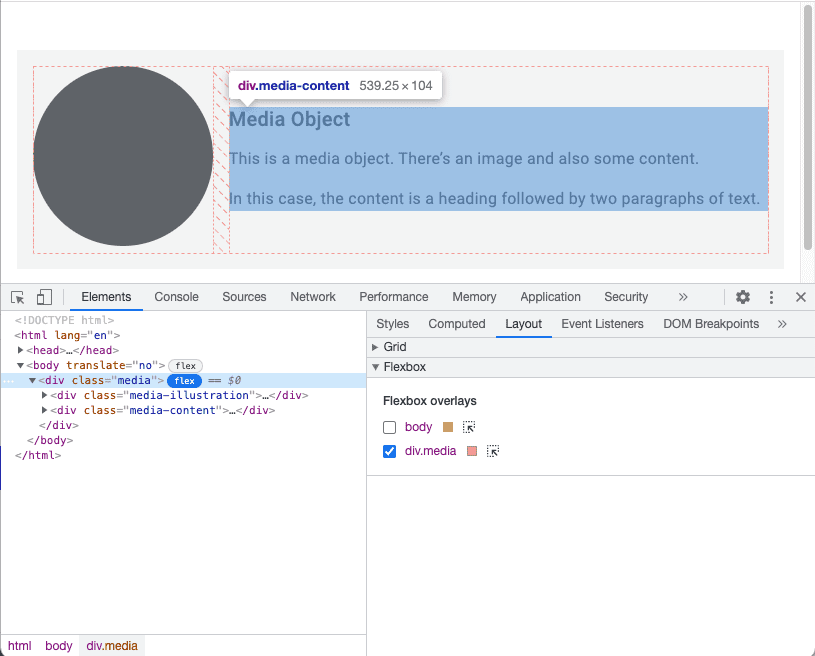
Learn how to inspect flexbox layouts in Chrome DevTools.
Container queries
Flexbox lets you design from the content out. You can specify the parameters of your elements (how narrow they should get, how wide they should get) and let the browser figure out the final implementation.
But the component itself has no awareness of its context. It doesn't know if it's being used in the main content or in a sidebar. This can make component layouts trickier than page layouts. To be able to apply contextually relevant styles, your components need to know more than the size of the viewport they are inside.
With page layouts, you do know the width of the container because the container is the browser viewport; media queries report the dimensions of the page-level container.
To report the dimensions of any container, use container queries.
To start, define which elements act as containers.
main,
aside {
  container-type: inline-size;
}
This means that you want to query the inline dimension. For English-language documents, that's the horizontal axis. You're going to change styles based on the width of the container.
If a component is inside one of those containers, you can apply styles similarly to how you apply media queries.
.media-illustration {
  max-width: 200px;
  margin: auto;
}

@container (min-width: 25em) {
  .media {
    display: flex;
    align-items: center;
    gap: 1em;
  }

  .media-illustration {
    flex: 1;
  }

  .media-content {
    flex: 3;
  }
}
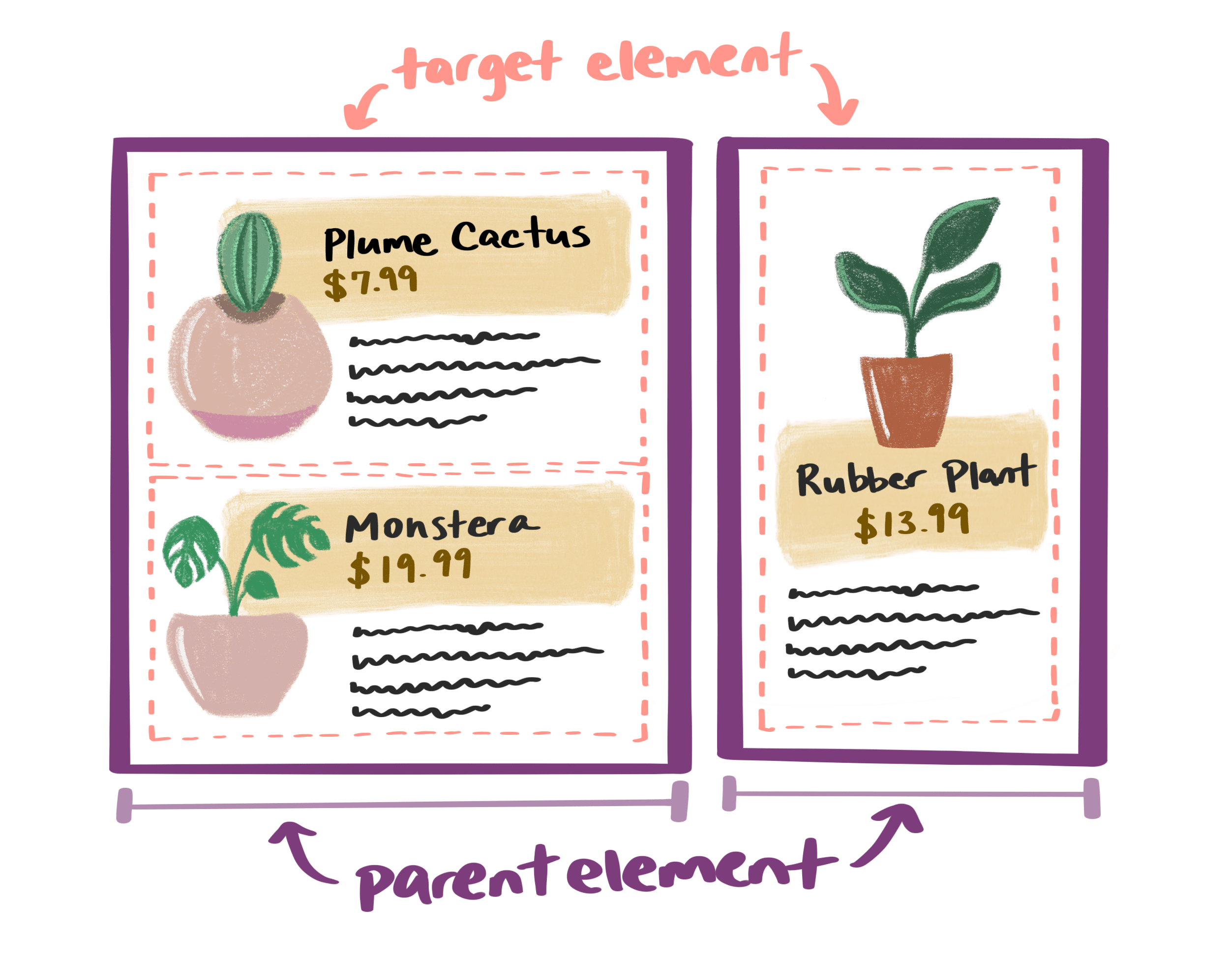
If a media object is inside a container that's narrower than 25em, the flexbox
styles aren't applied. The image and text appear are ordered vertically.
But, if the containing element is wider than 25em, the image and text appear
side-by-side.
With container queries, you can style components independently. You can write rules based on the width of the containing element; the width of the viewport no longer matters.
Combine queries
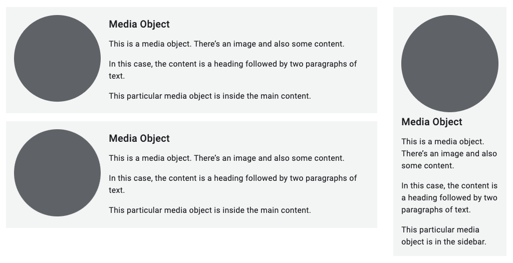
You can use media queries for the page layout and container queries for the components within the page.
Here the overall structure of the page has a main element and an aside element.
There are media objects within both elements.
<body>
  <main>
     <div class="media">…</div>
     <div class="media">…</div>
  </main>
  <aside>
     <div class="media">…</div>
  </aside>
</body>
A media query applies a grid layout to the main and aside elements when the
viewport is wider than 45em.
@media (min-width: 45em) {
  body {
    display: grid;
    grid-template-columns: 3fr 1fr;
  }
}
The container query rule for the media objects remains the same:
only apply a horizontal flexbox layout if the containing element is wider than 25em.

Container queries are a game-changer for micro layouts. Your components can be self-contained, independent of the browser viewport.
Check your understanding
Test your knowledge of micro layouts.
Grid and flexbox are both useful for micro layouts?
Previously, you learned about page-level macro layouts. Now you know about component-level micro layouts.
Next, you'll go deeper into the very building blocks of your content and learn how to make your images responsive. First, you'll learn about responsive typography.
