Component patterns
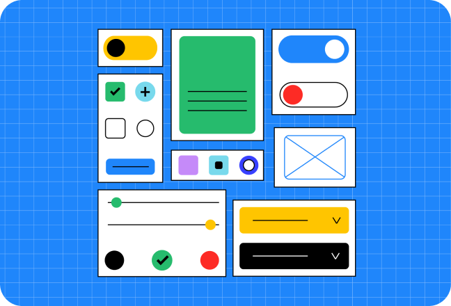
Welcome to our growing collection of component patterns. These can provide inspiration, accessibility requirements, adaptive strategies for viewport and user preferences, and more.
Breadcrumbs
Create a responsive and accessible breadcrumbs component for users to navigate your site..
Buttons
Style the different buttons types of the web.
Carousel
Create a color-adaptive, responsive, and accessible carousel component.
Dialog
Create color-adaptive, responsive, and accessible mini and mega modals.
Game menu
Create a mouse and keyboard accessible 3D game menu.
Loading bar
Build a color adaptive and accessible loading bar with the progress element.
Media scroller
Create horizontal scrolling experiences for the web that are minimal, responsive, accessible and work across browsers and platforms.
Multi-select
Build a responsive, adaptive, and accessible, multi-select component for sort and filter.
Settings
Build a settings component that is responsive, supports multiple device inputs, and works across browsers
Sidenav
Responsive, stateful, supports keyboard navigation, works with and without JavaScript, and works across browsers
Split buttons
Build an adaptive and accessible split button component.
Stories
Build a Stories component for the web that is responsive, supports keyboard navigation, and works across browsers.
svg-favicon
Build a dark and light theme adaptive favicon with SVG.
switch
Create a responsive, adaptive and accessible switch component.
tabs
Create a tab component with grid and scroll snap points.
toast
Build an adaptive and accessible toast component.
