

Published: August 22, 2012, Last updated: April 14, 2025
With so many devices on the market, there's a very wide range of screen pixel densities available. Application developers need to support a range of pixel densities, which can be quite challenging. On the mobile web, the challenges are compounded by several factors:
- Large variety of devices with different form factors.
- Constrained network bandwidth and battery life.
In terms of images, the goal for web developers is to serve the best quality images as efficiently as possible. Here, we cover some useful techniques to do this now and in the future.
Avoid images when possible
Before assuming you need to include an image, remember that the web has numerous
powerful technologies that are largely resolution- and DPI-independent.
Specifically, text, SVG, and much of CSS "just works" because of the
automatic pixel scaling feature of the web with
devicePixelRatio.
That said, you can't always avoid raster images. For example, you may be given assets that would be quite hard to replicate in pure SVGs or CSS. You may be dealing with a photograph. While you could convert an image into an SVG automatically, vectorizing photographs makes little sense because scaled-up versions usually don't look good.
History of pixel density
In the early days, computer displays had a pixel density of 72 or 96 dots per inch (DPI).
Displays gradually improved in pixel density, largely driven by the advance of mobile devices, as users generally hold their phones closer to their faces making pixels more visible. By 2008, 150dpi phones were the new norm. Increased display density continued, and today's phones have 300dpi displays.
In practice, low density images should look the same on new screens as they did on old ones, but compared to the crisp imagery high density users are used to seeing, the low density images look jarring and pixelated. The following is a rough simulation of how a 1x image looks on a 2x display. In contrast, the 2x image looks quite good.
| 1x pixels | 2x pixels |
 |
 |
Pixels on the web
When the web was designed, 99% of displays were 96dpi and few provisions were made for variations. Now that we have a large variation in screen sizes and densities, we need a standard way to make images look good across them all.
The HTML specification tackled this problem by defining a reference pixel that manufacturers use to determine the size of a CSS pixel.
Using the reference pixel, a manufacturer can determine the size of the device's physical pixel relative to the standard or ideal pixel. This ratio is called the device pixel ratio.
Calculate the device pixel ratio
Suppose a mobile phone has a screen with a physical pixel size of 180 pixels per inch (ppi). Calculating the device pixel ratio takes three steps:
Compare the actual distance at which the device is held to the distance for the reference pixel.
Per the spec, we know that at 28 inches, the ideal is 96 pixels per inch. With a mobile phone, we know people's faces are closer to their devices than with laptops and desktop computers. For the following equations, we estimate that distance to be 18 inches.
Multiply the distance ratio against the standard density (96ppi) to get the ideal pixel density for the given distance.
idealPixelDensity = (28/18) * 96 = 150 pixels per inch (approximately)
Take the ratio of the physical pixel density to the ideal pixel density to get the device pixel ratio.
devicePixelRatio = 180/150 = 1.2
So now when a browser needs to know how to resize an image to fit the screen, according to the ideal or standard resolution, the browser refers to the device pixel ratio of 1.2. This means for every ideal pixel, this device has 1.2 physical pixels. The formula to go between ideal (as defined by the web spec) and physical (dots on device screen) pixels is the following:
physicalPixels = window.devicePixelRatio * idealPixels
Historically, device vendors have tended to round devicePixelRatios
(DPRs). Apple's iPhone and iPad report DPR of 1, and their Retina
equivalents report 2. The CSS specification recommends that
the pixel unit refer to the whole number of device pixels that best approximates the reference pixel.
One reason why round ratios can be better is because they may lead to fewer sub-pixel artifacts.
However, the reality of the device landscape is much more varied, and Android phones often have DPRs of 1.5. The Nexus 7 tablet has a DPR of ~1.33, which was arrived at by a calculation similar to the previous example. Expect to see more devices with variable DPRs in the future. Because of this, you should never assume that your clients have integer DPRs.
HiDPI image techniques
There are many techniques for solving the problem of showing the best quality images as fast as possible, broadly falling into two categories:
- Optimizing single images.
- Optimizing selection between multiple images.
Single image approaches: use one image, but do something clever with it. These approaches have the drawback that you must inevitably sacrifice performance, since you have to download HiDPI images, even on older devices with lower DPI. Here are some approaches for the single image case:
- Heavily compressed HiDPI image
- Totally awesome image format
- Progressive image format
Multiple image approaches: use multiple images, but do something clever to pick which to load. These approaches have inherent overhead for the developer to create multiple versions of the same asset and then figure out a decision strategy. Here are the options:
- JavaScript
- Server side delivery
- CSS media queries
- Built-in browser features (
image-set(),<img srcset>)
Heavily compressed HiDPI image
Images already comprise a whopping 60% of bandwidth spent downloading an average website. By serving HiDPI images to all clients, we increase this number. How much bigger can it grow?
I ran some tests which generated 1x and 2x image fragments with JPEG quality at 90, 50 and 20.
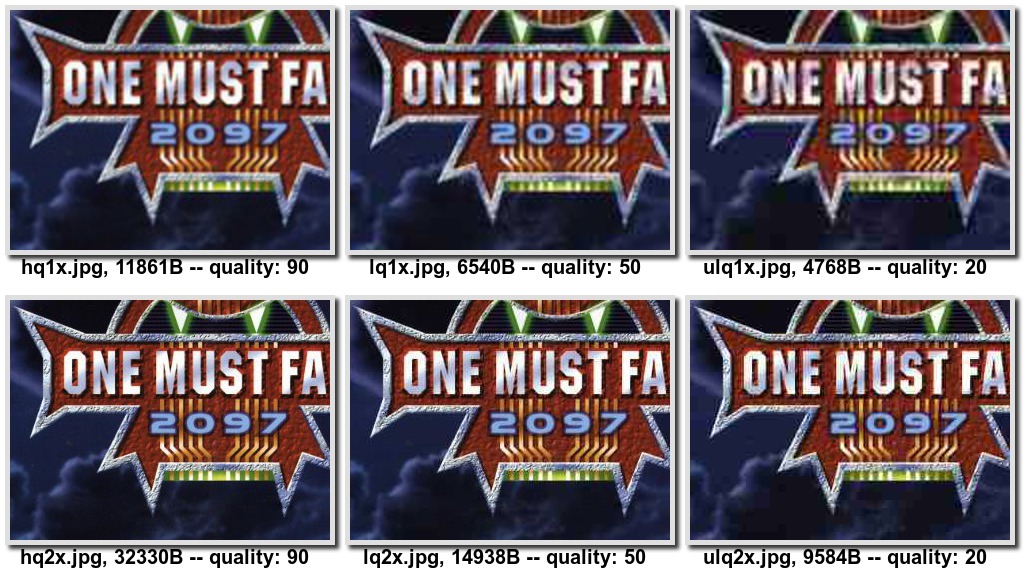
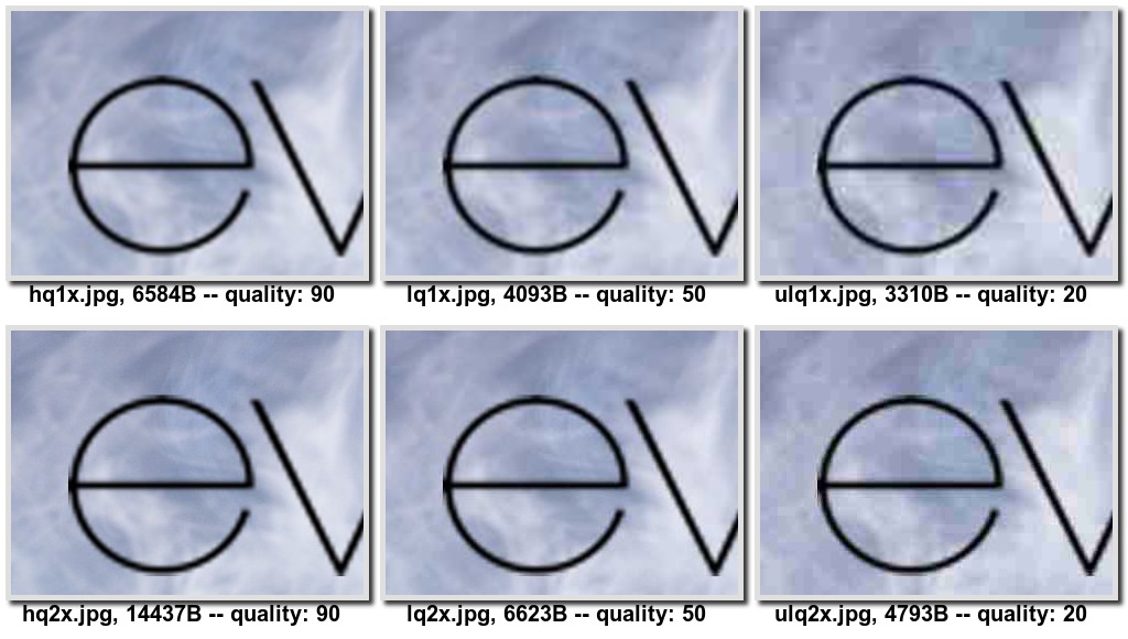
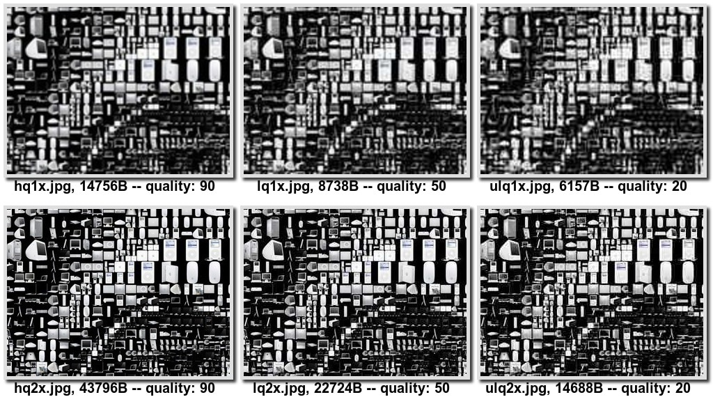
From this small, unscientific sampling, it seems that compressing large images provides a good quality-to-size tradeoff. To my eye, heavily compressed 2x imagery actually looks better than uncompressed 1x pictures.
That said, serving low-quality, highly compressed 2x imagery to 2x
devices is worse than serving higher quality ones, and that approach would
incur image quality penalties. If you compare quality: 90
images to quality: 20 images, there's a drop in how crisp the image is
and increased graininess. Artifacts with quality:20 may not be acceptable
where high quality images are important (for example, a photo viewer
application) or for app developers that are unwilling to compromise.
This comparison was made entirely with compressed JPEGs. It's worth noting that there are many tradeoffs between the widely implemented image formats (JPEG, PNG, GIF), which brings us to…
WebP: Totally awesome image format
WebP is a pretty compelling image format that compresses very well while keeping high image fidelity.
One way is to check for WebP support is using JavaScript. Load a 1px
image with data-uri, wait for either loaded or error events fired, and
then verify that the size is correct. Modernizr ships with
such a feature detection script, which is available
with Modernizr.webp.
A better way of doing this, however, is directly in CSS using the image() function. So if you have a WebP image and JPEG fallback, you can write the following:
#pic {
  background: image("foo.webp", "foo.jpg");
}
There are a few problems with this approach. First, image() is not
at all widely implemented. Secondly, while WebP compression blows JPEG
out of the water, it's still a relatively incremental improvement –
about 30% smaller based on this WebP gallery. Thus, WebP
alone isn't enough to address the high DPI problem.
Progressive image formats
Progressive image formats like JPEG 2000, Progressive JPEG, Progressive PNG and GIF have the (somewhat debated) benefit of seeing the image come into place before it's fully loaded. They may incur some size overhead, though there is conflicting evidence about this. Jeff Atwood claimed that progressive mode "adds about 20% to the size of PNG images, and about 10% to the size of JPEG and GIF images". However, Stoyan Stefanov claimed that for large files, progressive mode is more efficient (in most cases).
At first glance, progressive images look very promising in the context of serving the best quality images as fast as possible. The idea is that the browser can stop downloading and decoding an image once it knows that additional data won't increase the image quality (ie. all of the fidelity improvements are sub-pixel).
While connections are quick to terminate, they are often expensive to restart. For a site with many images, the most efficient approach is to keep a single HTTP connection alive, reusing it for as long as possible. If the connection is terminated prematurely because one image has been downloaded enough, the browser then needs to create a new connection, which can be really slow in low latency environments.
One workaround to this is to use the HTTP Range request, which lets browsers specify a range of bytes to fetch. A smart browser could make a HEAD request to get at the header, process it, decide how much of the image is actually needed, and then fetch. Unfortunately HTTP Range is poorly supported in web servers, making this approach impractical.
Finally, an obvious limitation of this approach is that you don't get to choose which image to load, only varying fidelities of the same image. As a result, this doesn't address the "art direction" use case.
Use JavaScript to decide which image to load
The first and most obvious approach to deciding which image to load is
to use JavaScript in the client. This approach lets you find out
everything about your user agent and do the right thing. You can
determine device pixel ratio with window.devicePixelRatio, get screen
width and height, and even potentially do some network connection
sniffing with navigator.connection or issuing a fake request, like the
foresight.js library does. Once you've collected all of
this information, you can decide which image to load.
There are approximately one million JavaScript libraries that use this technique. Unfortunately, none of them are particularly outstanding.
One big drawback is that you delay image loading until after the look-ahead
parser has finished. This essentially means that images won't even start
downloading until after the pageload event fires. More on this in
Jason Grigsby's article.
Decide what image to load on the server
You can defer the decision to the server-side by writing custom request handlers for each image you serve. Such a handler would check for Retina support based on User-Agent (the only piece of information shared with the server). Then, based on whether the server-side logic wants to serve HiDPI assets, you load the appropriate asset (named according to some known convention).
Unfortunately, the User-Agent doesn't necessarily provide enough
information to decide whether a device should receive high or low
quality images. And, any solution that uses the User-Agent to make style
decisions should be avoided.
Use CSS media queries
Being declarative, CSS media queries let you state your intention, and
let the browser do the right thing on your behalf. In addition to the most
common use of media queries—matching device size—you can
also match devicePixelRatio. The associated media query is
device-pixel-ratio, and has associated min and max variants, as you
might expect.
If you want to load high DPI images and the device pixel ratio exceeds a threshold, here's what you might do:
#my-image { background: (low.png); }

@media only screen and (min-device-pixel-ratio: 1.5) {
  #my-image { background: (high.png); }
}
It gets a little more complicated with all of the vendor prefixes mixed in, especially because of large differences in placement of "min" and "max" prefixes:
@media only screen and (min--moz-device-pixel-ratio: 1.5),
    (-o-min-device-pixel-ratio: 3/2),
    (-webkit-min-device-pixel-ratio: 1.5),
    (min-device-pixel-ratio: 1.5) {

  #my-image {
    background:url(high.png);
  }
}
With this approach, you regain the benefits of look-ahead parsing, which was lost with the JavaScript solution. You also gain the flexibility of choosing your responsive breakpoints (for example, you can have low, mid and high DPI images), which was lost with the server-side approach.
Unfortunately it's still a little unwieldy, and leads to strange looking
CSS or requires preprocessing. Also, this approach is restricted to
CSS properties, so there's no way to set an <img src>, and your images
must all be elements with a background. Finally, by relying strictly on
device pixel ratio, you can end up in situations where your High-DPI
mobile phone ends up downloading a massive 2x image asset while on an
EDGE connection. This isn't the best user experience.
As image-set() is a CSS function, it doesn't address the problem for
<img> tags. Enter @srcset, which addresses this issue.
The next section goes deeper into image-set and srcset.
Browser features for high DPI support
Ultimately, how you approach high DPI support depends on your particular requirements. All of the aforementioned approaches have drawbacks.
Now that image-set and srcset are widely supported, they're the best
solutions. There are additional best practices that can bring us closer
for older browsers.
How are these two different? Well, image-set() is a CSS
function, appropriate for use as a value of the background CSS property.
srcset is an attribute specific to <img> elements, with similar syntax.
Both of these tags let you specify image declarations, but the srcset
attribute lets you also configure which image to load based on viewport
size.
Best practices for image-set
The image-set() syntax takes one or more comma separated image declarations,
which consist of a URL string or url() function followed by the appropriate
resolution. For example:
image-set(
  url("image1.jpg") 1x,
  url("image2.jpg") 2x
);

/* You can also include image-set without `url()` */
image-set(
  "image1.jpg" 1x,
  "image2.jpg" 2x
);
This tells the browser is that there are two images to choose from. One image is optimized for 1x displays and the other for 2x displays. The browser then gets to choose which one to load, based on a variety of factors, which might even include network speed, if the browser is smart enough.
In addition to loading the correct image, the browser scales it accordingly. In other words, the browser assumes that 2 images are twice as large as 1x images, and so scales the 2x image down by a factor of 2, so that the image appears to be the same size on the page.
Instead of specifying 1x, 1.5x or Nx, you can also specify a certain device pixel density in DPI.
If you're concerned about older browsers that don't support the image-set
property, you can add a fallback to ensure an image is displayed. For example:
/* Fallback support. */
background-image: url(icon1x.jpg);
background-image: image-set(
  url(icon1x.jpg) 1x,
  url(icon2x.jpg) 2x
);

image-set(
  url(icon1x.jpg) 1x,
  url(icon2x.jpg) 2x
);
This sample code loads the appropriate asset in browsers that support image-set and falls back to the 1x asset otherwise.
At this point, you may be wondering why not just polyfill (that is,
build a JavaScript shim for) image-set() and call it a day? As it
turns out, it's quite difficult to implement efficient polyfills for CSS
functions. (For a detailed explanation why, see this www-style
discussion).
Image srcset
In addition to the declarations that image-set provides,
the srcset element also takes width and height values which correspond to the
size of the viewport, attempting to serve the most relevant version.
<img alt="my awesome image"
  src="banner.jpeg"
  srcset="banner-HD.jpeg 2x, banner-phone.jpeg 640w, banner-phone-HD.jpeg 640w 2x">
This example serves banner-phone.jpeg to devices with viewport width under
640px, banner-phone-HD.jpeg to small screen high DPI devices,
banner-HD.jpeg to high DPI devices with screens greater than 640px, and
banner.jpeg to everything else.
Use image-set for image elements
It may be tempting to replace your img elements with <div>s
with backgrounds and use the image-set approach. This does work, with
caveats. The drawback here is that the <img> tag has long-time
semantic value. In practice, this is important for accessibility and
web crawlers.
You could use the content CSS property, which automatically scales the image
based on devicePixelRation. For example:
<div id="my-content-image"
  style="content: -webkit-image-set(
    url(icon1x.jpg) 1x,
    url(icon2x.jpg) 2x);">
</div>
Polyfill srcset
One handy feature of srcset is that it comes with a natural fallback.
In the case where the srcset attribute is not implemented, all browsers
know to process the src attribute. Also, since it's just an HTML
attribute, it's possible to create polyfills with
JavaScript.
This polyfill comes with unit tests to ensure that it's as close to the specification as possible. In addition, there are checks in place that prevent the polyfill from executing any code if srcset is implemented natively.
Conclusion
The best solution for high-DPI images is to opt for SVGs and CSS. However, this isn't always a realistic solution, especially for image-dense websites.
Approaches in JavaScript, CSS, and server-side solutions have their strengths
and weaknesses. The most promising approach is to use image-set and srcset.
To summarize, my recommendations are as follows:
- For background images, use image-set with the appropriate fallbacks for browsers that don't support it.
- For content images, use a srcset polyfill, or fallback to using image-set (see above).
- For situations where you're willing to sacrifice image quality, consider using heavily compressed 2x images.