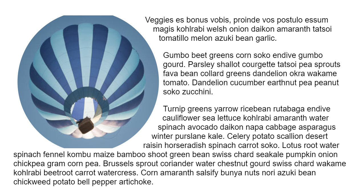
Using clipping in CSS can help us move away from everything in our designs looking like a box. By using various basic shapes, or an SVG, you can create a clip path. Then cut away the parts of an element you don't want to show.
Elements on web pages are all defined inside a rectangular box.
However that doesn't mean that we have to make everything look like a box.
You can use the CSS clip-path property to clip away parts of an image or other element,
to create interesting effects.
In the example above, the balloon image is square (source).
Using clip-path and the basic shape value of circle()
the additional sky around the balloon is clipped away leaving a circular image on the page.
As the image is a link you can see something else about the clip-path property.
Only the visible area of the image can be clicked on,
as events do not fire on the hidden parts of the image.
Clipping can be applied to any HTML element, not just images.
There are a few different ways to create a clip-path, in this post we will take a look at them.
Browser compatibility
For legacy browsers a fallback may be to allow the browser to ignore the clip-path property and show the unclipped image.
If this is a problem you could test for clip-path in a feature query and offer an alternate layout for unsupporting browsers.
@supports(clip-path: circle(45%)) {
  /* code that requires clip-path here. */
}
Basic shapes
The clip-path property can take a number of values.
The value used in the initial example was circle().
This is one of the basic shape values, which are defined in the
CSS Shapes specification.
This means that you can clip an area,
and also use the same value for shape-outside to cause text to wrap around that shape.
The full list of basic shapes is:
inset()
The inset() value insets the clipped area from the edge of the element,
and can be passed values for the top, right, bottom, and left edges.
A border-radius can also be added to curve the corners of the clipped area,
by using the round keyword.
In my example I have two boxes both with a class of .box.
The first box has no clipping, the second is clipped using inset() values.
circle()
As you have seen, the circle() value creates a circular clipped area.
The first value is a length or a percentage and is the radius of the circle.
A second optional value allows you to set the center of the circle.
In the example below I am using keyword values to set my clipped circle top right.
You could also use lengths or percentages.
Watch out for flat edges!
Be aware with all of these values that the shape will be clipped by the margin box on the element. If you create a circle on an image, and that shape would extend outside of the natural size of the image, you will get a flat edge.

circle(50%) applied. As the image is not square, we hit the margin box at the top and bottom and the circle is clipped.ellipse()
An ellipse is essentially a squashed circle,
and so acts very much like circle() but accepts a radius for x and a radius for y,
plus the value for the center of the ellipse.
polygon()
The polygon() value can help you create fairly complex shapes,
defining as many points as you need,
by setting the coordinates of each point.
To help you create polygons and see what is possible check out Clippy,
a clip-path generator,
then copy and paste the code into your own project.
Shapes from box values
Also defined in CSS Shapes are shapes from box values.
These relate to the CSS Box Model -- the content box, padding box, border box,
and margin box with keyword values of content-box, border-box, padding-box, and margin-box.
These values can be used alone, or alongside a basic shape to define the reference box used by the shape. For example, the following would clip the shape to the edge of the content.
.box {
  clip-path: content-box;
}
In this example the circle would use the content-box as the reference box rather than the margin-box (which is the default).
.box {
  clip-path: circle(45%) content-box;
}
Currently browsers do not support the use of box values for the clip-path property.
They are supported for shape-outside however.
Using an SVG element
For more control over your clipped area than is possible with basic shapes,
use an SVG clipPath element.
Then reference that ID, using url() as the value for clip-path.
Animating the clipped area
CSS transitions and animations can be applied to the clip-path to create some interesting effects.
In this next example I am animating a circle on hover by transitioning between two circles with a different radius value.
There are lots of creative ways in which animation can be used with clipping. Animating with clip-path on CSS Tricks runs through some ideas.
Photo by Matthew Henry on Burst.

