A foundational overview of how to build a color adaptive and accessible loading bar with the <progress> element.
In this post I want to share thinking on how to build a color adaptive and
accessible loading bar with the <progress> element. Try the
demo and view the
source!
If you prefer video, here's a YouTube version of this post:
Overview
The
<progress>
element provides visual and audible feedback to users about completion. This
visual feedback is valuable for scenarios such as: progress through a form,
displaying downloading or uploading information, or even showing that the
progress amount is unknown but work is still active.
This GUI Challenge worked with
the existing HTML <progress> element to save some effort in accessibility. The
colors and layouts push the limits of customization for the built-in element, to
modernize the component and have it fit better within design systems.

Markup
I chose to wrap the <progress> element in a
<label> so
I could skip the explicit relationship attributes in favor of an implicit
relationship.
I've also labeled a parent element affected by the loading state, so screen
reader technologies can relay that information back to a user.
<progress></progress>
If there is no value, then the element's progress is
indeterminate.
The max attribute defaults to 1, so progress is between 0 and 1. Setting max
to 100, for example, would set the range to 0-100. I chose to stay within the 0
and 1 limits, translating progress values to 0.5 or 50%.
Label-wrapped progress
In an implicit relationship, a progress element is wrapped by a label like this:
<label>Loading progress<progress></progress></label>
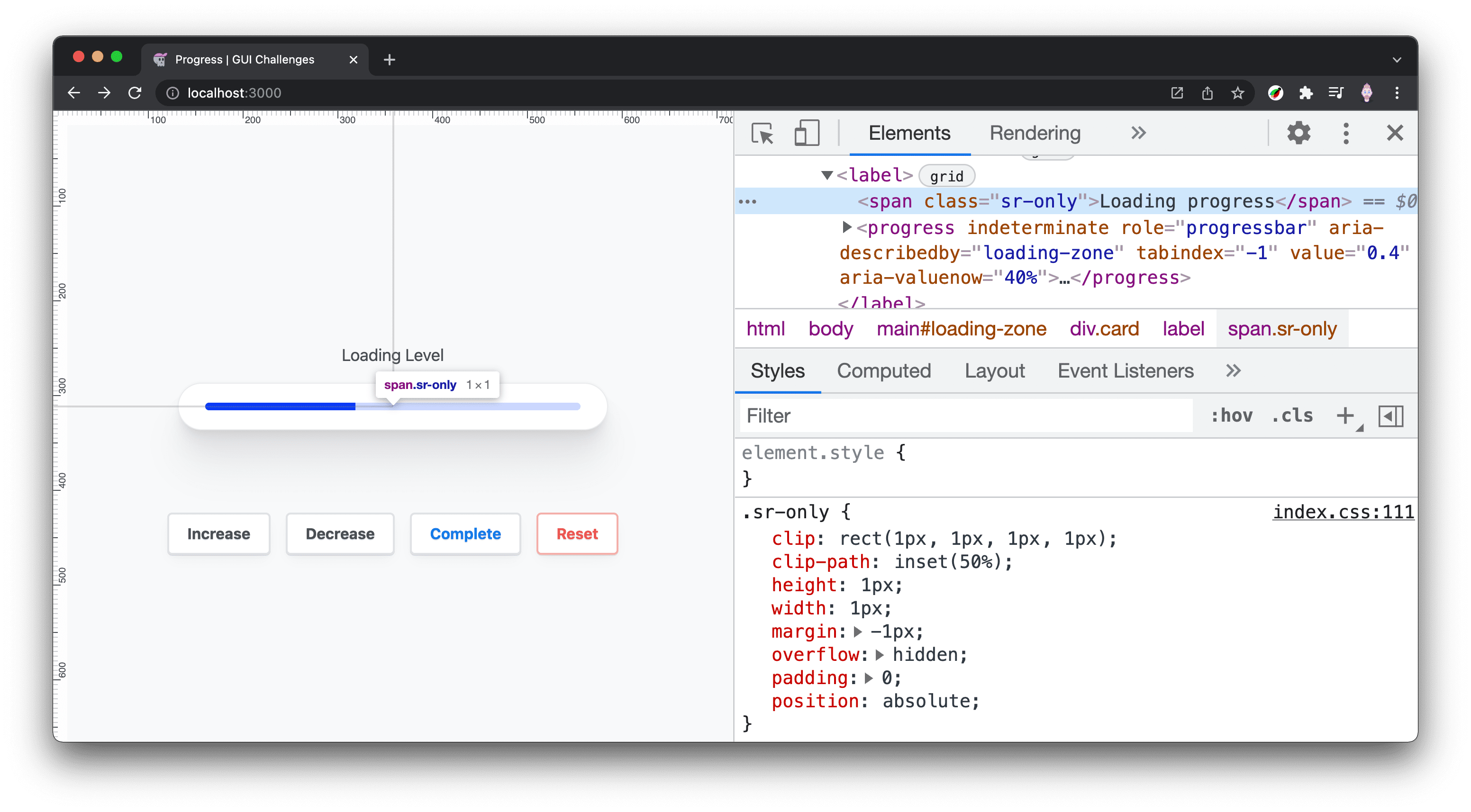
In my demo I chose to include the label for screen readers
only.
This is done by wrapping the label text in a <span> and applying some styles
to it so that it's effectively off screen:
<label>
  <span class="sr-only">Loading progress</span>
  <progress></progress>
</label>
With the following accompanying CSS from WebAIM:
.sr-only {
  clip: rect(1px, 1px, 1px, 1px);
  clip-path: inset(50%);
  height: 1px;
  width: 1px;
  margin: -1px;
  overflow: hidden;
  padding: 0;
  position: absolute;
}
Area affected by loading progress
If you have healthy vision, it can be easy to associate a progress indicator
with related elements and page areas, but for visually impaired users, it's not
so clear. Improve this by assigning the
aria-busy
attribute to the top-most element that will change when loading is complete.
Furthermore, indicate a relationship between the progress and the loading zone
with
aria-describedby.
<main id="loading-zone" aria-busy="true">
  …
  <progress aria-describedby="loading-zone"></progress>
</main>
From JavaScript, toggle aria-busy to true at the start of the task, and to
false once finished.
Aria attribute additions
While the implicit role of a <progress> element is
progressbar, I've made it explicit
for browsers that lack that implicit role. I've also added the attribute
indeterminate to explicitly put the element into a state of unknown, which is
clearer than observing the element has no value set.
<label>
  Loading
  <progress
    indeterminate
    role="progressbar"
    aria-describedby="loading-zone"
    tabindex="-1"
  >unknown</progress>
</label>
Use
tabindex="-1"
to make the progress element focusable from JavaScript. This is important for
screen reader technology, since giving the progress focus as progress changes,
will announce to the user how far the updated progress has reached.
Styles
The progress element is a bit tricky when it comes to styling. Built-in HTML elements have special hidden parts that can be difficult to select and often only offer a limited set of properties to be set.
Layout
The layout styles are intended to allow some flexibility in the progress element's size and label position. A special completion state is added that can be a useful, but not required, additional visual cue.
<progress> Layout
The width of the progress element is left untouched so it can shrink and grow
with the space needed in the design. The built-in styles are stripped out by
setting appearance and border to none. This is done so the element can be
normalized across browsers, since each browser has its own styles for their
element.
progress {
  --_track-size: min(10px, 1ex);
  --_radius: 1e3px;

  /*  reset  */
  appearance: none;
  border: none;

  position: relative;
  height: var(--_track-size);
  border-radius: var(--_radius);
  overflow: hidden;
}
The value of 1e3px for _radius uses scientific number
notation to express a
large number so the border-radius is always rounded. It's equivalent to
1000px. I like to use this because my aim is to use a value large enough that
I can set it and forget it (and it's shorter to write than 1000px). It is also
easy to make it even larger if needed: just change the 3 to a 4, then 1e4px is
equivalent to 10000px.
overflow: hidden is used and has been a contentious style. It made a few
things easy, such as not needing to pass border-radius values down to the
track, and track fill elements; but it also meant no children of the progress
could live outside of the element. Another iteration on this custom progress
element could be done without overflow: hidden and it may open up some
opportunities for animations or better completion states.
Progress complete
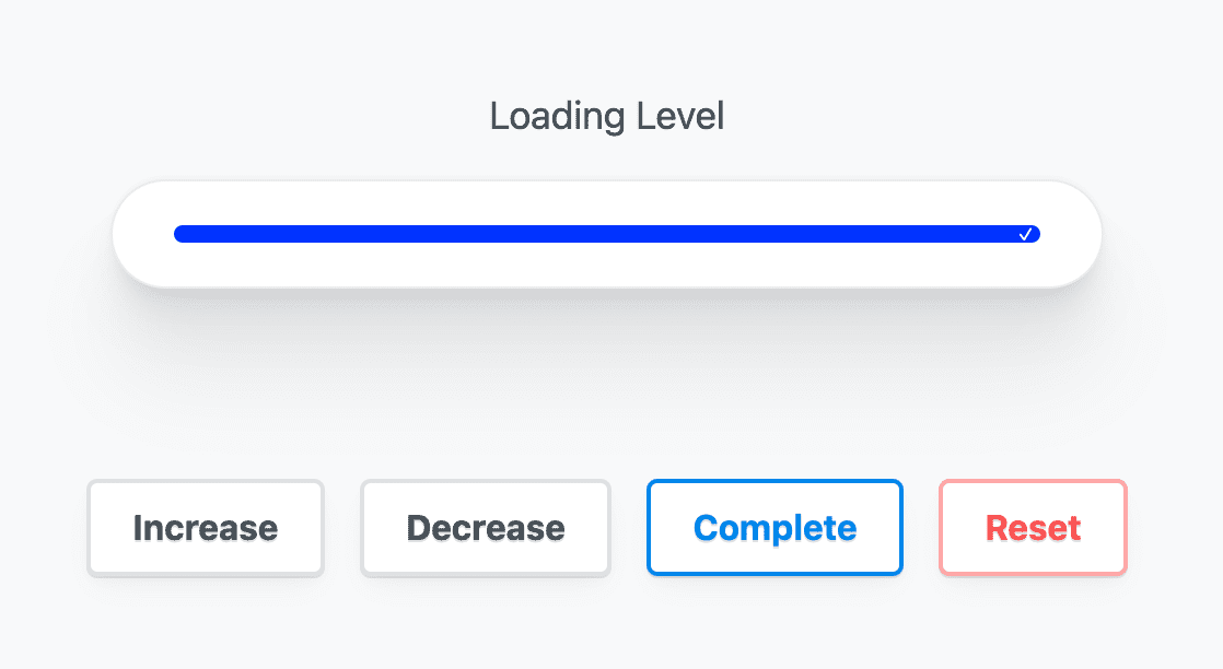
CSS selectors do the tough work here by comparing the maximum with the value, and if they match, then the progress is complete. When complete, a pseudo-element is generated and appended to the end of the progress element, providing a nice additional visual cue to the completion.
progress:not([max])[value="1"]::before,
progress[max="100"][value="100"]::before {
  content: "✓";

  position: absolute;
  inset-block: 0;
  inset-inline: auto 0;
  display: flex;
  align-items: center;
  padding-inline-end: max(calc(var(--_track-size) / 4), 3px);

  color: white;
  font-size: calc(var(--_track-size) / 1.25);
}
Color
The browser brings its own colors for the progress element, and is adaptive to light and dark with just one CSS property. This can be built upon with some special browser-specific selectors.
Light and dark browser styles
To opt your site into a dark and light adaptive <progress> element,
color-scheme is all that is required.
progress {
  color-scheme: light dark;
}
Single property progress filled color
To tint a <progress> element, use accent-color.
progress {
  accent-color: rebeccapurple;
}
Notice the track background color changes from light to dark depending on the
accent-color. The browser is ensuring proper contrast: pretty neat.
Fully custom light and dark colors
Set two custom properties on the <progress> element, one for the track color
and the other for the track progress color. Inside the
prefers-color-scheme
media query, provide new color values for the track and track progress.
progress {
  --_track: hsl(228 100% 90%);
  --_progress: hsl(228 100% 50%);
}

@media (prefers-color-scheme: dark) {
  progress {
    --_track: hsl(228 20% 30%);
    --_progress: hsl(228 100% 75%);
  }
}
Focus styles
Earlier we gave the element a negative tab index so it could be programmatically
focused. Use
:focus-visible to
customize focus to opt into the smarter focus ring style. With this, a mouse
click and focus won't show the focus ring, but keyboard clicks will. The
YouTube video goes into this in more depth and
is worth reviewing.
progress:focus-visible {
  outline-color: var(--_progress);
  outline-offset: 5px;
}

Custom styles across browsers
Customize the styles by selecting the parts of a <progress> element that each
browser exposes. Using the progress element is a single tag, but it's made of a
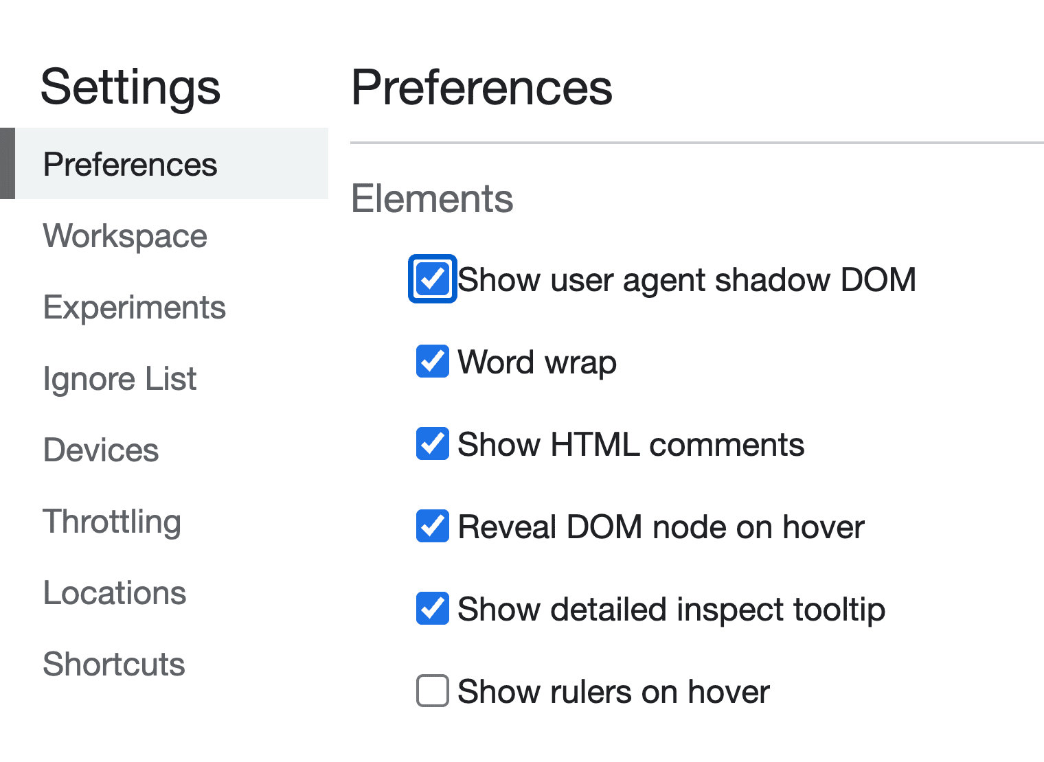
few child elements that are exposed via CSS pseudo selectors. Chrome DevTools
will show these elements to you if you enable the setting:
- Right-click on your page and select Inspect Element to bring up DevTools.
- Click the Settings gear in the top-right corner of the DevTools window.
- Under the Elements heading, find and enable the Show user agent shadow DOM checkbox.
Safari and Chromium styles
WebKit-based browsers such as Safari and Chromium expose
::-webkit-progress-bar and ::-webkit-progress-value, which allow a subset of
CSS to be used. For now, set background-color using the custom properties
created earlier, which adapt to light and dark.
/*  Safari/Chromium  */
progress[value]::-webkit-progress-bar {
  background-color: var(--_track);
}

progress[value]::-webkit-progress-value {
  background-color: var(--_progress);
}

Firefox styles
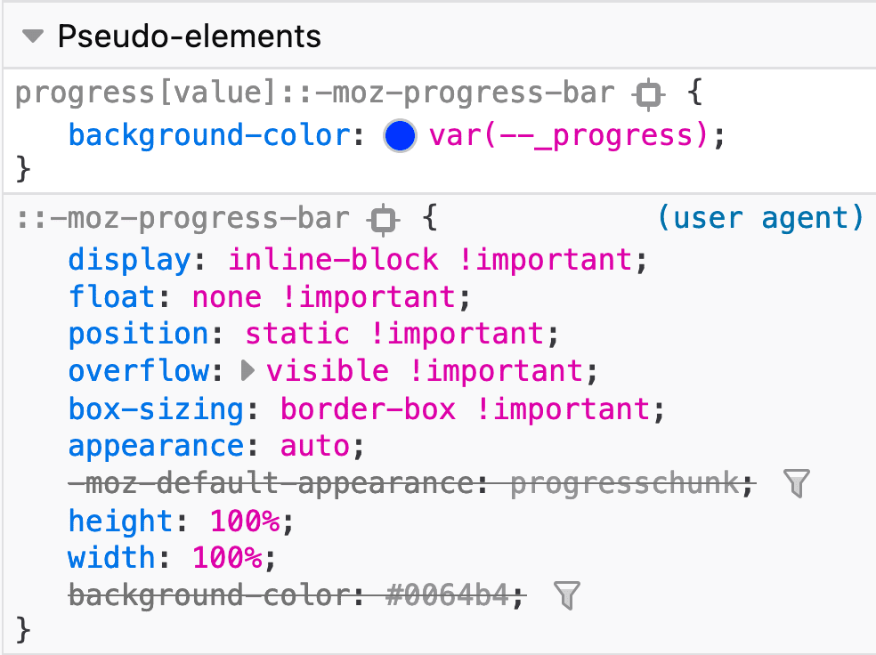
Firefox only exposes the ::-moz-progress-bar pseudo selector on the
<progress> element. This also means we can't tint the track directly.
/*  Firefox  */
progress[value]::-moz-progress-bar {
  background-color: var(--_progress);
}
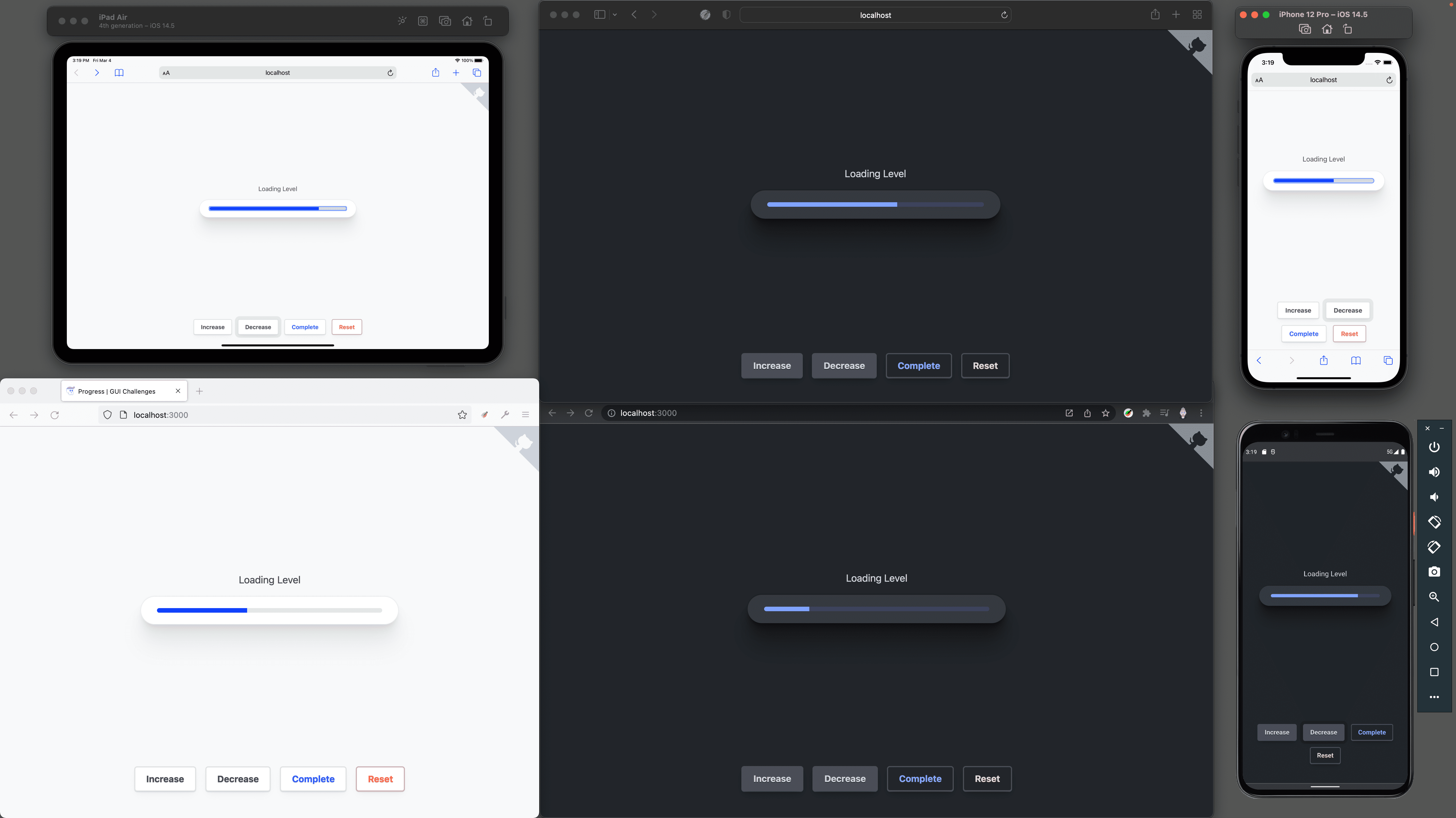
Notice that Firefox has a track color set from accent-color while iOS Safari
has a light blue track. It's the same in dark mode: Firefox has a dark track but
not the custom color we've set, and it works in Webkit-based browsers.
Animation
While working with browser built-in pseudo selectors, it's often with a limited set of permitted CSS properties.
Animating the track filling up
Adding a transition to the
inline-size of
the progress element works for Chromium but not for Safari. Firefox also does
not use a transition property on it's ::-moz-progress-bar.
/*  Chromium Only 😢  */
progress[value]::-webkit-progress-value {
  background-color: var(--_progress);
  transition: inline-size .25s ease-out;
}
Animating the :indeterminate state
Here I get a bit more creative so I can provide an animation. A pseudo-element for Chromium is created and a gradient is applied that is animated back and forth for all three browsers.
The custom properties
Custom properties are great for many things, but one of my favorites is simply
giving a name to an otherwise magical looking CSS value. Following is a fairly
complex
linear-gradient,
but with a nice name. Its purpose and use cases can be clearly understood.
progress {
  --_indeterminate-track: linear-gradient(to right,
    var(--_track) 45%,
    var(--_progress) 0%,
    var(--_progress) 55%,
    var(--_track) 0%
  );
  --_indeterminate-track-size: 225% 100%;
  --_indeterminate-track-animation: progress-loading 2s infinite ease;
}
Custom properties will also help the code stay DRY since once again, we can't group these browser-specific selectors together.
The keyframes
The goal is an infinite animation that goes back and forth. The start and end
keyframes will be set in CSS. Only one keyframe is needed, the middle keyframe
at 50%, to create an animation that returns to where it started from, over and
over again!
@keyframes progress-loading {
  50% {
    background-position: left;
  }
}
Targeting each browser
Not every browser allows the creation of pseudo-elements on the <progress>
element itself or allows animating the progress bar. More browsers support
animating the track than a pseudo-element, so I upgrade from pseudo-elements as
a base and into animating bars.
Chromium pseudo-element
Chromium does allow the pseudo-element: ::after used with a position to cover
the element. The indeterminate custom properties are used, and the back and
forth animation works very well.
progress:indeterminate::after {
  content: "";
  inset: 0;
  position: absolute;
  background: var(--_indeterminate-track);
  background-size: var(--_indeterminate-track-size);
  background-position: right;
  animation: var(--_indeterminate-track-animation);
}
Safari progress bar
For Safari, the custom properties and an animation are applied to the pseudo-element progress bar:
progress:indeterminate::-webkit-progress-bar {
  background: var(--_indeterminate-track);
  background-size: var(--_indeterminate-track-size);
  background-position: right;
  animation: var(--_indeterminate-track-animation);
}
Firefox progress bar
For Firefox, the custom properties and an animation are also applied to the pseudo-element progress bar:
progress:indeterminate::-moz-progress-bar {
  background: var(--_indeterminate-track);
  background-size: var(--_indeterminate-track-size);
  background-position: right;
  animation: var(--_indeterminate-track-animation);
}
JavaScript
JavaScript plays an important role with the <progress> element. It controls
the value sent to the element and ensures enough information is present in the
document for screen readers.
const state = {
  val: null
}
The demo offers buttons for controlling the progress; they update state.val
and then call a function for updating the
DOM.
document.querySelector('#complete').addEventListener('click', e => {
  state.val = 1
  setProgress()
})
setProgress()
This function is where the UI/UX orchestration occurs. Get started by creating a
setProgress() function. No parameters are needed because it has access to the
state object, progress element, and <main> zone.
const setProgress = () => {

}
Setting the loading status on the <main> zone
Depending on whether the progress is complete or not, the related <main>
element needs an update to the
aria-busy
attribute:
const setProgress = () => {
  zone.setAttribute('aria-busy', state.val < 1)
}
Clear attributes if loading amount is unknown
If the value is unknown or unset, null in this usage, remove the value and
aria-valuenow attributes. This will turn the <progress> to indeterminate.
const setProgress = () => {
  zone.setAttribute('aria-busy', state.val < 1)

  if (state.val === null) {
    progress.removeAttribute('aria-valuenow')
    progress.removeAttribute('value')
    progress.focus()
    return
  }
}
Fix JavaScript decimal math issues
Since I chose to stick with the progress default maximum of 1, the demo
increment and decrement functions use decimal math. JavaScript, and other
languages, are not always great at
that.
Here's a roundDecimals() function that will trim the excess off the math
result:
const roundDecimals = (val, places) =>
  +(Math.round(val + "e+" + places)  + "e-" + places)
Round the value so it can be presented and is legible:
const setProgress = () => {
  zone.setAttribute('aria-busy', state.val < 1)

  if (state.val === null) {
    progress.removeAttribute('aria-valuenow')
    progress.removeAttribute('value')
    progress.focus()
    return
  }

  const val = roundDecimals(state.val, 2)
  const valPercent = val * 100 + "%"
}
Set value for screen readers and browser state
The value is used in three locations in the DOM:
- The
<progress>element'svalueattribute. - The
aria-valuenowattribute. - The
<progress>inner text content.
const setProgress = () => {
  zone.setAttribute('aria-busy', state.val < 1)

  if (state.val === null) {
    progress.removeAttribute('aria-valuenow')
    progress.removeAttribute('value')
    progress.focus()
    return
  }

  const val = roundDecimals(state.val, 2)
  const valPercent = val * 100 + "%"

  progress.value = val
  progress.setAttribute('aria-valuenow', valPercent)
  progress.innerText = valPercent
}
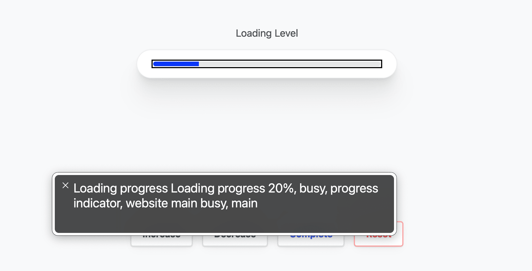
Giving the progress focus
With the values updated, sighted users will see the progress change, but screen
reader users are not yet given the announcement of change. Focus the
<progress> element and the browser will announce the update!
const setProgress = () => {
  zone.setAttribute('aria-busy', state.val < 1)

  if (state.val === null) {
    progress.removeAttribute('aria-valuenow')
    progress.removeAttribute('value')
    progress.focus()
    return
  }

  const val = roundDecimals(state.val, 2)
  const valPercent = val * 100 + "%"

  progress.value = val
  progress.setAttribute('aria-valuenow', valPercent)
  progress.innerText = valPercent

  progress.focus()
}
Conclusion
Now that you know how I did it, how would you‽ 🙂
There are certainly a few changes I'd like to make if given another chance. I think there's room to clean up the current component, and room to try and build one without the <progress> element's pseudo-class style limitations. It's worth exploring!
Let's diversify our approaches and learn all the ways to build on the web.
Create a demo, tweet me links, and I'll add it to the community remixes section below!

