Introduction
Antialiasing is something of an unsung hero in web graphics; it’s the reason we have clear text and smooth vector shapes on our screens. There are actually a couple of approaches to antialiasing used in browsers today which are most obvious when it comes to text rendering. When the algorithm used for antialising switches it can lead to unexpected visual results. In this article we’ll take a look at the approaches to antialiasing and see how the pixels get drawn.
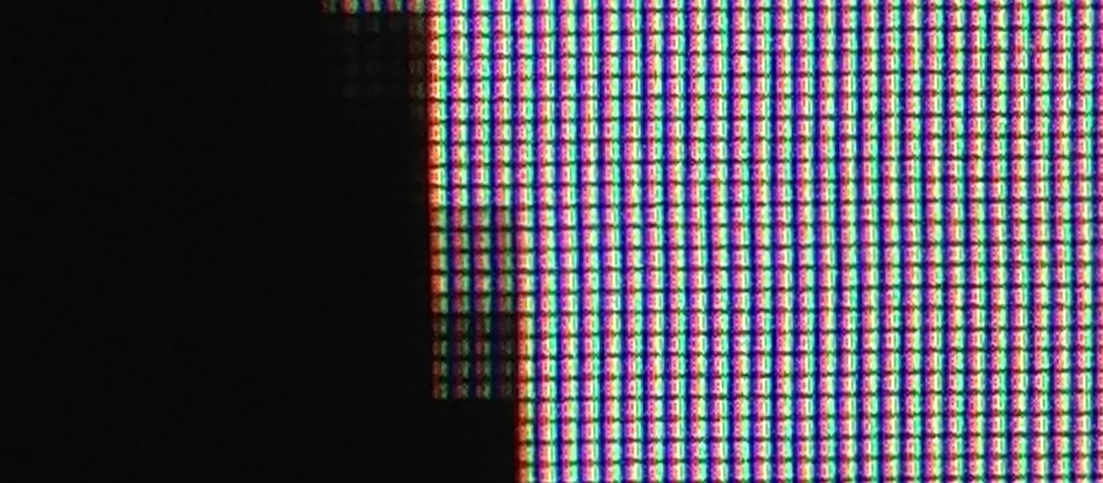
All of our screens are made up, as we all know, of pixels. It’s a giant grid of blocks, and each one contains red, green and blue (RGB) components. At a distance we see images, text and icons, but up close we can actually see the grid of RGB components and how everything is made up.

Antialiasing
So what happens when we’re drawing a vector shape and it passes through “part” of a pixel? Let’s assume that the shape we’re drawing is black and the background is white. Should we color that pixel at all? If we color it, what color should it be? Black, gray, something else?
The process of antialiasing determines which color we should use when we’re filling in pixels. The simplest version of it is called grayscale antialiasing, and it treats the three components of the pixels equally. So if the pixel is half covered - and let's assume black text on white for a second to keep it simple - you'd think each component will be set to half brightness (I know I certainly did), but actually it's more complex than that: you have to account for gamma, which means you'll likely never set it to that exact value. That of course makes things a little trickier, but since this is an introduction to the topic I won't dive into that here. The important thing to know is that grayscale antialiasing is dealt with at the pixel level and we can, in fact, do much better.

In Figure 2 you can see the same triangle being drawn, but on the left it has antialiasing enabled and on the right it’s been disabled. As you can see, when antialiasing is enabled the pixels are shades of gray when the triangle only passes through part of the pixel. When disabled, however, the pixel is filled in as either solid black or solid white and the shape looks jagged.
Text Rendering
Whenever a browser is rendering text, which is essentially a vector shape, we will come up against the same problem: the characters of text will only partially fill some pixels so we will want to have a strategy for how to fill in those pixels. Ideally we want the text to be antialiased as it will make it easier and more pleasant to read.
It turns out, however, that the grayscale approach to antialiasing is only one way to handle it. An approach that is often taken is to be a bit more selective with how we enable the RGB components of the pixels. The process is called subpixel antialiasing and over the years the ClearType team at Microsoft in particular have invested a great deal of time and effort to make progress on it. It’s now much more widely used, and all the major browsers use it to a greater or lesser degree.
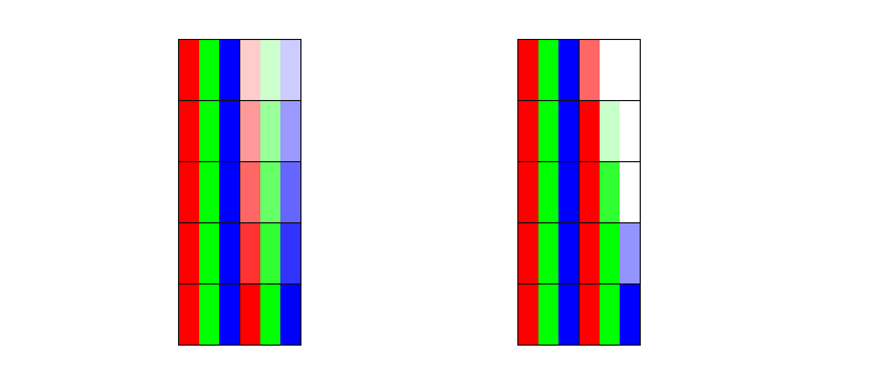
Firstly, since we know that each pixel is in fact made up of separate red, green and blue components we detect how much of each of those components should be “switched on” for the pixel in question. So if a pixel is “half covered” from the left hand side then we might switch on the red component totally, the green component to half way, and keep the blue switched off. This process is often described as “tripling the horizontal resolution of the screen”, and relies on the fact that each pixel is really the three separate components side by side rather than a single unit.

In figure 3 above you can see that on the left we treat each component equally and each is turned on or off equally (grayscale). On the right hand side, however, we use the subpixel approach, enabling each component (red, green and blue) differently depending on how much it overlaps with the shape being drawn.
With all that said, however, human vision doesn’t actually weigh red, green and blue light equally. We are far more sensitive to green than either red or blue, and this means that while there is definite benefit over grayscale antialiasing, as Darel Rex Finley notes, enabling each component separately is not actually going to yield a 3x improvement in clarity. Subpixel antialiasing is definitely helpful, though, and it does mean that we see text more clearly than if grayscale antialiasing is used.

Cutting to the chase
What does all this mean for us as developers? Well, from a Chrome perspective at least there is a mix of both grayscale and subpixel antialiasing used to render text, and which one you get depends on a few criteria. To begin with, however, we need to understand a little about layers, since that’s the main criterion at play. If you’ve not come across layers and how they are used internally by Chrome, Tom Wiltzius has written a fantastic introduction to the topic that you should read first.
Assuming you’re familiar with layers, or you’ve just read about them, let’s continue on. If hardware compositing is enabled for the page, and you have text content on a layer that isn’t the root layer it will, by default, be rendered using grayscale antialiasing. Developers often notice that if they apply hacks to elements to get them into their own (non-root) layers (such as using translateZ) that they see text being rendered differently. Often times developers apply “new layer” triggers on the fly through JavaScript or CSS causing the text rendering to switch from subpixel to grayscale; it can be confusing if you don’t know what triggered the rendering change. If your text resides in the root layer, however, it should be rendered with subpixel antialiasing, and consequently it will be much clearer to read.
But, like all things web, it’s changing. Subpixel antialiasing is being enabled in Chrome for text in non-root layers, provided the layer satisfies three criteria. It’s worth saying that these criteria apply today, but it’s likely they will change and you should expect to see more cases covered over time. Today those criteria are:
- The layer has a fully opaque background color. Notably using
border-radiusor a non-defaultbackground-clipvalue results in the layer being treated as non-opaque and text rendering reverts to grayscale antialiasing. - The layer can only have either identity transform or integral translation applied to it. By integral we mean rounded values. So for example
translate(20.2px, 30px)would result in grayscale antialiasing since the x component,20.2px, is non-integral. The identity transform simply means that there is no additional rotation, translation, or scaling applied beyond its default. - The layer has an opacity of 1.0. Any change in opacity will change the antialiasing from subpixel to grayscale.

One final thing of note is that applying a CSS animation may cause a new layer to be created, whereas using requestAnimationFrame does not. For some developers the text rendering differences that implies has precluded the use of CSS animations. So if you’ve been using JavaScript to animate elements because of text rendering differences, check to see if this update fixes things for you!
So that’s Chrome covered. As far as other browsers go, Opera, as it moves to Chromium, should match Chrome’s behaviours closely. Internet Explorer seems to use subpixel antialiasing for virtually all text (if you’ve enabled ClearType, of course!), although seemingly not in Windows 8’s Metro mode. Safari, given WebKit’s proximity to Blink, behaves very similarly to Chrome, albeit without these newer improvements that allow for more subpixel antialiasing. Firefox largely behaves in the same way as Internet Explorer insofar as it uses subpixel antialiasing for virtually all text. Of course this isn’t an exhaustive list, and there are likely to be cases in all browsers where grayscale antialiasing is used instead of subpixel, but it’s good to know that subpixel antialiasing is widely used across the main set of browsers.
Conclusion
So now you know a little about how antialiasing works, and why you might see text rendering differences in your sites and applications today, especially on lower DPI devices. If you’re interested in following along with Chrome’s implementation with respect to text rendering you should star the following bugs:
- Automatic Font Grayscale Anti-Aliasing above 48px not Overridable
- Horrible font rendering with Google Web Fonts on Chrome for Windows)
- DirectWrite support
