Optimizing CLS by 0.2 led to a 15% increase in page views per session, 13% longer session durations, and a 1.72 percentage point decrease in bounce rate.
Yahoo! JAPAN is one of the largest media companies in Japan, providing over 79 billion page views per month. Their news platform, Yahoo! JAPAN News has more than 22 billion page views per month and an engineering team dedicated to improving the user experience.
By continuously monitoring Core Web Vitals, they correlated the site's improved Cumulative Layout Shift (CLS) score with a 15% increase in page views per session and 13% increase in session duration.
0.2
CLS improvement
15.1%
More page views per session
13.3%
Longer session duration
Page content moving around unexpectedly often causes accidental clicks, disorientation on the page, and ultimately user frustration. Frustrated users tend not to stick around for long. To keep users happy, the page layout should stay stable through the entire lifecycle of the user journey. For Yahoo! JAPAN News this improvement had a significant positive impact on business critical engagement metrics.
For technical details on how they improved the CLS, read the Yahoo! JAPAN News engineering team's post.
Identifying the issue
Monitoring Core Web Vitals, including CLS, is crucial in catching issues and identifying where they're coming from. At Yahoo! JAPAN News, Search Console provided a great overview of groups of pages with performance issues and Lighthouse helped identify per-page opportunities to improve page experience. Using these tools, they discovered that the article detail page had poor CLS.
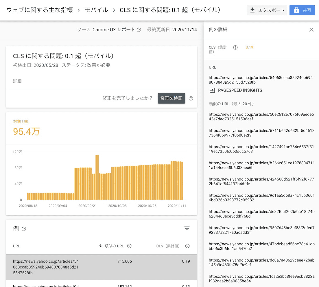

It's important to keep in mind the cumulative part of the Cumulative Layout Shift—the score is captured through the entire page lifecycle. In the real-world, the score can include shifts that happen as a result of user interactions such as scrolling a page or tapping a button. To collect CLS scores from the field data, the team integrated web-vitals JavaScript library reporting.
The team used Chrome DevTools to identify which elements were making layout shifts on the page. Layout Shift Regions in DevTools visualizes elements that contribute to CLS by highlighting them with a blue rectangle whenever a layout shift happens.

They figured out that a layout shift occurred after the hero image at the top of the article was loaded for the first view.
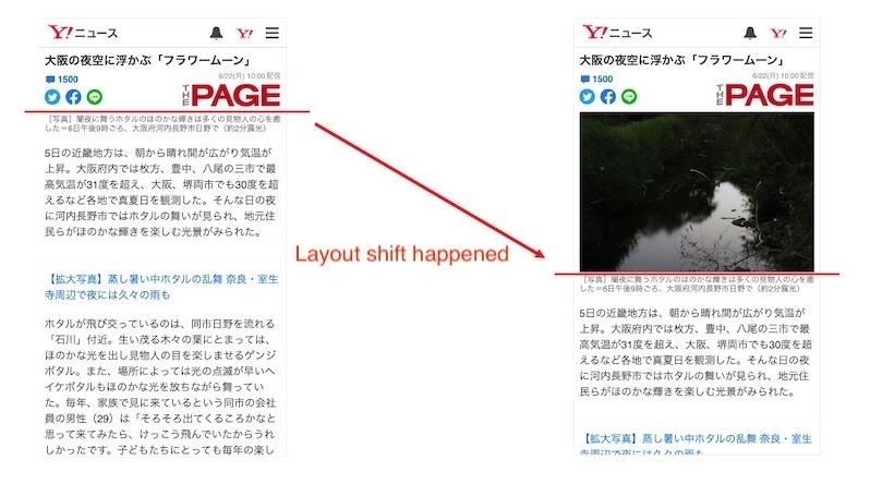
In the example above, when the image finishes loading, the text gets pushed down (the position change is indicated with the red line).
Improving CLS for images
For fixed-size images, layout shifts can be prevented by specifying the width
and height attributes in the img element and using the CSS
aspect-ratio
property available in modern browsers. However, Yahoo! JAPAN News needed to
support not only modern browsers, but also browsers installed in relatively old
operating systems such as iOS 9.
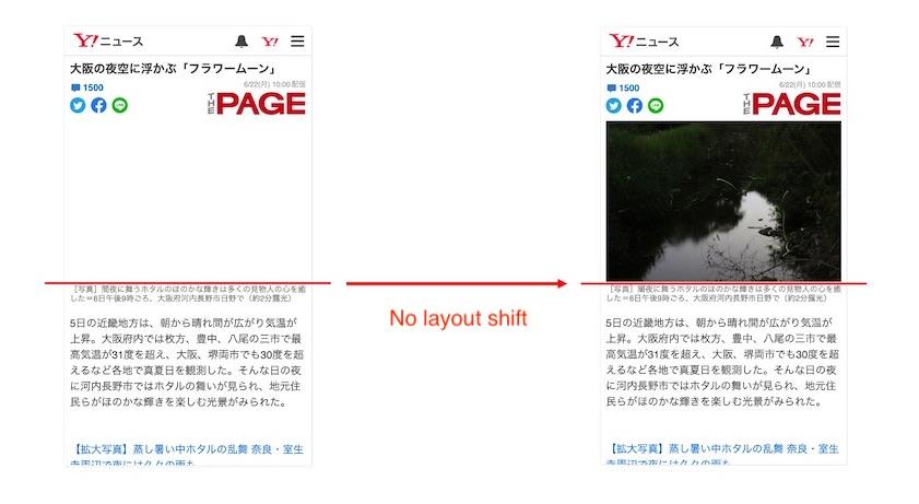
They used Aspect Ratio Boxes—a method which uses markup to reserve the space on the page before the image is loaded. This method requires knowing the aspect ratio of the image in advance, which they were able to get from the backend API.
Results
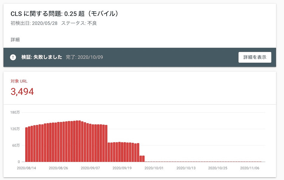
The number of URLs with poor performance in Search Console decreased by 98% and CLS in lab data decreased from about 0.2 to 0. More importantly, there were several correlated improvements in business metrics.
When Yahoo! JAPAN News compared user engagement metrics before and after CLS optimization, they saw multiple improvements:
15.1%
More page views per session
13.3%
Longer session duration
1.72%*
Lower bounce rate (*percentage points)
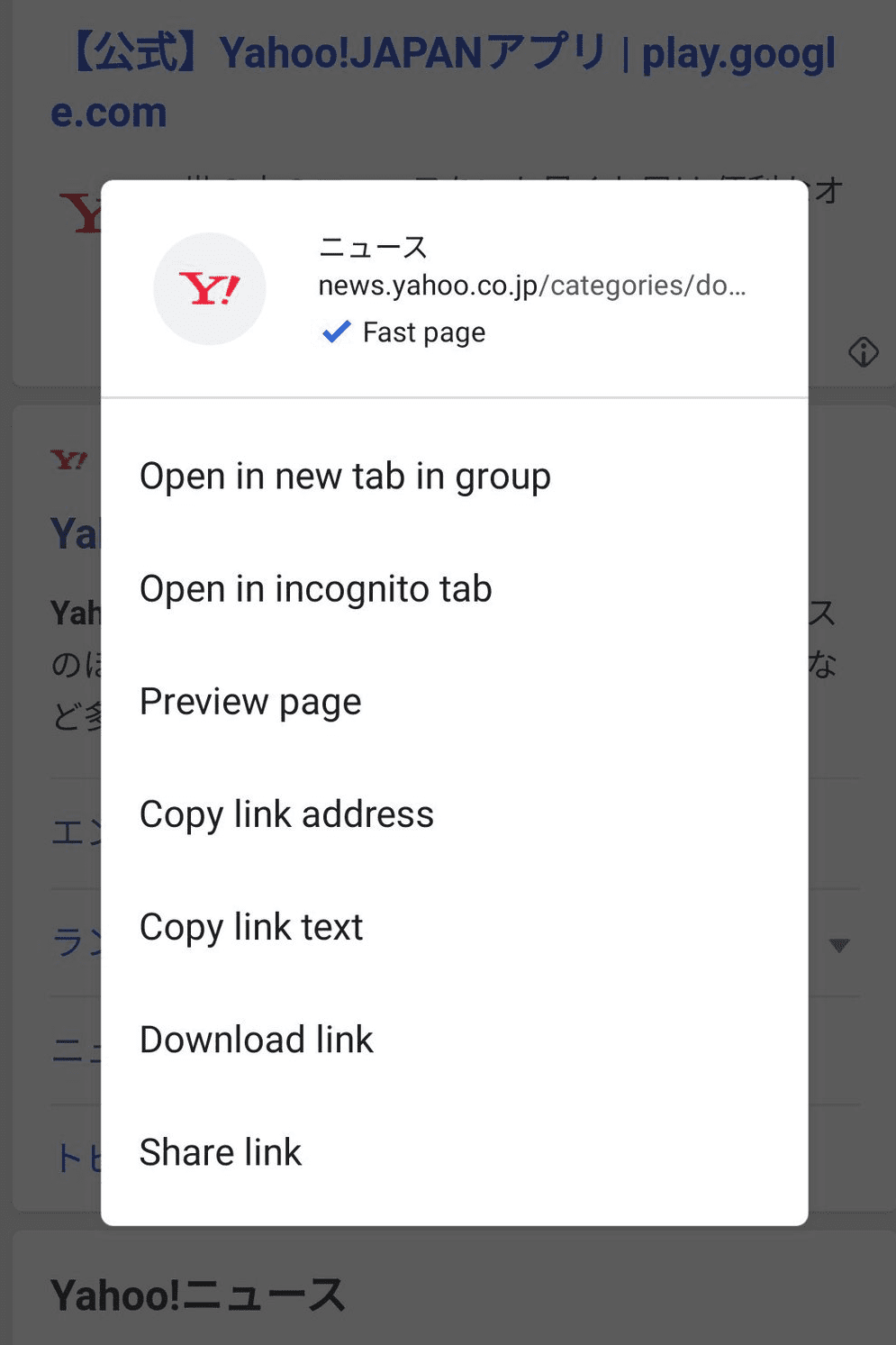
By improving CLS and other Core Web Vitals metrics, Yahoo! JAPAN News also got the "Fast page" label in the context menu of Chrome Android.
Layout shifts are frustrating and discourage users from reading more pages, but that can be improved by using the appropriate tools, identifying issues, and applying best practices. Improving CLS is a chance to improve your business.
For more information, read the Yahoo! JAPAN engineering team's post.


