The CSS gap property is here for Chromium's CSS Flexbox and Multi-Column layout engines.
CSS Gap
gap is flow relative, meaning it changes
dynamically based on the direction of content flow. For example, gap will automatically
adjust for the different writing-mode or direction values that you set for your
international users. This significantly eases the burden of spacing challenges for
the component and CSS author. Less code scaling further.
Browser compatibility
Usage
gap accepts any CSS length
or percentage as a value.
.gap-example {
  display: grid;
  gap: 10px;
  gap: 2ch;
  gap: 5%;
  gap: 1em;
  gap: 3vmax;
}
Gap can be passed 1 length, which will be used for both row and column.
.grid {
  display: grid;
  gap: 10px;
}
.grid {
  display: grid;
  row-gap: 10px;
  column-gap: 10px;
}
Gap can be passed 2 lengths, which will be used for row and column.
.grid {
  display: grid;
  gap: 10px 5%;
}
.grid {
  display: grid;
  row-gap: 10px;
  column-gap: 5%;
}
Flexbox gap
Before gap was in Flexbox, strategies involved negative margins, complex selectors,
:last or :first type pseudo-class selectors, or other means to manage the space
of a dynamically layed-out and wrapping set of children.
Previous Attempts
The following are patterns that folks have used to get gap-like spacing.
.layout > :not(:last-child) {
  margin-bottom: 10px;
  margin-right: 10px;
}
The above are not a full replacement for gap though, and often need @media
or :lang() adjustments to account for wrapping scenarios, writing modes or direction.
Adding one or two media queries doesn't seem so bad, but they can add up and
lead to complicated layout logic.
What the above author really intended was to have none of the child items touch.
The Antidote: gap
.layout {
  display: flex;
  gap: 10px;
}
In the first 2 examples (without Flexbox gap), the children are targeted and
assigned spacing from other elements. In the antidote gap example, the container
owns the spacing. Each child can relieve itself of the burden, while also
centralizing the spacing ownership. Simplifying consistency. Reorder,
change viewports, remove elements, append new elements, etc. and spacing remains
consistent. No new selectors, no new media queries, just space.
Chromium DevTools updates
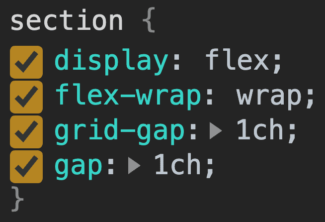
With these updates come changes to Chromium DevTools, notice how the Styles
pane handles grid-gap and gap now 👍

grid-gap and gap, with gap shown used below grid-gap as to let the cascade use the latest syntax.DevTools supports both grid-gap and gap, this is because gap is essentially
an alias to the previous syntaxes.
New layout potential
With Flexbox gap, we unlock more than convenience. We unlock powerful, perfectly
spaced, intrinsic layouts. In the video and following code sample below, Grid
cannot achieve the layout that Flexbox can. Grid must have equal rows and columns,
even if they're intrinsically assigned.
Also, notice how dynamic the spacing between children is when they wrap intrinsically
like that. Media queries can't detect wrapping like that to make intelligent adjustments.
Flexbox gap can, and will, do it for you across all internationalizations.
Multi-column gap
In addition to Flexbox supporting the gap syntax, multi-column layouts also support
the shorter gap syntax.
article {
  column-width: 40ch;
  column-gap: 5ch;
  gap: 5ch;
}
Pretty rad.


