Google is working with other browser vendors and industry partners to fix the top five browser compatibility pain points for web developers: CSS flexbox, CSS Grid, position: sticky, aspect-ratio, and CSS transforms.
Google is working with other browser vendors and industry partners to fix the
top five browser compatibility pain points for web developers. The areas of focus
are CSS flexbox, CSS Grid, position: sticky, aspect-ratio, and CSS
transforms. Check out How you can contribute and follow along to
learn how to get involved.
Background
Compatibility on the web has always been a big challenge for developers. In the last couple of years, Google and other partners, including Mozilla and Microsoft, have set out to learn more about the top pain points for web developers, to drive our work and prioritization to make the situation better. This project is connected to Google's Developer Satisfaction (DevSAT) work, and it started on a larger scale with the creation of the MDN DNA (Developer Needs Assessment) surveys in 2019 and 2020, and a deep-dive research effort presented in the MDN Browser Compatibility Report 2020. Additional research has been done in various channels, such as the State of CSS and State of JS surveys.
The goal in 2021 is to eliminate browser compatibility problems in five key focus areas so developers can confidently build on them as reliable foundations. This effort is called #Compat 2021.
Choosing what to focus on
While there are browser compatibility issues in basically all of the web platform, the focus of this project is on a small number of the most problematic areas which can be made significantly better, thus removing them as top issues for developers.
The compatibility project uses multiple criteria influencing which areas to prioritize, and some are:
- Feature usage. For example, flexbox is used in 75% of all page views, and adoption is growing strongly in HTTP Archive.
- Number of bugs (in Chromium, Gecko, WebKit), and for Chromium, how many stars those bugs have.
Survey results:
- MDN DNA surveys
- MDN Browser Compatibility Report
- State of CSS most known and used features
Test results from web-platform-tests. For example, flexbox on wpt.fyi.
Can I use's most-searched-for features.
The five top focus areas in 2021
In 2020, Chromium started work addressing the top areas outlined in Improving Chromium's browser compatibility in 2020. In 2021, we are beginning a dedicated effort to go even further. Google and Microsoft are working together on addressing top issues in Chromium, along with Igalia. Igalia, who are regular contributors to Chromium and WebKit, and maintainers of the official WebKit port for embedded devices, have been very supportive and engaged in these compatibility efforts, and will be helping tackle and track the identified issues.
Here are the areas which are committed to being fixed in 2021.
CSS flexbox
CSS flexbox
is
widely used
on the web and there are still some major challenges for developers. For example,
both Chromium and
WebKit
have had issues with auto-height flex containers leading to incorrectly sized images.


Photo by Alireza Mahmoudi.
Igalia's flexbox Cats blog post dives deeper into these issues with many more examples.
Why it is prioritized
- Surveys: Top issue in MDN Browser Compatibility Report, most known and used in State of CSS
- Tests: 85% pass in all browsers
- Usage: 75% of page views, growing strongly in HTTP Archive
CSS Grid
CSS Grid is a core building block for modern web layouts, replacing many older techniques and workarounds. As adoption is growing, it needs to be rock solid, so that differences between browsers is never a reason to avoid it. One area that's lacking is the ability to animate grid layouts, supported in Gecko but not Chromium or WebKit. When supported, effects like this are made possible:
Why it is prioritized
- Surveys: Runner-up in MDN Browser Compatibility Report, well known but less often used in State of CSS
- Tests: 75% pass in all browsers
- Usage: 8% and growing steady, slight growth in HTTP Archive
CSS position: sticky
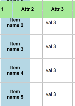
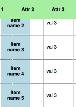
Sticky positioning allows content to stick to the edge of the viewport and is commonly used for headers that are always visible at the top of the viewport. While supported in all browsers, there are common use cases where it doesn't work as intended. For example, sticky table headers aren't supported in Chromium, and although now supported behind a flag, the results are inconsistent across browsers:


Check out the sticky table headers demo by Rob Flack.
Why it is prioritized
- Surveys: Highly known/used in State of CSS and was brought up multiple times in MDN Browser Compatibility Report
- Tests: 66% pass in all browsers
- Usage: 8%
CSS aspect-ratio property
The new
aspect-ratio
CSS property makes it easy to maintain a consistent width-to-height ratio for
elements, removing the need for the well-known
padding-top hack:
.container {
  width: 100%;
  padding-top: 56.25%;
}
.container {
  width: 100%;
  aspect-ratio: 16 / 9;
}
Because it is such a common use case this is expected to become widely used, and we want to make sure it's solid in all common scenarios and across browsers.
Why it is prioritized
- Surveys: Already well known but not yet widely used in State of CSS
- Tests: 27% pass in all browsers
- Usage: 3% and expected to grow
CSS transforms
CSS transforms have been supported in all browsers for many years and are widely used on the web. However, there still remain many areas where they don't work the same across browsers, notably with animations and 3D transforms. For example, a card flip effect can be very inconsistent across browsers:
Why it is prioritized
- Surveys: Very well known and used in State of CSS
- Tests: 55% pass in all browsers
- Usage: 80%
How you can contribute and follow along
Follow and share any updates we post on @ChromiumDev or the public mailing list, Compat 2021. Make sure bugs exist, or file them for issues you have been experiencing, and if there's anything missing, reach out through the above channels.
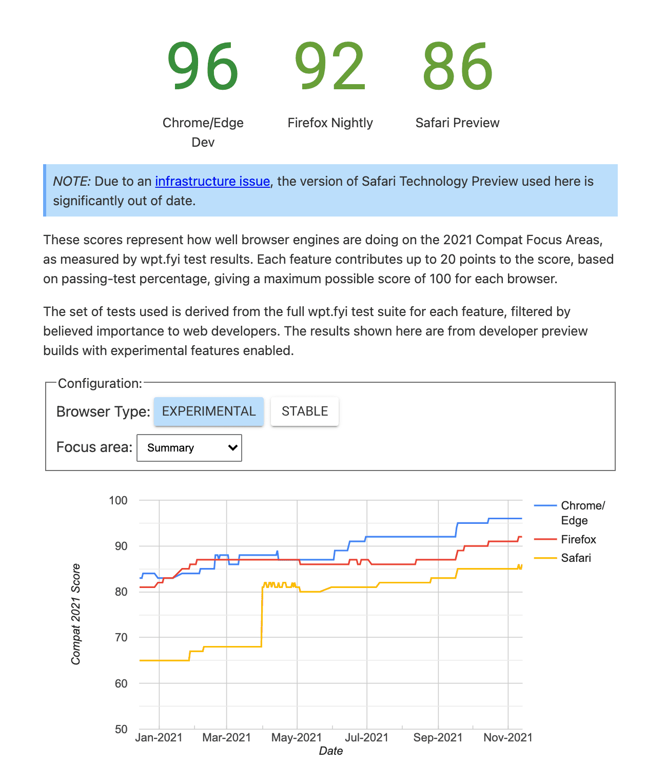
There will be regular updates about the progress here on web.dev and you can also follow the progress for each focus area in the Compat 2021 Dashboard.

We hope this concerted effort among browser vendors to improve reliability and interoperability will help you go build amazing things on the web!


