Baseline is coming to caniuse.com! In this post, learn about the integration and discover some of the features that became part of Baseline in 2023.
With the new definition of Baseline, there are two stages in a feature's lifecycle: when it becomes newly available, and then when it becomes widely available after 30 months. A feature becomes part of Baseline Newly available when it becomes interoperable in the following browsers:
- Safari (macOS and iOS)
- Firefox (desktop and Android)
- Chrome (desktop and Android)
- Edge (desktop)
Baseline lands on Can I Use
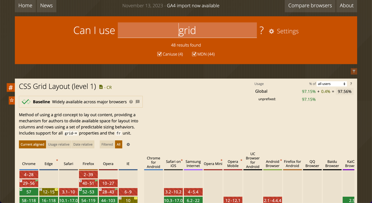
As the next step in clarifying feature availability, Baseline is beginning to land on Can I Use from today. When visiting some pages on Can I Use, you'll see a badge telling you whether the feature is in Baseline Widely available.

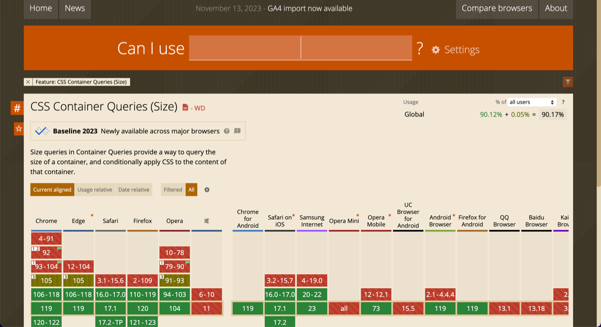
Features that are in Baseline Newly available will also show a badge, along with the year that they became available. Anything that became interoperable across the core browser set this year is part of Baseline 2023.

In the rest of this post, find out about the features that hit this milestone during 2023. All of these features are Baseline 2023—newly available.
Size container queries and container query units
Size container queries let you query the size of an element, in much the same way that media queries let you query the size of the viewport. They make creating reusable components much easier by letting you create components that react to the size of the area they're placed in.
The design of the following card changes depending on the width of the component. Learn more in Container queries land in stable browsers.
New color spaces and functions
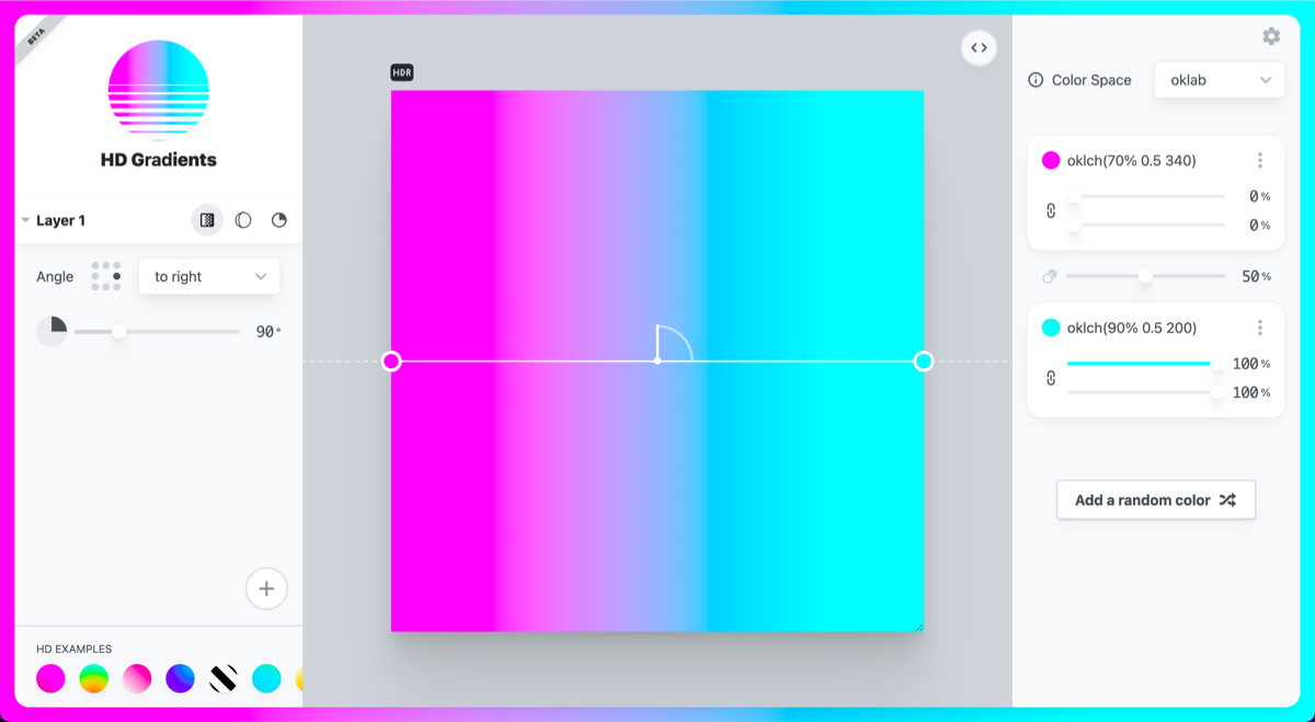
CSS now supports color spaces that let you access colors outside the sRGB gamut. This means you can support HD (high definition) displays using colors from HD gamuts.
New color models
Now in Baseline, the color functions lch(), lab(), oklch(), and oklab()
give access to the LCH, Lab, OKLCH, and OKLab color models.

The color-mix() function
In addition, new color functions have become part of Baseline. The color-mix()
function enables mixing of one color into another, in any of the color spaces.
In the following CSS, 25% of blue is mixed into white, in the srgb color space.
.example {
  background-color: color-mix(in srgb, blue 25%, white);
}
The color() function
The color()
function can be used for any color space that specifies colors with R, G and B
channels. color() takes a color space parameter first, then a series of
channel values for RGB and optionally some alpha. You can use any of: srgb,
srgb-linear, display-p3, a98-rgb, prophoto-rgb, rec2020, xyz,
xyz-d50, and xyz-d65. For example:
.valid-css-color-function-colors {
  --srgb: color(srgb 1 1 1);
  --srgb-linear: color(srgb-linear 100% 100% 100% / 50%);
  --display-p3: color(display-p3 1 1 1);
  --rec2020: color(rec2020 0 0 0);
  --a98-rgb: color(a98-rgb 1 1 1 / 25%);
  --prophoto: color(prophoto-rgb 0% 0% 0%);
  --xyz: color(xyz 1 1 1);
}
The CSS high definition color guide gives you many more examples of the new color spaces and functions, along with information about which to use when.
Compression streams
The Compression Streams API is a JavaScript API for compressing and decompressing streams of data. Apps using this built-in compression no longer need to include a compression library.
Learn more in Compression streams are now supported in all browsers.
Offscreen canvas
Before OffscreenCanvas, canvas drawing capabilities were tied to the <canvas>
element, which meant it directly depended on the DOM. OffscreenCanvas decouples
the DOM from the Canvas API by moving the canvas off-screen.
Thanks to this decoupling, rendering of OffscreenCanvas is fully detached from the DOM, so it offers some speed improvements over the regular canvas because there's no synchronization between the two. It can also be used to move rendering work to a Web Worker, even though there's no DOM available, freeing the main thread and making the application more responsive.
Learn more in OffscreenCanvas—speed up your canvas operations with a web worker
Module preload
Preloading modules can reduce download and processing time. Add
rel="modulepreload"
to the link element referencing a JavaScript module, and the browser gets the
module, parses and compiles it, and puts the results into the module map ready
to execute.
Learn more in Preload modules.
Trigonometric functions in CSS
In 2023 trigonometric functions from the CSS Values and Units Level 4
specification became interoperable. This means the functions sin(), cos(),
tan(), asin(), acos(), atan(), and atan2() are part of Baseline 2023.
Learn to use these functions and discover some use cases in Trigonometric functions in CSS.
The inert attribute
When you mark a DOM element as inert, you remove movement or interaction from
it. The inert attribute causes the browser to ignore the element:
- The
clickevent doesn't fire if a user clicks the element. - The element won't gain focus.
- The element and its content are excluded from the accessibility tree.
Add this attribute to elements that are offscreen or otherwise hidden. For more
information, see The inert attribute.
Subgrid in CSS grid layout
The subgrid value for grid-template-columns and grid-template-rows lets
you use the tracks defined on a parent grid, on nested grids. This means you can
align elements in separate nested grids with each other.
In CSS subgrid, you'll find some examples and links to many other posts and examples highlighting subgrid use cases.
NumberFormat V3
Intl.NumberFormat V3 is a set of new features for Intl.NumberFormat that became part of Baseline during 2023. The additional features are:
- Three new functions to format ranges of numbers:
formatRange,formatRangeToParts, andselectRange - Grouping enum
- New rounding and precision options
- Rounding priority
- Interpret strings as decimals
- Rounding modes
- Sign display negative
The proposal for NumberFormat V3 details each of these new features.
The Fullscreen API
The Fullscreen API lets you place an element such as a <video> into fullscreen
mode by calling the requestFullscreen() method. It also provides methods for
detecting whether an element is in fullscreen mode, and whether the document is
in a state that lets you request fullscreen mode.
Learn more in this Guide to the Fullscreen API on MDN.
The CSS :has() selector
Just making Baseline 2023 is the :has() selector, which will land in Firefox
121 on the 19th of December. Among other uses, this selector acts as a
parent selector, letting you select an element based on things that are inside
it. For example, you can apply different CSS depending on whether or not there's
an image inside an element.
Find out more in :has(): the family selector.
More features that joined Baseline this year
Other features that became part of Baseline this year include the following:
- Constructable Stylesheets
- Complex nth-child selectors in CSS
- The range syntax for media queries
- Import Maps
- Multiple values for CSS display
- @counter-style
- The
counter-setCSS property - The
linear()easing function - Origin Private File System (OPFS)
- CSS Nesting, including the change that adds relaxed parsing.
- CSS
:dir()pseudo-class selector - CSS
caplength unit - CSS masking
- Media query support for HTML video
<source>elements - The HTML
<search>element - Lazy loading of
<iframe>elements (landing in Firefox 121 on December 19th) - The
lhandrlhCSS line-height units
Many of these features reached interoperability through the collaborative work on Interop 2023. It's exciting to see how features can be brought through that process and land as Baseline Newly available, which sets off the timer for them to become widely available. This creates a clearer path for decisions on when to adopt features in your own projects.

