This tutorial describes how to build an accessible main navigation of a website. You learn about semantic HTML, accessibility, and how using ARIA attributes can sometimes do more harm than good.
There are many different ways of building the main navigation of a website, in terms of styling, functionality, and the underlying markup and semantic information. If the implementation is too minimalist, it works for most people, but the user experience (UX) might not be great. If it's over-engineered, it might confuse users or even hinder them from being able to access it at all.
For most websites, you want to build something that's neither too simple, nor too complicated.
Building layer by layer
In this tutorial you start with a basic setup and add features layer by layer up to a point where you provide just enough information, styling, and functionality to please most users. To achieve that you make use of the progressive enhancement principle, which states that you start with the most fundamental and robust solution and progressively add layers of functionality. If one layer fails to work for some reason, the navigation will still work because it gracefully falls back to the underlying layer.
Basic structure
For a basic navigation you need two things: <a> elements and a few lines of CSS to improve the default styling and layout of your links.
<a href="/home">Home</a>
<a href="/about-us">About us</a>
<a href="/pricing">Pricing</a>
<a href="/contact">Contact</a>
/* Define variables for your colors */
:root {
  --color-shades-dark: rgb(25, 25, 25);
}

/* Use the alternative box model
Details: <https://web.dev/learn/css/box-model/> */
*{
  box-sizing: border-box;
}

/* Basic font styling */
body {
  font-family: Segoe UI, system-ui, -apple-system, sans-serif;
  font-size: 1.6rem;
}

/* Link styling */
a {
  --text-color: var(--color-shades-dark);
  border-block-end: 3px solid var(--border-color, transparent);
  color: var(--text-color);
  display: inline-block;
  margin-block-end: 0.5rem; /* See note at the bottom of this chapter */
  margin-inline-end: 0.5rem;
  padding: 0.1rem;
  text-decoration: none;
}

/* Change the border-color on :hover and :focus */
a:where(:hover, :focus) {
  --border-color: var(--text-color);
}
This works well for most users, no matter how they're accessing the site. The navigation is accessible with a mouse, a keyboard, a touch device, or a screen reader, but there's room for improvement. You can enhance the experience by extending this basic pattern with additional functionality and information.
Here's what you can do:
- Highlight the active page.
- Announce the number of items to screen reader users.
- Add a landmark and allow screen reader users to access the navigation directly using a shortcut.
- Hide the navigation on narrow viewports.
- Improve focus styling.
Highlight the active page
To highlight the active page, you can add a class to the corresponding link.
<a href="/about-us" class="active-page">About us</a>
The issue with this approach is that it conveys the information which link is active purely visually. A blind screen reader user couldn't tell the difference between the active page and other pages. Fortunately, the Accessible Rich Internet Applications (ARIA) standard offers a way to communicate this information semantically, as well. Use the aria-current="page" attribute and value instead of a class.
aria-current (state) indicates the element that represents the current item within a container or set of related elements.
A page token used to indicate a link within a set of pagination links, where the link is visually styled to represent the currently-displayed page.
[Accessible Rich Internet Applications (WAI-ARIA) 1.1](https://www.w3.org/TR/wai-aria/#aria-current)
With the additional attribute, a screen reader now announces something like "current page, link, About Us" instead of just "link, About Us".
<a href="/about-us" aria-current="page" class="active-page">About us</a>
A convenient side effect is that you can use the attribute to select the active link in CSS, making the active-page class obsolete.
<a href="/home">Home</a>
<a href="/about-us" aria-current="page">About us</a>
<a href="/pricing">Pricing</a>
<a href="/contact">Contact</a>
/* Change border-color and color for the active page */
[aria-current="page"] {
  --border-color: var(--color-highlight);
  --text-color: var(--color-highlight);
}
Announce the number of items
By looking at the navigation, sighted users can tell that it only contains four links. A blind screen reader user can't obtain this information as quickly. They may have to work their way through the whole list of links. This might not be an issue if the list is short like in this example, but if it contains 40 links this task can be cumbersome. If a screen reader user knows upfront that the navigation contains a lot of links, they might decide to use a different, more efficient way of navigation, like the site search.
A nice way of communicating the number of items upfront, is wrapping each link in a list item (<li>), nested in an unordered list (<ul>).
<ul>
  <li>
     <a href="/home">Home</a>
  </li>
  <li>
    <a href="/about-us" aria-current="page">About us</a>
  </li>
  <li>
    <a href="/pricing">Pricing</a>
  </li>
  <li>
    <a href="/contact">Contact</a>
  </li>
</ul>
When a screen reader user finds the list, their software will announce something like "list, 4 items".
Here's a demo of the navigation used with the screen reader NVDA on Windows.
Now you have to adapt the styling to make it look like before.
/* Remove the default list styling and create a flexible layout for the list */
ul {
  display: flex;
  flex-wrap: wrap;
  gap: 1rem;
  list-style: none;
  margin: 0;
  padding: 0;
}

/* Basic link styling */
a {
  --text-color: var(--color-shades-dark);

  border-block-end: 3px solid var(--border-color, transparent);
  color: var(--text-color);
  padding: 0.1rem;
  text-decoration: none;
}
Using lists can have many advantages for screen reader users:
- They can get the total number of items before they interact with the items.
- They may use shortcuts to jump from list item to list item.
- They may use shortcuts to jump from list to list.
- The screen reader may announce the index of the current item (for example, "list item, two of four").
On top of that, if the page is presented without CSS, the list shows the links as a coherent group of items instead of just a pile of links.
A notable detail about VoiceOver in Safari is that you lose all these advantages, when you set list-style: none. This is by design. The WebKit team decided to remove list semantics, when a list doesn't look like a list. Depending on the complexity of your navigation, this may or may not be an issue. On one hand, the navigation is still usable and it only affects VoiceOver in Safari. VoiceOver with Chrome or Firefox still announces the number of items, as well as other screen readers, like NVDA. On the other hand, the semantic information could be really useful in some situations. To make that decision, you should test the navigation with actual screen reader users and get their feedback. If you decide that you need VoiceOver in Safari to behave like all the other screen readers, you can work around the issue by setting the ARIA list role explicitly on the <ul>. This reverts the behaviour to the state before you've removed the list styling. Visually, the list still looks the same.
<ul role="list">
  <li>
     <a href="/home">Home</a>
  </li>
  ...
</ul>
Add a landmark
With little effort, you've made great improvements for screen reader users, but there's one more thing you can do. The navigation is semantically still just a list of links and it's hard to tell that this specific list is the main navigation of your website. You can turn this ordinary list into a navigational list by wrapping the <ul> in a <nav> element.
Using the <nav> element has several advantages. Notably, a screen reader announces something like "navigation", when the user interacts with it, and it adds a landmark to the page. Landmarks are special regions on the page, like the <header>, <footer> or <main>, to which a screen reader can jump. Having landmarks on a page can be useful, because it allows screen reader users to access important regions on the page directly without having to interact with the rest of the page. For example, you can jump from landmark to landmark by pressing the D key in NVDA. In Voice Over you can use the rotor to list all landmarks on the page by pressing VO + U.
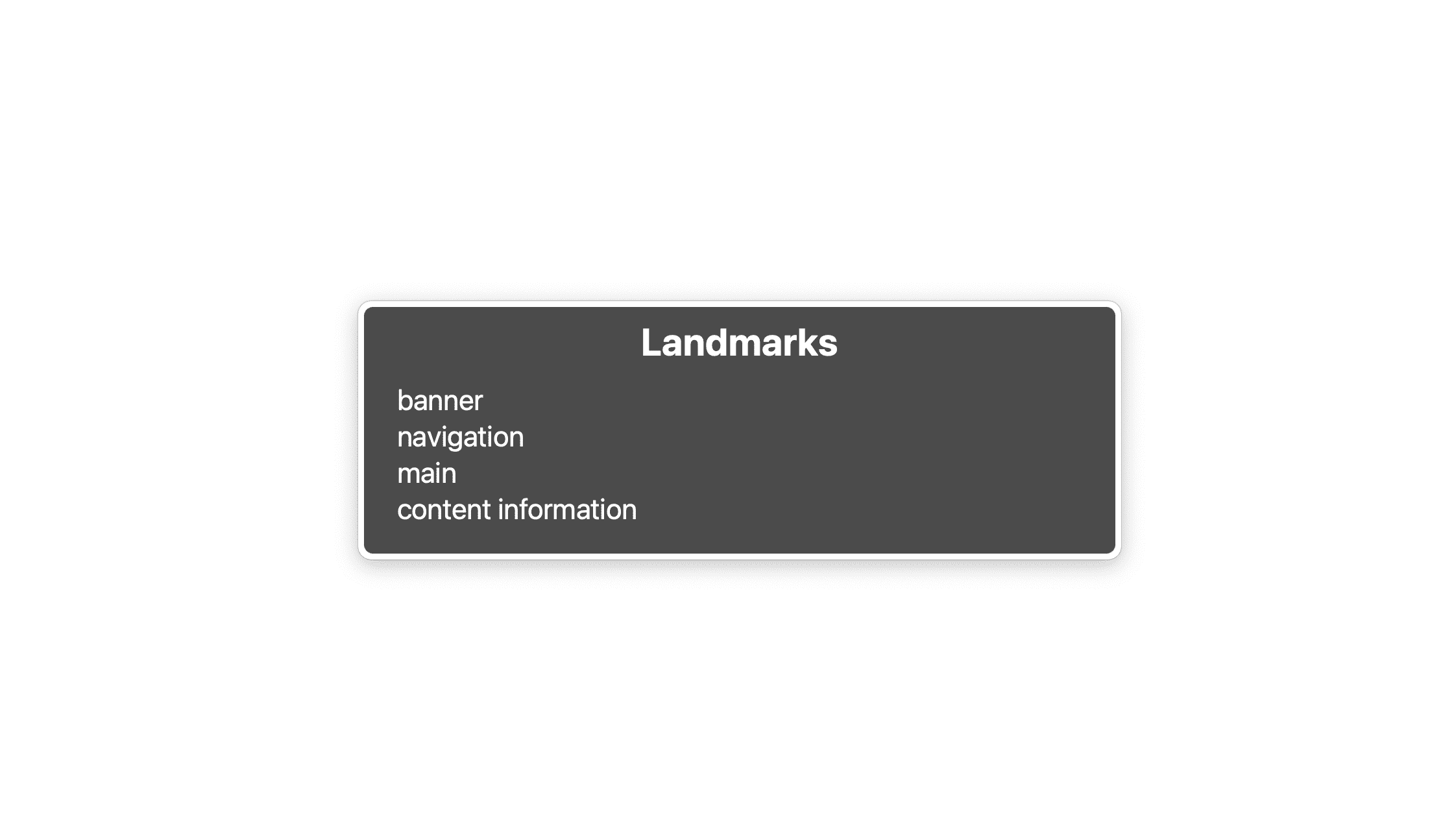
In this list you see 4 landmarks: banner which is the <header> element, navigation is the <nav>, main the <main> element, and content information is the <footer>. This list shouldn't be too long, you really only want to mark critical parts of your UI as landmarks, like the site search, a local navigation, or a pagination.
If you have a site-wide navigation, a local navigation for the page, and a pagination on a single page, you might also have 3 <nav> elements. That's fine, but now there are three navigation landmarks and semantically they all look the same. It's hard to tell them apart, unless you know the structure of the page really well.
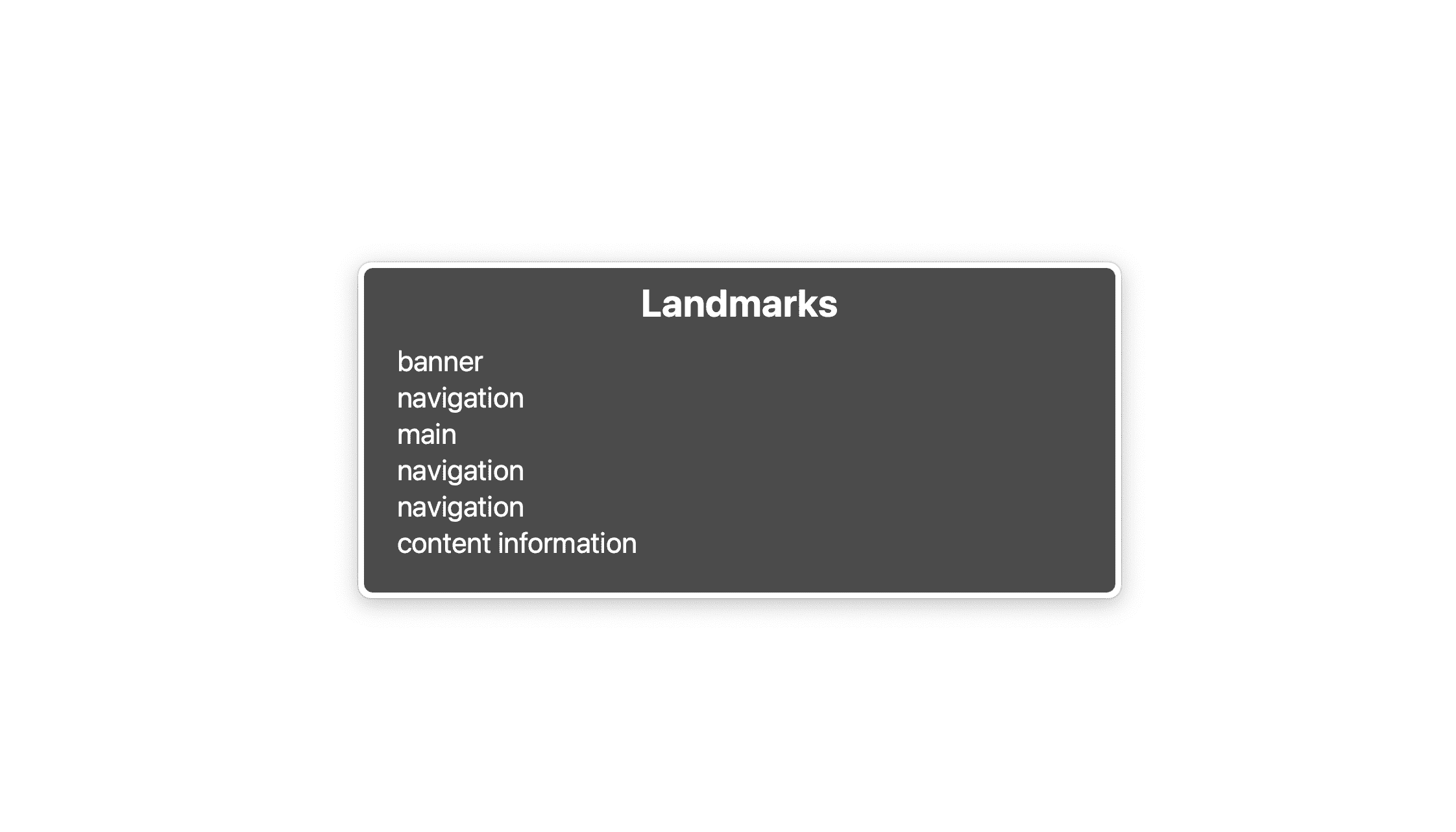
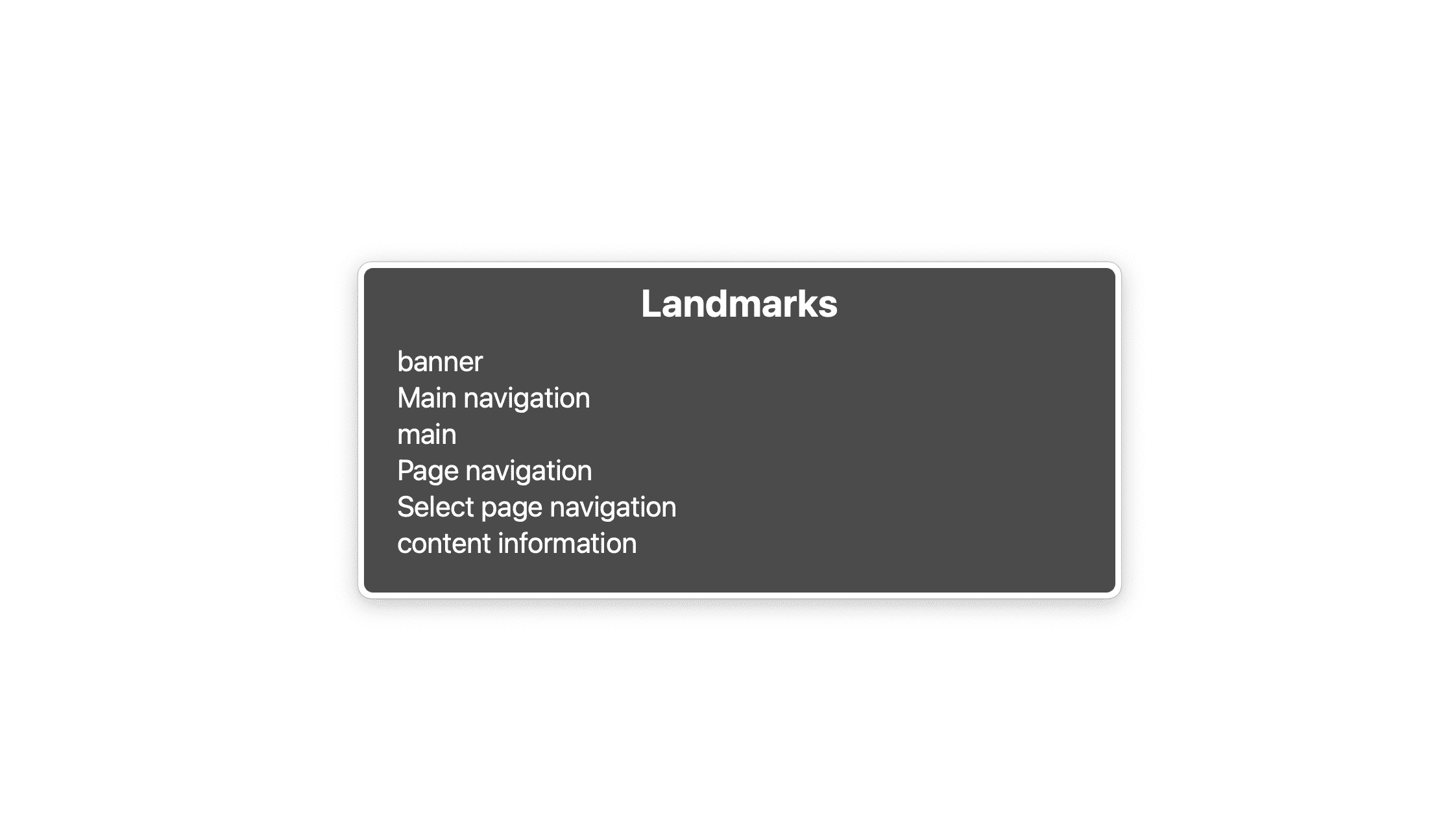
To make them distinguishable, you should label them by either using aria-labelledby or aria-label.
<nav aria-label="Main">
    <ul>
      <li>
         <a href="/home">Home</a>
      </li>
      ...
  </ul>
</nav>
...
<nav aria-label="Select page">
    <ul>
      <li>
         <a href="/page-1">1</a>
      </li>
      ...
    </ul>
</nav>
If the label you've picked already exists somewhere in the page, you can use aria-labelledby instead and reference the existing label using the id attribute.
<nav aria-labelledby="pagination_heading">
  <h2 id="pagination_heading">Select a page</h2>
  <ul>
    <li>
       <a href="/page-1">1</a>
    </li>
    ...
  </ul>
</nav>
A concise label is sufficient, don't get too wordy. Omit expressions like "navigation" or "menu" because the screen reader already provides users with this information.
Hide the navigation on narrow viewports
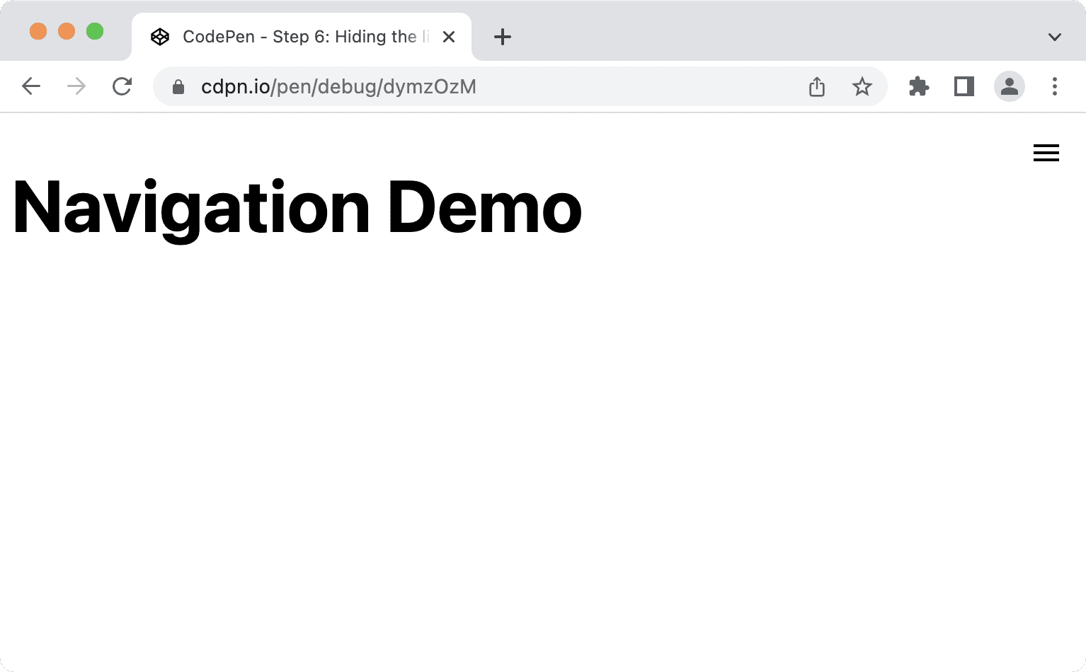
Personally, I'm not a big fan of hiding the main navigation on narrow viewports, but if the list of links gets too long, there's no way around it. If that's the case, instead of the list, users see a button labelled "Menu" or a burger icon or a combination. Clicking the button shows and hides the list. If you know basic JavaScript and CSS, that's a doable task, but there are several things in terms of UX and accessibility you have to take care of.
- You have to hide the list in an accessible manner.
- The navigation must be keyboard accessible.
- The navigation must communicate whether or not it's visible.
Adding a burger button
Since you're following the progressive enhancement principle, you want to make sure that your navigation still works and makes sense even with JavaScript turned off.
The first thing your navigation needs is a burger button. You create it in HTML in a template element, clone it in JavaScript, and add it to the navigation.
<nav id="mainnav">
  ...
</nav>

<template id="burger-template">
  <button type="button" aria-expanded="false" aria-label="Menu" aria-controls="mainnav">
    <svg width="24" height="24" aria-hidden="true">
      <path d="M3 18h18v-2H3v2zm0-5h18v-2H3v2zm0-7v2h18V6H3z">
    </svg>
  </button>
</template>
- The
aria-expandedattribute tells the screen reader software whether or not the element the button controls is expanded. aria-labelgives the button a so-called accessible name, a text alternative for the burger icon.- You hide the
<svg>from assistive technology usingaria-hiddenbecause it already has a text label provided byaria-label. aria-controlstells assistive technology, that supports the attribute (for example JAWS), which element the button controls.
const nav = document.querySelector('#mainnav')
const list = nav.querySelector('ul');
const burgerClone = document.querySelector('#burger-template').content.cloneNode(true);
const button = burgerClone.querySelector('button');

// Toggle aria-expanded attribute
button.addEventListener('click', e => {
  // aria-expanded="true" signals that the menu is currently open
  const isOpen = button.getAttribute('aria-expanded') === "true"
  button.setAttribute('aria-expanded', !isOpen);
});

// Hide list on keydown Escape
nav.addEventListener('keyup', e => {
  if (e.code === 'Escape') {
    button.setAttribute('aria-expanded', false);
  }
});

// Add the button to the page
nav.insertBefore(burgerClone, list);
- It's convenient for users to have the ability to close the navigation whenever they want, for example by pressing the Escape key.
- It's important to use
insertBeforeinstead ofappendChildbecause the button should be the first element in your navigation. If a keyboard or screen reader user presses Tab after clicking the button, they expect to focus the first item in the list. If the button comes after the list, that would not be the case.
Next, you reset the default styling of the button and make sure that it's only visible on narrow viewports.
@media (min-width: 48em) {
  nav {
    --nav-button-display: none;
  }
}

/* Reset button styling */
button {
  all: unset;
  display: var(--nav-button-display, flex);
}
Hiding the list
Before you hide the list, position and style the navigation and list so that the layout is optimised for narrow viewports, but still looks good on larger screens.
First, remove the <nav> from the natural flow of the page and place it at the top end corner of the viewport.
@media (min-width: 48em) {
  nav {
    --nav-button-display: none;
    --nav-position: static;
  }
}

nav {
  position: var(--nav-position, fixed);
  inset-block-start: 1rem;
  inset-inline-end: 1rem;
}
Next, change the layout on narrow viewports by adding a new custom property (—-nav-list-layout). The layout is column by default and switches to row on larger screens.
@media (min-width: 48em) {
  nav {
    --nav-button-display: none;
    --nav-position: static;
  }

  ul {
    --nav-list-layout: row;
  }
}

ul {
  display: flex;
  flex-direction: var(--nav-list-layout, column);
  flex-wrap: wrap;
  gap: 1rem;
  list-style: none;
  margin: 0;
  padding: 0;
}
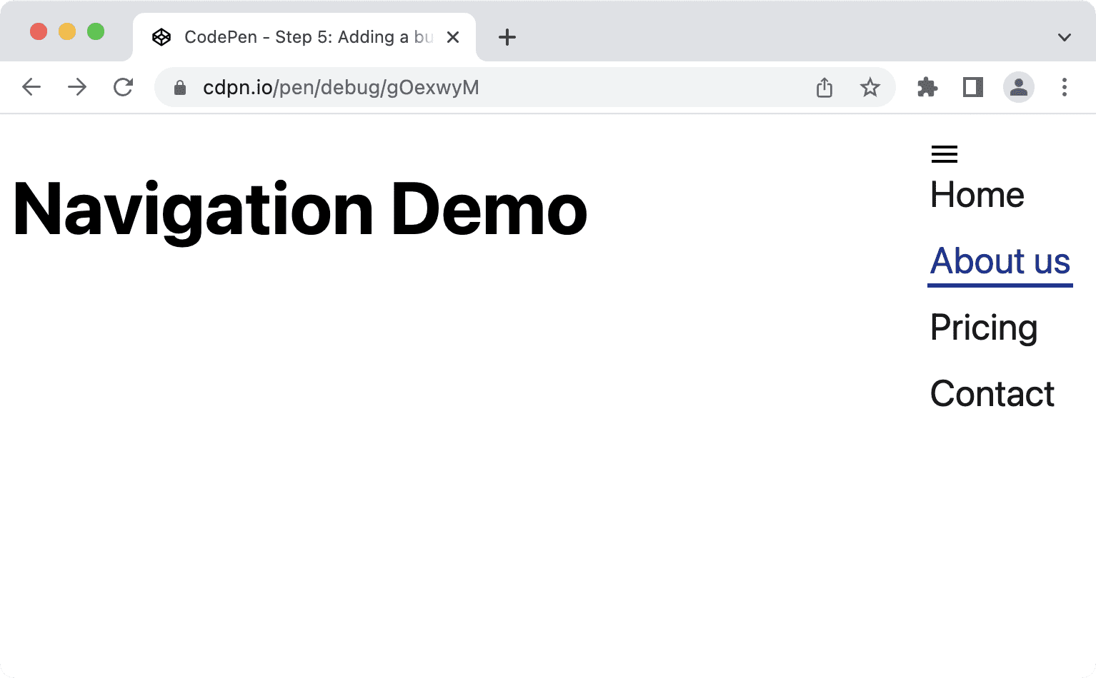
Your navigation should look something like this on narrow viewports.
The list obviously needs some CSS. We'll move it up to the top end corner, make it fill the whole screen vertically, apply a background-color and a box-shadow.
@media (min-width: 48em) {
  nav {
    --nav-button-display: none;
    --nav-position: static;
  }

  ul {
    --nav-list-layout: row;
    --nav-list-position: static;
    --nav-list-padding: 0;
    --nav-list-height: auto;
    --nav-list-width: 100%;
    --nav-list-shadow: none;
  }
}

ul {
  background: rgb(255, 255, 255);
  box-shadow: var(--nav-list-shadow, -5px 0 11px 0 rgb(0 0 0 / 0.2));
  display: flex;
  flex-direction: var(--nav-list-layout, column);
  flex-wrap: wrap;
  gap: 1rem;
  height: var(--nav-list-height, 100vh);
  list-style: none;
  margin: 0;
  padding: var(--nav-list-padding, 2rem);
  position: var(--nav-list-position, fixed);
  inset-block-start: 0; /* Logical property. Equivalent to top: 0; */
  inset-inline-end: 0; /* Logical property. Equivalent to right: 0; */
  width: var(--nav-list-width, min(22rem, 100vw));
}

button {
  all: unset;
  display: var(--nav-button-display, flex);
  position: relative;
  z-index: 1;
}
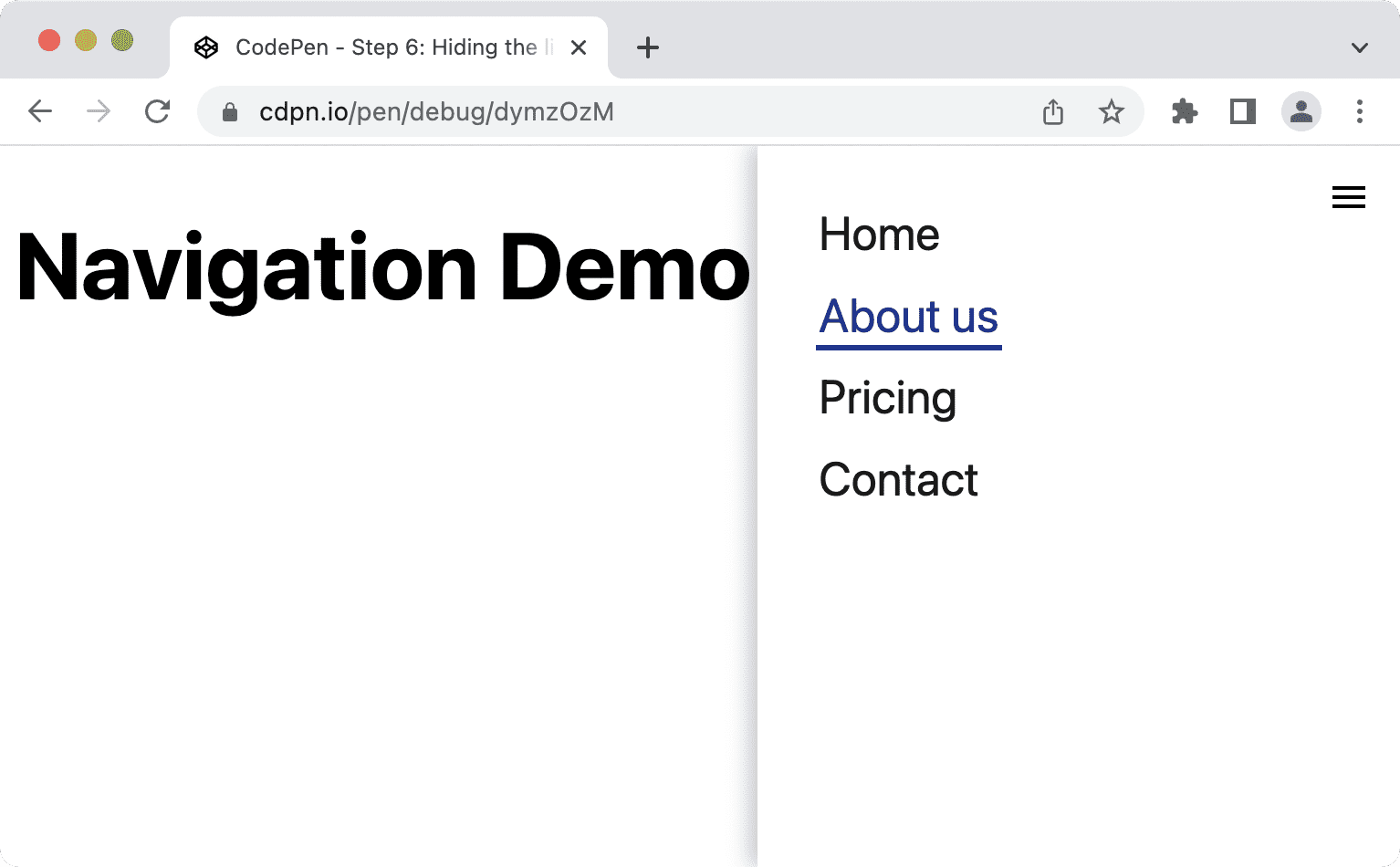
The list should look something like this on narrow viewports, more like a sidebar than a simple list.
Finally, hide the list, only show it when the user clicks the button once and hide it when they click again. It's important to only hide the list and not the whole navigation because hiding the navigation would also mean hiding an important landmark.
Earlier, you added a click event to the button to toggle the value of the aria-expanded attribute. You can use that information as a condition for showing and hiding the list in CSS.
@media (min-width: 48em) {
  ul {
    --nav-list-visibility: visible;
  }
}

ul {
  visibility: var(--nav-list-visibility, visible);
}

/* Hide the list on narrow viewports, if it comes after an element with
   aria-expanded set to "false". */
[aria-expanded="false"] + ul {
  visibility: var(--nav-list-visibility, hidden);
}
It's important to use a property declaration like visibility: hidden or display: none instead of opacity: 0 or translateX(100%) to hide the list. These properties make sure that the links are not focusable when the navigation is hidden. Using opacity or translate will remove content visually so the links would be invisible yet still accessible using the keyboard which would be confusing and frustrating. Using visibility or display hides it visually and makes it inaccessible, therefore hiding it for all users.
Animating the list
If you're wondering why to use visibility: hidden; over display: none;, it's because you can animate visibility. It only has two states, hidden and visible, but you can combine it with another property like transform or opacity to create a slide- or fade-in effect. That wouldn't work with display: none because the display property is not animatable.
The following CSS transitions opacity to create a fade-in and fade-out effect.
ul {
  transition: opacity 0.6s linear, visibility 0.3s linear;
  visibility: var(--nav-list-visibility, visible);
}

[aria-expanded="false"] + ul {
  opacity: 0;
  visibility: var(--nav-list-visibility, hidden);
}
If you want to animate motion instead, you should consider wrapping the transition property in a prefers-reduced-motion media query because animations can trigger nausea, dizziness, and headaches in some users.
ul {
  visibility: var(--nav-list-visibility, visible);
}

@media (prefers-reduced-motion: no-preference) {
  ul {
    transition: transform 0.6s cubic-bezier(.68,-0.55,.27,1.55), visibility 0.3s linear;
  }
}

[aria-expanded="false"] + ul {
  transform: var(--nav-list-transform, translateX(100%));
  visibility: var(--nav-list-visibility, hidden);
}
This makes sure that only people who have no preference for reduced motion will see the animation.
Improve focus styling
Keyboard users rely on the focus styles of elements for orientation and navigation on a page. Default focus styles are better than no focus styles (which happens if you set outline: none), but having more clearly visible custom focus styles improves the user experience.
Here's how the default focus styles on the link look in Chrome 103.
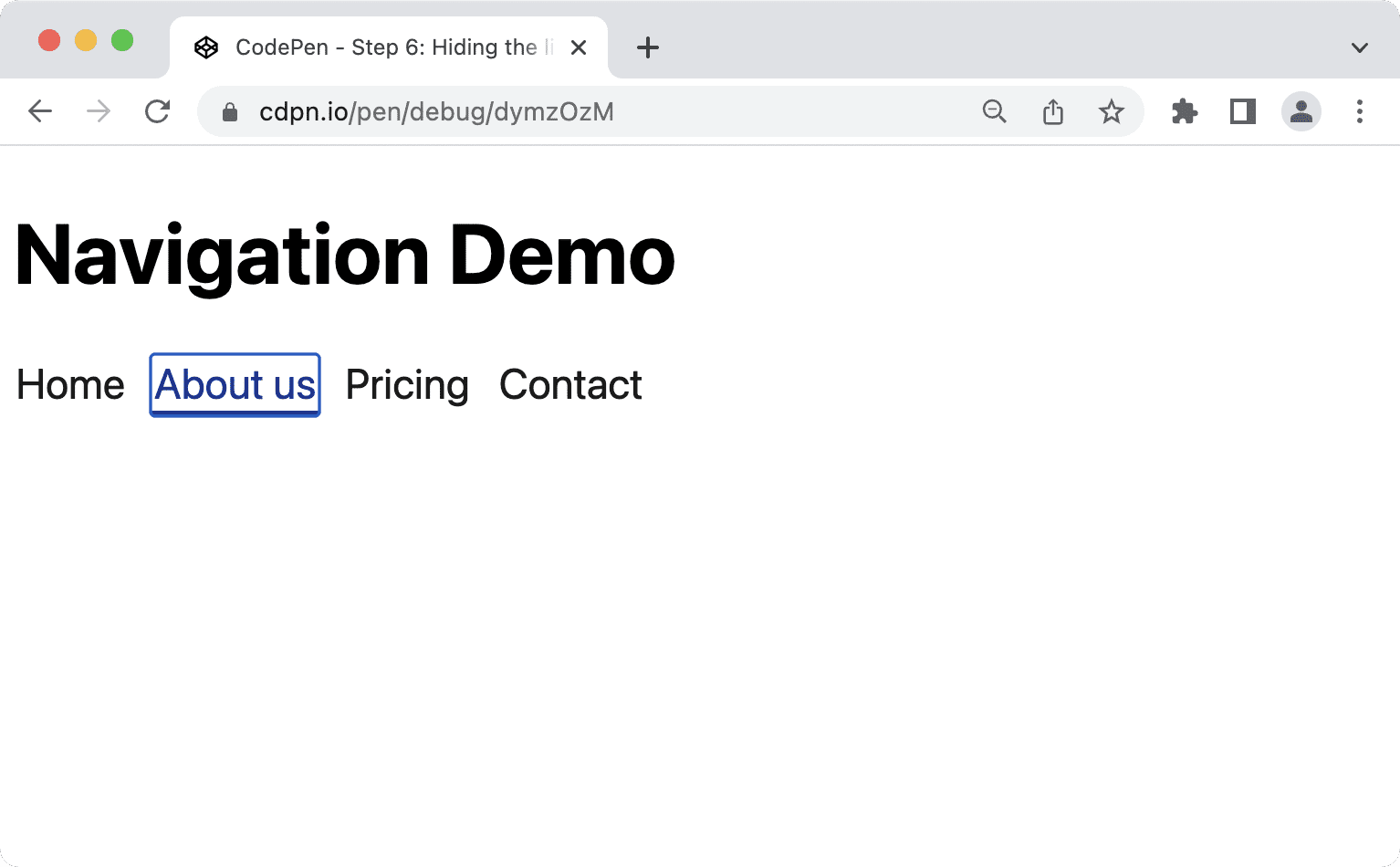
You can improve that by providing your own styles in your own colors. By using :focus-visible instead of :focus you let the browser decide when it's appropriate to show focus styles. :focus styles will be visible to everyone, mouse, keyboard and touch users, no matter whether they need them or not. With :focus-visible the browser uses internal heuristics to decide whether to show them just to keyboard users or to everyone.
/* Remove the default :focus outline */
*:focus {
  outline: none;
}

/* Show a custom outline on :focus-visible */
*:focus-visible {
  outline: 2px solid var(--color-shades-dark);
  outline-offset: 4px;
}
Browser support for :focus-visible
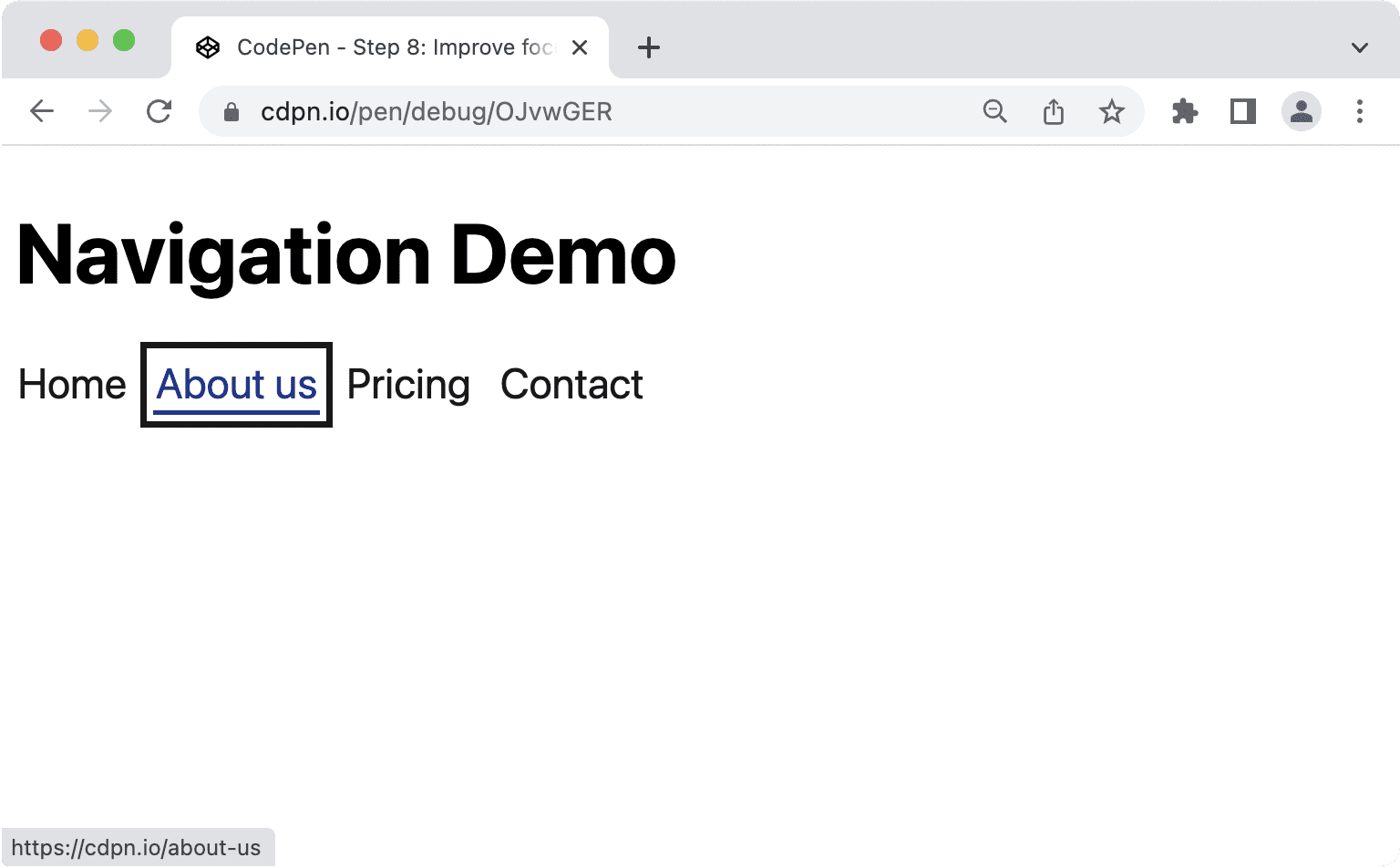
There are different ways of highlighting items when they're focused. Using the outline property is recommended because it doesn't break layout, which could happen with border, and it works well with high contrast mode on Windows. Properties that don't work well are background-color or box-shadow, because they might not be displayed at all with custom contrast settings.
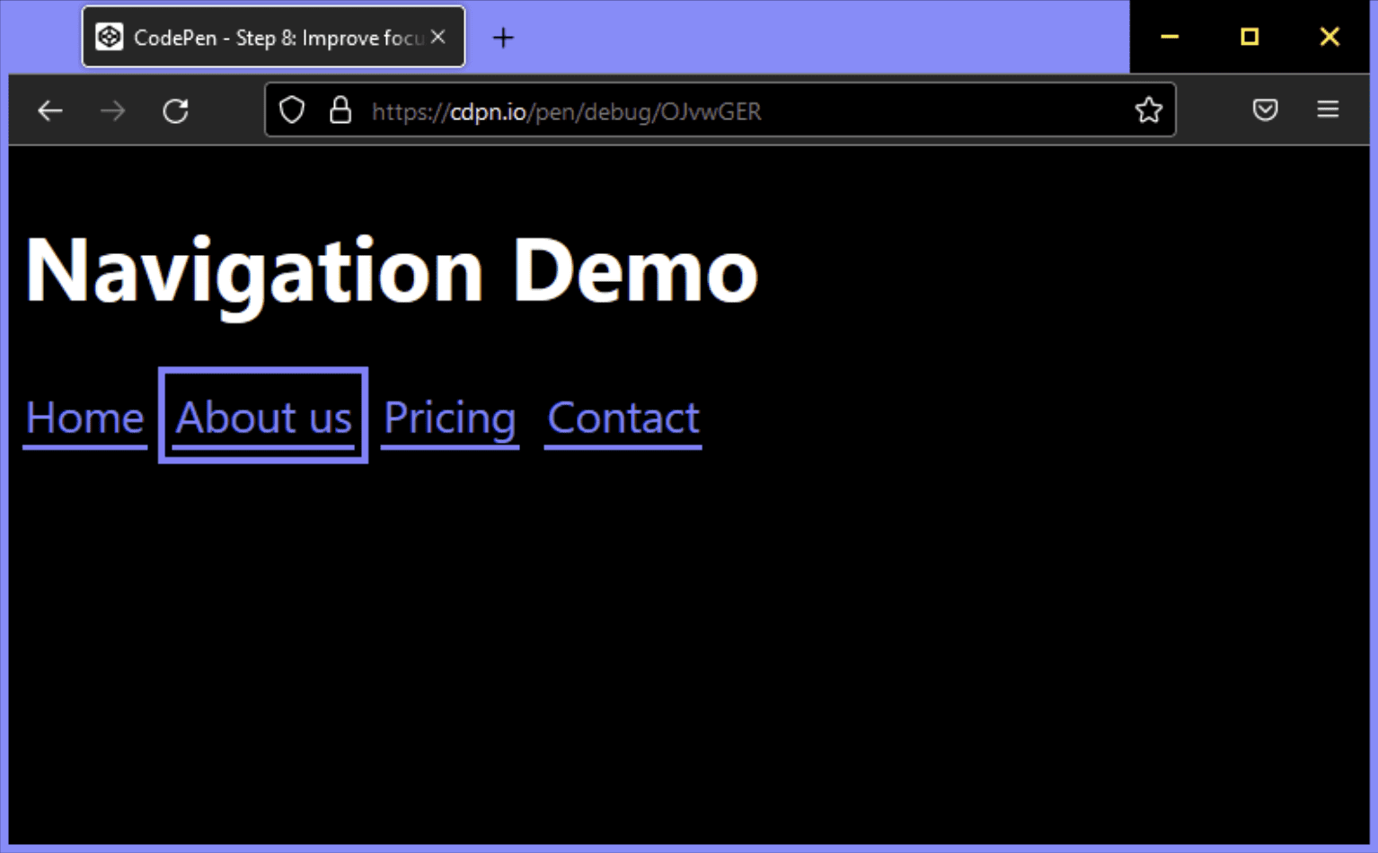
Congratulations! You've built a progressively enhanced, semantically rich, accessible, and mobile friendly main navigation.
There's always something that can be improved, for example:
- You could consider trapping focus inside the navigation or making the rest of the page inert on narrow viewports.
- You can add a skip link at the top of the page to allow keyboard users to skip the navigation.
If you remember how this article started, with the aim that the solution should "neither be too simple, nor too complicated", that's where we are now. It's possible however to over-engineer a navigation.
Navigations versus menus
There's a clear difference between navigations and menus. Navigations are collections of links for navigating related documents. Menus are collections of actions to perform in a document. Sometimes these tasks overlap. You might have a navigation that also includes a button that performs an action, like opening a modal window, or you might have a menu where one action is navigating to another page, like a help page. When that's the case, it's important that you don't mash-up ARIA roles, but identify the main purpose of your component and pick the markup and the roles accordingly.
The <nav> element has an implicit ARIA role of navigation which is sufficient to communicate that the element is a navigation, but often you see sites also use menu, menubar, and menuitem. Since we sometimes use these terms interchangeably, thinking that combining them to improve the experience for screen reader users might make sense. Before we learn why that's usually not the case, let's have a look at the official definition of these roles.
The navigation role
A collection of navigational elements (usually links) for navigating the document or related documents.
navigation (role) WAI-ARIA 1.1
The menu role
A menu is often a list of common actions or functions that the user can invoke. The menu role is appropriate when a list of menu items is presented in a manner similar to a menu on a desktop application.
menu (role) WAI-ARIA 1.1
The menubar role
A presentation of menu that usually remains visible and is usually presented horizontally. The menubar role is used to create a menu bar similar to those found in Windows, Mac, and Gnome desktop applications. A menu bar is used to create a consistent set of frequently used commands. Authors should ensure that menubar interaction is similar to the typical menu bar interaction in a desktop graphical user interface.
menubar (role) WAI-ARIA 1.1
The menuitem role
An option in a set of choices contained by a menu or menubar.
menuitem (role) WAI-ARIA 1.1
The specification is very clear here, use navigation for navigating the document or related documents and menu only for a list of actions or functions similar to menus in desktop applications. If you're not building the next Google Docs, you probably don't need any of the menu roles for the main navigation.
When is a menu appropriate?
The primary use of menu items isn't navigation, but to perform actions. Let's say you have a list or table of data and users can perform certain actions on each item in the list. You could add a button to each row and show the actions when the users click the button.
<ul>
  <li>
    Product 1

    <button aria-expanded="false" aria-controls="options1">Edit</button>

    <div role="menu" id="options1">
      <button role="menuitem">
        Duplicate
      </button>
      <button role="menuitem">
        Delete
      </button>
      <button role="menuitem">
        Disable
      </button>
    </div>
  </li>
  <li>
    Product 2
    ...
  </li>
</ul>
Implications of using menu roles
It's really important to use these menu roles wisely because a lot can go wrong.
Menus expect a certain DOM structure. menuitem must be a direct child item of menu. The following code could break the semantic behaviour:
 <!-- Wrong, don't do this -->
<ul role="menu">
  <li>
    <a href="#" role="menuitem">Item 1</a>
  </li>
</ul>
Savvy users expect certain keyboard shortcuts to work with menus and menubars. Based on the ARIA Authoring Practices Guide (APG), this includes:
- Enter and Space to select menu items.
- Arrow keys in all directions to navigate between items.
- The Home and End keys to move focus to the first or last items respectively.
- a-z to move focus to the next menu item with a label that starts with the typed character.
- Esc to close the menu.
If a screen reader detects a menu, the software might automatically change the browsing mode, enabling usage of the previously mentioned shortcuts. Inexperienced screen reader users might not be able to use the menu because they don't know these shortcuts or how to use them.
That's the same for keyboard users who might expect that they can use Shift and Shift + Tab.
There's a lot to consider when you create menus and menu bars, with whether it's appropriate to use them in the first place leading the way. When you're building a typical website, the nav element with a list and links is all you need. This also includes Single Page Applications (SPA) or web apps. The underlying stack doesn't matter. Unless you're building something that's very close to a desktop application, avoid menu roles.
Additional Resources
- Fixing Lists by Scott O'hara.
- Don't Use ARIA Menu Roles for Site Nav by Adrian Roselli.
- Menus & Menu Buttons by Heydon Pickering.
- WAI-ARIA menus, and why you should handle them with great care by Marco Zehe.
- Hiding content responsibly by Kitty Giraudel.
- :focus-visible Is Here by Matthias Ott.
Hero image by Mick Haupt

