We've all been there: you forgot to scale down an image before adding it to the page. The image looks fine, but it is wasting users' data and hurting page performance.
Identify incorrectly sized images
Lighthouse makes it easy to identify incorrectly-sized images. Run the Performance Audit (Lighthouse > Options > Performance) and look for the results of the Properly size images audit. The audit lists any images that need to be resized.
Determine the correct image size
Image sizing can be deceptively complicated. For this reason, we've provided two approaches: the "good" and the "better." Both will improve performance, but the "better" approach may take a bit longer to understand and implement. However, it will also reward you with bigger performance improvements. The best choice for you is the one that you feel comfortable implementing.
A quick note on CSS units
There are two types of CSS units for specifying the size of HTML elements, including images:
- Absolute units: Elements styled using absolute units will always be displayed at the same size, regardless of device. Examples of valid, absolute CSS units: px, cm, mm, in.
- Relative units: Elements styled using relative units will be displayed at varying sizes, depending on the relative length specified. Examples of valid, relative CSS units: %, vw (1vw = 1% of the width of the viewport), em (1.5 em = 1.5 times font size).
The "Good" Approach
For images with sizing based on…
- Relative units: Resize the image to a size that will work across all devices.
You may find it helpful to check your analytics data (e.g. Google Analytics) to see which display sizes are commonly used by your users. Alternatively, screensiz.es provides information about the displays of many common devices. - Absolute units: Resize the image to match the size that it is displayed at.
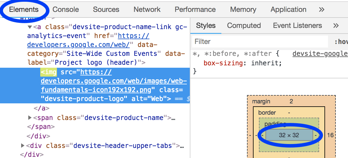
The DevTools Elements panel can be used to determine what size an image is displayed at.

The "Better" approach
For images with both absolute and relative sizing, use srcset
and sizes
attributes to serve different images to different display densities.
Read the guide on responsive images.
"Display density" refers to the fact that different displays have different densities of pixels. All other things being equal, a high pixel density display will look sharper than a low pixel density display.
As a result, multiple image versions are necessary if you want users to experience the crispest possible images, regardless of the pixel density of their device.
Responsive image techniques make this possible by allowing you to list multiple image versions and for the device to choose the image that works best for it.
An image that works across all devices will be unnecessarily large for smaller devices. Responsive image techniques, specifically srcset and sizes, allow you to specify multiple image versions and for the device to choose the size that works best for it.
Resize images
Regardless of the approach that you choose, you may find it helpful to use ImageMagick to resize your images. ImageMagick is the most popular command line tool for creating and editing images. Most people can resize images far more quickly when using the CLI than a GUI-based image editor.
Resize image to 25% the size of the original:
convert flower.jpg -resize 25% flower_small.jpg
Scale image to fit within "200px wide by 100px tall":
# macOS/Linux
convert flower.jpg -resize 200x100 flower_small.jpg

# Windows
magick convert flower.jpg -resize 200x100 flower_small.jpg
If you'll be resizing many images, you may find it more convenient to use a script or service to automate the process. You can learn more about this in the Responsive Images guide.
Avoid layout shifts by specifying dimensions
While this guide discusses image dimensions in the context of reducing the amount of unnecessary bytes downloaded, it's important to note that reserving the correct space for images in the layout is another crucial component of minimizing a page's Cumulative Layout Shift metric. When serving images in HTML, be sure to use proper width and height attributes so that the browser knows how much space to allocate in the layout for the image:
<img src="flower.jpg" width="640" height="480" alt="A picture of a siberian iris.">
Without these attributes, or the equivalent CSS sizing, the browser has no idea how much space the image will take up until it has loaded. This will cause layout shifts in the document, which can be frustrating to users when content moves after they have started consuming it. This can result in users losing their place when reading, or to "miss" their intended hit target and end up clicking on something else they didn't intend to during page load.
An alternative to providing the width and height explicitly, is to use the CSS aspect-ratio property on the image. This has a similar effect on an element's size that width and height attributes do in the sense that the container will maintain a consistent aspect ratio. However, the difference is that this may result in a different aspect-ratio being used than the image is provided in, so you will likely want to use an object-fit setting to ensure the image is not distorted in this explicit 16/9 view:
img {
  aspect-ratio: 16 / 9;
  width: 100%;
  object-fit: cover;
}
Verify
Once you've resized all your images, re-run Lighthouse to verify that you didn't miss anything.

