Web components
Web components started with the promise of letting developers piece them together and build great apps on top of them. Examples of such atomic components are GitHub's time-elements, Stefan Judis' web-vitals-element, or, shameless plug, Google's dark mode toggle. When it comes to complete design systems, however, I have observed that people prefer to rely on a coherent set of components from the same vendor. An incomplete list of examples includes SAP's UI5 Web Components, the Polymer Elements, Vaadin's elements, Microsoft's FAST, the Material Web Components, arguably the AMP components, and many more. Due to a number of factors out of scope for this article, a lot of developers, however, have also flocked to frameworks like React, Vue.js, Ember.js, etc. Rather than giving the developer the freedom to choose from any of these options (or, dependent on your viewpoint, forcing them to make a technology choice), super app providers universally supply a set of components that developers must use.
Components in mini apps
You can think of these components like any of the component libraries mentioned above. To get an overview of the available components, you can browse WeChat's component library, ByteDance's components, Alipay's components, Baidu's, and Quick App components.
Earlier I showed that while, for example, WeChat's <image>
is a web component under the hood, not all of these components are technically web components. Some
components, like <map> and <video>, are rendered as
OS-built-in components
that get layered over the WebView. For the developer, this implementation detail is not revealed,
they are programmed like any other component.
As always, the details vary, but the overall programming concepts are the same across all super app providers. An important concept is data binding, as shown before in Markup languages. Generally, components are grouped by function, so finding the right one for the job is easier. Below is an example from Alipay's categorization, which is similar to the component grouping of other vendors.
- View containers
viewswiperscroll-viewcover-viewcover-imagemovable-viewmovable-area
- Basic content
texticonprogressrich-text
- Form components
buttonformlabelinputtextarearadioradio-groupcheckboxcheckbox-groupswitchsliderpicker-viewpicker
- Navigation
navigator
- Media components
imagevideo
- Canvas
canvas
- Map
map
- Open components
web-viewlifestylecontact-button
- Accessibility
aria-component
Below, you can see Alipay's <image> used in an
a:for directive (see List rendering) that loops over an image data array
provided in index.js.
/* index.js */
Page({
  data: {
    array: [
      {
        mode: "scaleToFill",
        text: "scaleToFill",
      },
      {
        mode: "aspectFit",
        text: "aspectFit",
      },
    ],
    src: "https://images.example.com/sample.png",
  },
  imageError(e) {
    console.log("image", e.detail.errMsg);
  },
  onTap(e) {
    console.log("image tap", e);
  },
  imageLoad(e) {
    console.log("image", e);
  },
});
<!-- index.axml -->
<view class="page">
  <view class="page-section" a:for="{{array}}" a:for-item="item">
    <view class="page-section-demo" onTap="onTap">
      <image
        class="image"
        mode="{{item.mode}}"
        onTap="onTap"
        onError="imageError"
        onLoad="imageLoad"
        src="{{src}}"
        lazy-load="true"
        default-source="https://images.example.com/loading.png"
      />
    </view>
  </view>
</view>
Note the data binding of the item.mode to the mode attribute, the src to the src attribute,
and the three event handlers onTap, onError, and onLoad to the functions of the same name. As
shown before, the <image> tag internally gets converted into a
<div> with a placeholder of the image's final dimensions, optional lazy loading, a default source,
etc.
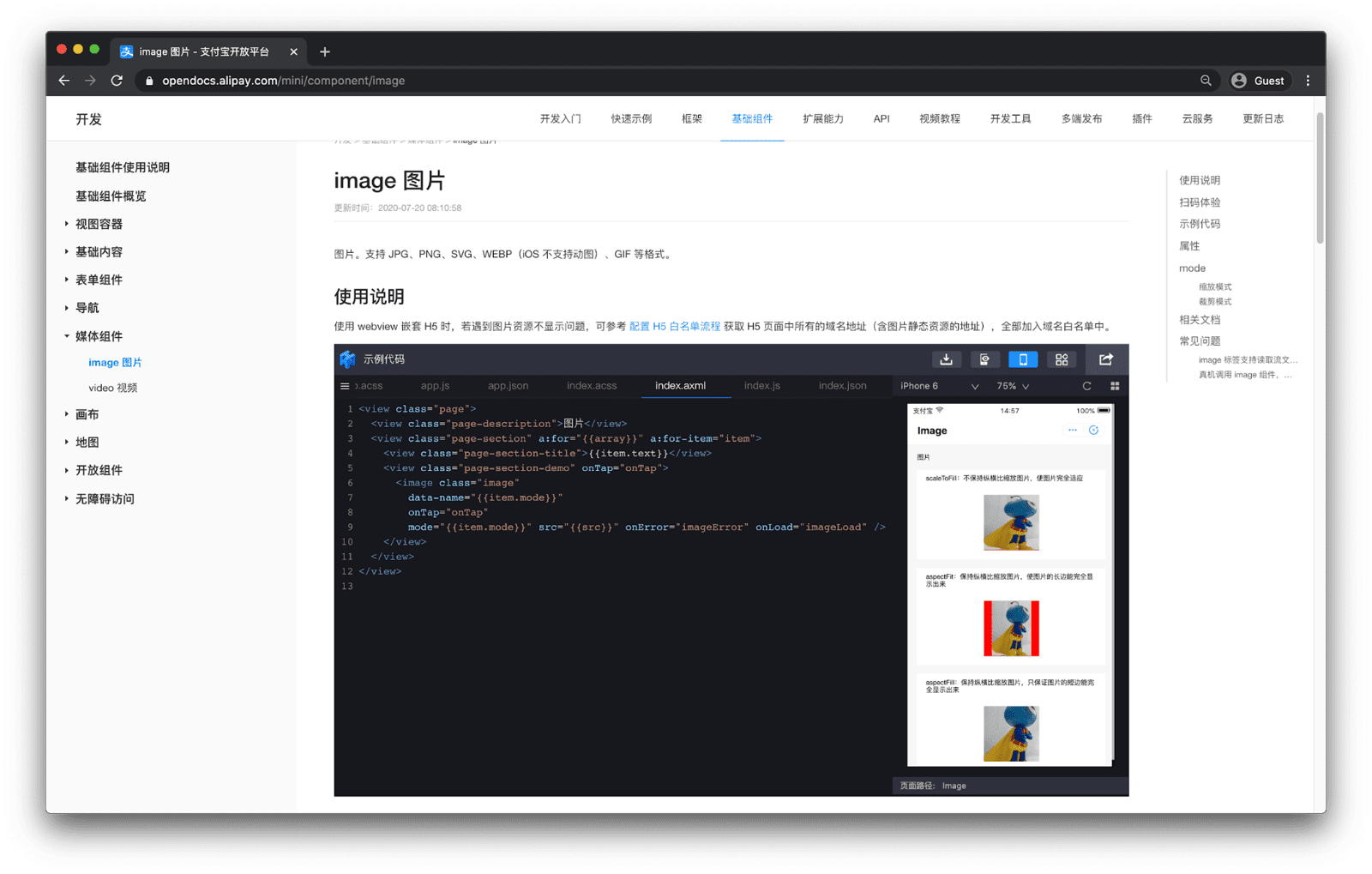
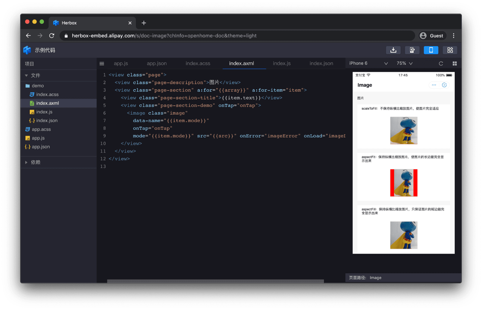
The available configuration options of the component are all listed in the documentation. An embedded-in-the-docs component preview with simulator makes the code immediately tangible.


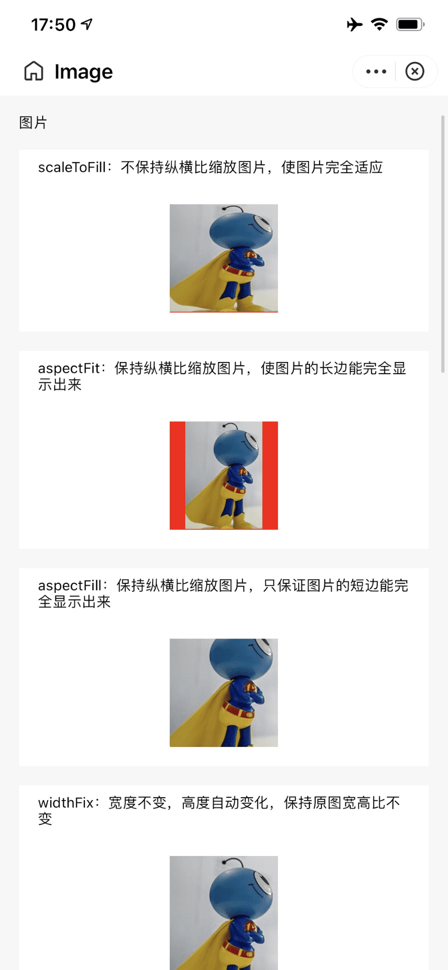
Each component also has a QR code that can be scanned with the Alipay app that opens the component example in a self-contained minimal example.

<image> component on a real device after following a QR code link from the docs.
Developers can jump from the documentation straight into Alipay DevTools IDE by leveraging a
proprietary URI scheme antdevtool-tiny://. This allows the documentation to link directly into a
to-be-imported mini app project, so developers can get started with the component immediately.
Custom components
Apart from using the vendor-provided components, developers can also create custom components. The
concept exists for
WeChat,
ByteDance,
Alipay, and
Baidu, as well as
Quick App.
For example, a Baidu custom component consists of four files that must reside in the same folder:
custom.swan, custom.css, custom.js, and custom.json.
The file custom.json denotes the folder contents as a custom component.
{
  "component": true
}
The file custom.swan contains the markup and custom.css the CSS.
<view class="name" bindtap="tap">{{name}} {{age}}</view>
.name {
  color: red;
}
The file custom.js contains the logic. The component lifecycle functions are attached(),
detached(), created(), and ready(). The component can additionally also react on
page lifecycle events, namely show() and hide().
Component({
  properties: {
    name: {
      type: String,
      value: "swan",
    },
  },
  data: {
    age: 1,
  },
  methods: {
    tap: function () {},
  },
  lifetimes: {
    attached: function () {},
    detached: function () {},
    created: function () {},
    ready: function () {},
  },
  pageLifetimes: {
    show: function () {},
    hide: function () {},
  },
});
The custom component can then be imported in index.json, the key of the import determines the name
(here: "custom") that the custom component can then be used with in index.swan.
{
  "usingComponents": {
    "custom": "/components/custom/custom"
  }
}
<view>
  <custom name="swanapp"></custom>
</view>
Acknowledgements
This article was reviewed by Joe Medley, Kayce Basques, Milica Mihajlija, Alan Kent, and Keith Gu.

