A foundational overview of how to build split letter and word animations.
In this post I want to share thinking on ways to solve split text animations and interactions for the web that are minimal, accessible, and work across browsers. Try the demo.
If you prefer video, here's a YouTube version of this post:
Overview
Split text animations can be amazing. We'll be barely scratching the surface of animation potential in this post, but it does provide a foundation to build upon. The goal is to animate progressively. The text should be readable by default, with the animation built on top. Split text motion effects can get extravagant and potentially disruptive, so we will only manipulate HTML, or apply motion styles if the user is OK with motion.
Here's a general overview of the workflow and results:
- Prepare reduced motion conditional variables for CSS and JS.
- Prepare split text utilities in JavaScript.
- Orchestrate the conditionals and utilities on page load.
- Write CSS transitions and animations for letters and words (the rad part!).
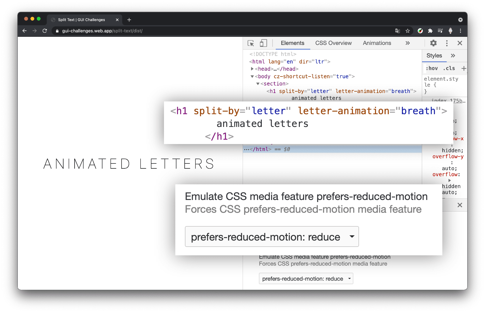
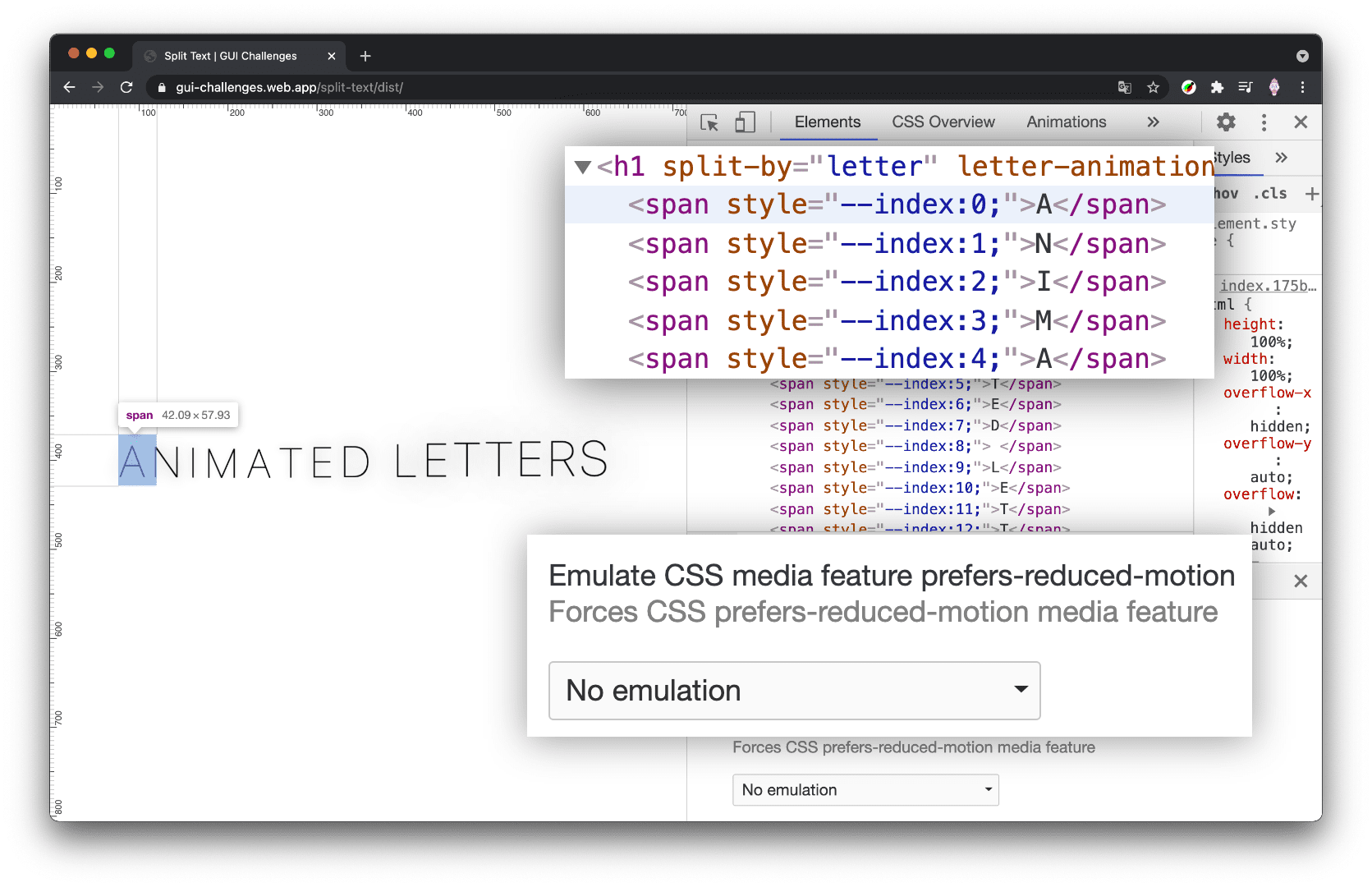
Here's a preview of the conditional results we're going for:

If a user prefers reduced motion, we leave the HTML document alone and do no animation. If motion is OK, we go ahead and chop it up into pieces. Here's a preview of the HTML after JavaScript has split the text by letter.

Preparing motion conditionals
The conveniently available @media
(prefers-reduced-motion: reduce) media query will be used from CSS and
JavaScript in this project. This media query is our primary conditional for
deciding to split text or not. The CSS media query will be used to withhold
transitions and animations, while the JavaScript media query will be used to
withhold the HTML manipulation.
Preparing the CSS conditional
I used PostCSS to enable the syntax of Media Queries Level 5, where I can store a media query boolean into a variable:
@custom-media --motionOK (prefers-reduced-motion: no-preference);
Preparing the JS conditional
In JavaScript, the browser provides a way to check media queries, I used destructuring to extract and rename the boolean result from the media query check:
const {matches:motionOK} = window.matchMedia(
  '(prefers-reduced-motion: no-preference)'
)
I can then test for motionOK, and only change the document if the user has not
requested to reduce motion.
if (motionOK) {
  // document split manipulations
}
I can check the same value by using PostCSS to enable the @nest syntax from
Nesting Draft 1. This allows me to
store all the logic about the animation and it's style requirements for the
parent and children, in one place:
letter-animation {
  @media (--motionOK) {
    /* animation styles */
  }
}
With the PostCSS custom property and a JavaScript boolean, we're ready to conditionally upgrade the effect. That rolls us into the next section where I break down the JavaScript for transforming strings into elements.
Splitting Text
Text letters, words, lines, etc., cannot be individually animated with CSS or JS. To achieve the effect, we need boxes. If we want to animate each letter, then each letter needs to be an element. If we want to animate each word, then each word needs to be an element.
- Create JavaScript utility functions for splitting strings into elements
- Orchestrate the usage of these utilities
Splitting letters utility function
A fun place to start is with a function which takes a string and returns each letter in an array.
export const byLetter = text =>
  [...text].map(span)
The spread syntax from ES6 really helped make that a swift task.
Splitting words utility function
Similar to splitting letters, this function takes a string and returns each word in an array.
export const byWord = text =>
  text.split(' ').map(span)
The
split()
method on JavaScript strings allows us to specify which characters to slice at.
I passed an empty space, indicating a split between words.
Making boxes utility function
The effect requires boxes for each letter, and we see in those functions, that
map()
is being called with a span() function. Here is the span() function.
const span = (text, index) => {
  const node = document.createElement('span')

  node.textContent = text
  node.style.setProperty('--index', index)

  return node
}
It's crucial to note that a custom property called --index is being set with
the array position. Having the boxes for the letter animations is great, but
having an index to use in CSS is a seemingly small addition with a large impact.
Most notable in this large impact is
staggering.
We'll be able to use --index as a way of offsetting animations for a staggered
look.
Utilities conclusion
The splitting.js module in completion:
const span = (text, index) => {
  const node = document.createElement('span')

  node.textContent = text
  node.style.setProperty('--index', index)

  return node
}

export const byLetter = text =>
  [...text].map(span)

export const byWord = text =>
  text.split(' ').map(span)
Next is importing and using these byLetter() and byWord() functions.
Split orchestration
With the splitting utilities ready to use, putting it all together means:
- Finding which elements to split
- Splitting them and replacing text with HTML
After that, CSS takes over and will animate the elements / boxes.
Finding Elements
I chose to use attributes and values to store information about the desired
animation and how to split the text. I liked putting these declarative options
into the HTML. The attribute split-by is used from JavaScript, to find
elements and create boxes for either letters or words. The attribute
letter-animation or word-animation is used from CSS, to target element
children and apply transforms and animations.
Here's a sample of HTML that demonstrates the two attributes:
<h1 split-by="letter" letter-animation="breath">animated letters</h1>
<h1 split-by="word" word-animation="trampoline">hover the words</h1>
Finding elements from JavaScript
I used the CSS selector syntax for attribute presence to gather the list of elements which want their text split:
const splitTargets = document.querySelectorAll('[split-by]')
Finding elements from CSS
I also used the attribute presence selector in CSS to give all letter animations the same base styles. Later, we'll use the attribute value to add more specific styles to achieve an effect.
letter-animation {
  @media (--motionOK) {
    /* animation styles */
  }
}
Splitting text in place
For each of the split targets we find in JavaScript, we'll split their text
based on the value of the attribute and map each string to a <span>. We can
then replace the text of the element with the boxes we made:
splitTargets.forEach(node => {
  const type = node.getAttribute('split-by')
  let nodes = null

  if (type === 'letter') {
    nodes = byLetter(node.innerText)
  }
  else if (type === 'word') {
    nodes = byWord(node.innerText)
  }

  if (nodes) {
    node.firstChild.replaceWith(...nodes)
  }
})
Orchestration conclusion
index.js in completion:
import {byLetter, byWord} from './splitting.js'

const {matches:motionOK} = window.matchMedia(
  '(prefers-reduced-motion: no-preference)'
)

if (motionOK) {
  const splitTargets = document.querySelectorAll('[split-by]')

  splitTargets.forEach(node => {
    const type = node.getAttribute('split-by')
    let nodes = null

    if (type === 'letter')
      nodes = byLetter(node.innerText)
    else if (type === 'word')
      nodes = byWord(node.innerText)

    if (nodes)
      node.firstChild.replaceWith(...nodes)
  })
}
The JavaScript could be read in the following English:
- Import some helper utility functions.
- Check if motion is ok for this user, if not do nothing.
- For each element that wants to be split.
- Split them based on how they want to be split.
- Replace text with elements.
Splitting animations and transitions
The above splitting document manipulation has just unlocked a multitude of potential animations and effects with CSS or JavaScript. There are a few links at the bottom of this article to help inspire your splitting potential.
Time to show what you can do with this! I'll share 4 CSS driven animations and transitions. 🤓
Split letters
As a foundation for the split letter effects, I found the following CSS to be
helpful. I put all transitions and animations behind the motion media query and
then give each new child letter span a display property plus a style for what
to do with white spaces:
[letter-animation] > span {
  display: inline-block;
  white-space: break-spaces;
}
The white spaces style is important so that the spans which are only a space, aren't collapsed by the layout engine. Now onto the stateful fun stuff.
Transition split letters example
This example uses CSS transitions to the split text effect. With transitions we need states for the engine to animate between, and I chose three states: no hover, hover in sentence, hover on a letter.
When the user hovers the sentence, aka the container, I scale back all the children as if the user pushed them further away. Then, as the user hovers a letter, I bring it forward.
@media (--motionOK) {
  [letter-animation="hover"] {
    &:hover > span {
      transform: scale(.75);
    }

    & > span {
      transition: transform .3s ease;
      cursor: pointer;

      &:hover {
        transform: scale(1.25);
      }
    }
  }
}
Animate split letters example
This example uses a predefined @keyframe animation to infinitely animated each
letter, and leverages the inline custom property index to create a stagger
effect.
@media (--motionOK) {
  [letter-animation="breath"] > span {
    animation:
      breath 1200ms ease
      calc(var(--index) * 100 * 1ms)
      infinite alternate;
  }
}

@keyframes breath {
  from {
    animation-timing-function: ease-out;
  }
  to {
    transform: translateY(-5px) scale(1.25);
    text-shadow: 0 0 25px var(--glow-color);
    animation-timing-function: ease-in-out;
  }
}
Split words
Flexbox worked as a container type for me here in these examples, nicely
leveraging the ch unit as a healthy gap length.
word-animation {
  display: inline-flex;
  flex-wrap: wrap;
  gap: 1ch;
}
Transition split words example
In this transition example I use hover again. As the effect initially hides the content until hover, I ensured that the interaction and styles were only applied if the device had the capability to hover.
@media (hover) {
  [word-animation="hover"] {
    overflow: hidden;
    overflow: clip;

    & > span {
      transition: transform .3s ease;
      cursor: pointer;

      &:not(:hover) {
        transform: translateY(50%);
      }
    }
  }
}
Animate split words example
In this animation example I use CSS @keyframes again to create a staggered
infinite animation on a regular paragraph of text.
[word-animation="trampoline"] > span {
  display: inline-block;
  transform: translateY(100%);
  animation:
    trampoline 3s ease
    calc(var(--index) * 150 * 1ms)
    infinite alternate;
}

@keyframes trampoline {
  0% {
    transform: translateY(100%);
    animation-timing-function: ease-out;
  }
  50% {
    transform: translateY(0);
    animation-timing-function: ease-in;
  }
}
Conclusion
Now that you know how I did it, how would you?! 🙂
Let's diversify our approaches and learn all the ways to build on the web. Create a Codepen or host your own demo, tweet me with it, and I'll add it to the Community remixes section below.
Source
More demos and inspiration
Community remixes
<text-hover>web component by gnehcwu on CodeSandbox

