A foundational overview of how to build a settings component of sliders and checkboxes.
In this post I want to share thinking on building a Settings component for the web that is responsive, supports multiple device inputs, and works across browsers. Try the demo.
If you prefer video, or want a UI/UX preview of what we're building, here's a shorter walkthrough on YouTube:
Overview
I've broken out the aspects of this component into the following sections:
Layouts
This is the first GUI Challenge demo to be all CSS Grid! Here's each grid highlighted with the Chrome DevTools for grid:
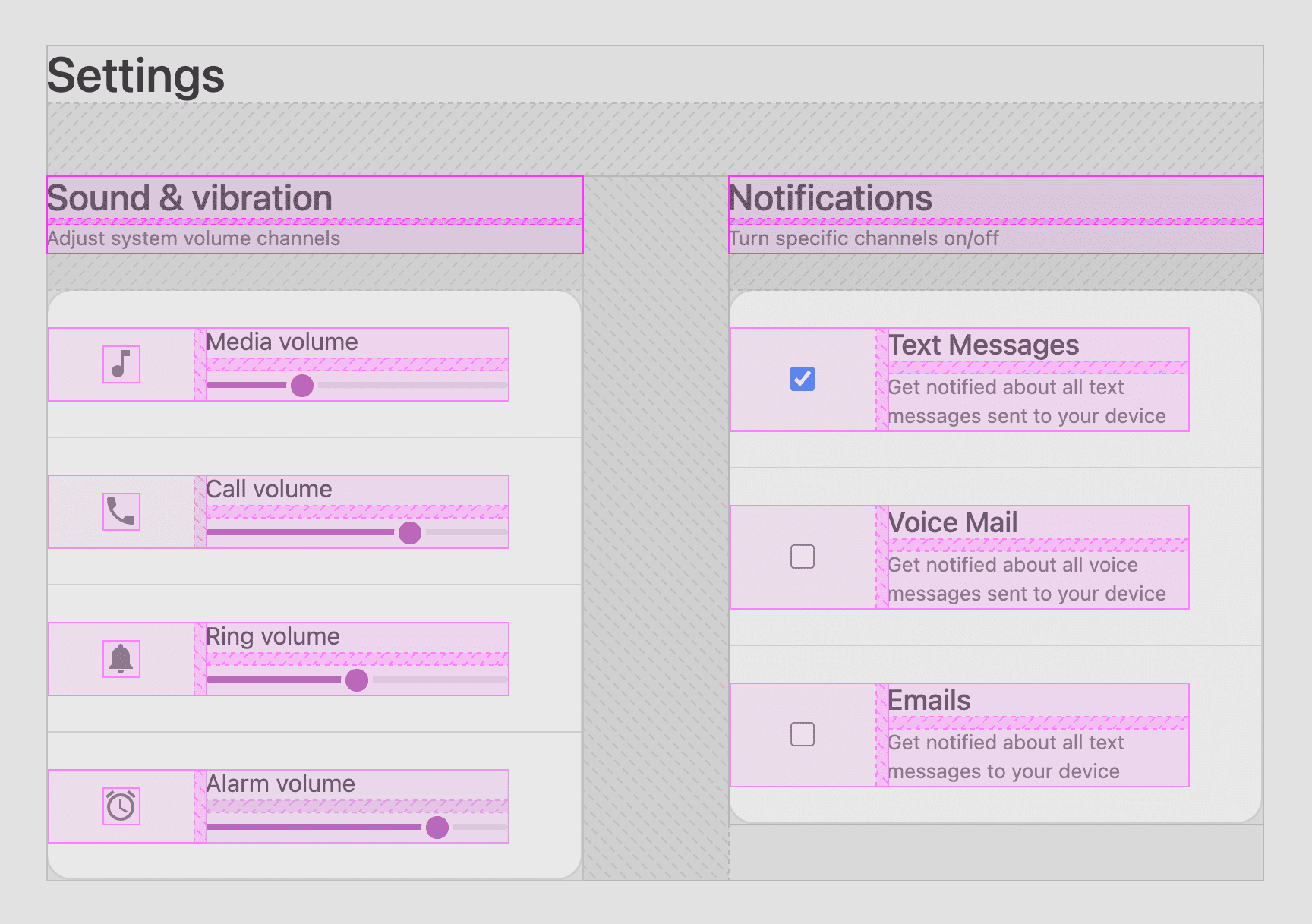
Just for gap
The most common layout:
foo {
  display: grid;
  gap: var(--something);
}
I call this layout "just for gap" because it only uses grid to add gaps between blocks.
Five layouts use this strategy, here's all of them displayed:
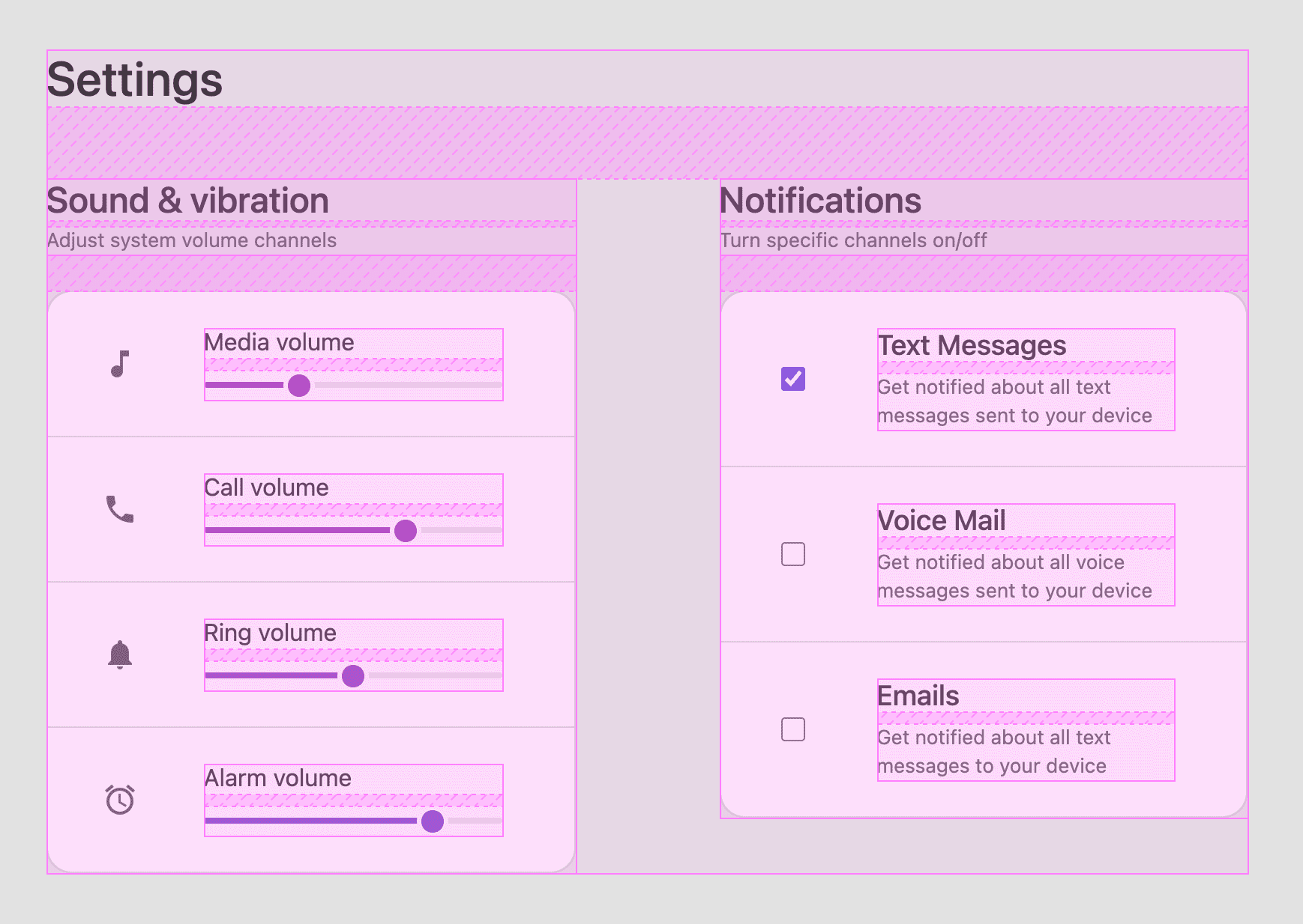
The fieldset element, which contains each input group (.fieldset-item), is using gap: 1px to
create the hairline borders between elements. No tricky border solution!
.grid {
  display: grid;
  gap: 1px;
  background: var(--bg-surface-1);

  & > .fieldset-item {
    background: var(--bg-surface-2);
  }
}
.grid {
  display: grid;

  & > .fieldset-item {
    background: var(--bg-surface-2);

    &:not(:last-child) {
      border-bottom: 1px solid var(--bg-surface-1);
    }
  }
}
Natural grid wrapping
The most complex layout ended up being the macro layout, the logical layout
system between <main> and <form>.
Centering wrapping content
Flexbox and grid both provide abilities to align-items or
align-content, and when dealing with wrapping elements, content layout
alignments will distribute space amongst the children as a group.
main {
  display: grid;
  gap: var(--space-xl);
  place-content: center;
}
The main element is using place-content: center alignment
shorthand so
that the children are centered vertically and horizontally in both one and two column layouts.
Watch in the above video how the "content" stays centered, even though wrapping has occurred.
Repeat auto-fit minmax
The <form> uses an adaptive grid layout for each section.
This layout switches from one to two columns based on available space.
form {
  display: grid;
  gap: var(--space-xl) var(--space-xxl);
  grid-template-columns: repeat(auto-fit, minmax(min(10ch, 100%), 35ch));
  align-items: flex-start;
  max-width: 89vw;
}
This grid has a different value for row-gap (--space-xl) than column-gap (--space-xxl)
to put that custom touch on the responsive layout. When the columns stack, we
want a large gap, but not as large as if we're on a wide screen.
The grid-template-columns property uses 3 CSS functions: repeat(), minmax() and
min(). Una Kravets has a great layout blog
post about this, calling it
RAM.
There's 3 special additions in our layout, if you compare it to Una's:
- We pass an extra
min()function. - We specify
align-items: flex-start. - There's a
max-width: 89vwstyle.
The extra min() function is well described by Evan Minto on their blog in the
post Intrinsically Responsive CSS Grid with minmax() and
min().
I recommend giving that a read. The flex-start alignment correction is to
remove the default stretching effect, so that the children of this layout don't
need to have equal heights, they can have natural, intrinsic heights. The
YouTube video has a quick breakdown of this alignment addition.
max-width: 89vw is worth a small breakdown in this post.
Let me show you the layout with and without the style applied:
What's happening? When max-width is specified, it's providing context,
explicit sizing or definite
sizing for the auto-fit
layout algorithm to know how
many repetitions it can fit into the space. While it seems obvious that the
space is "full width", per the CSS grid spec, a definite size or max-size must
be provided. I've provided a max-size.
So, why 89vw? Because "it worked" for my layout.
Me and a couple of other Chrome folks are investigating why a more reasonable value,
like 100vw isn't sufficient, and if this is in fact a bug.
Spacing
A majority of the harmony of this layout is from a limited palette of spacing, 7 to be exact.
:root {
  --space-xxs: .25rem;
  --space-xs:  .5rem;
  --space-sm:  1rem;
  --space-md:  1.5rem;
  --space-lg:  2rem;
  --space-xl:  3rem;
  --space-xxl: 6rem;
}
Usage of these flows really nicely with grid, CSS @nest, and level 5 syntax
of @media. Here's an example, the fully <main> layout set of styles.
main {
  display: grid;
  gap: var(--space-xl);
  place-content: center;
  padding: var(--space-sm);

  @media (width >= 540px) {
    & {
      padding: var(--space-lg);
    }
  }

  @media (width >= 800px) {
    & {
      padding: var(--space-xl);
    }
  }
}
A grid with centered content, moderately padded by default (like on mobile). But as more viewport space becomes available, it spreads out by increasing padding. 2021 CSS is looking pretty good!
Remember the earlier layout, "just for gap"? Here's a more complete version of how they look in this component:
header {
  display: grid;
  gap: var(--space-xxs);
}

section {
  display: grid;
  gap: var(--space-md);
}
Color
A controlled use of color helped this design stand out as expressive yet minimal. I do it like this:
:root {
  --surface1: lch(10 0 0);
  --surface2: lch(15 0 0);
  --surface3: lch(20 0 0);
  --surface4: lch(25 0 0);

  --text1: lch(95 0 0);
  --text2: lch(75 0 0);
}
I name my surface and text colors with numbers as opposed to names like
surface-dark and surface-darker because in a media query, I'll be flipping
them, and light and dark won't be meaningful.
I flip them in a preference media query like this:
:root {
  ...

  @media (prefers-color-scheme: light) {
    & {
      --surface1: lch(90 0 0);
      --surface2: lch(100 0 0);
      --surface3: lch(98 0 0);
      --surface4: lch(85 0 0);

      --text1: lch(20 0 0);
      --text2: lch(40 0 0);
    }
  }
}
It's important to get a quick glimpse at the overall picture and strategy before we dive into color syntax details. But, since I've gotten a bit ahead of myself, let me back up a bit.
LCH?
Without getting too deep into color theory land, LCH is a human oriented syntax, that caters to how we perceive color, not how we measure color with math (like 255). This gives it a distinct advantage as humans can write it more easily and other humans will be in tune with these adjustments.
For today, in this demo, let's focus on the syntax and the values I'm flipping to make light and dark. Let's look at 1 surface and 1 text color:
:root {
  --surface1: lch(10 0 0);
  --text1:    lch(95 0 0);

  @media (prefers-color-scheme: light) {
    & {
      --surface1: lch(90 0 0);
      --text1:    lch(40 0 0);
    }
  }
}
--surface1: lch(10 0 0) translates to 10% lightness, 0 chroma and 0 hue: a
very dark colorless gray. Then, in the media query for light mode, the lightness
is flipped to 90% with --surface1: lch(90 0 0);. And that's the gist of the
strategy. Start by just changing lightness between the 2 themes, maintaining the
contrast ratios the design calls for or what can maintain accessibility.
The bonus with lch() here is that lightness is human oriented, and we can feel
good about a % change to it, that it will be perceptually and consistently
that % different. hsl() for example is not as
reliable.
There's more to
learn about
color spaces and lch() if you're interested. It's coming!
CSS right now cannot access these colors at all. Let me repeat: We have no access to one third of the colors in most modern monitors. And these are not just any colors, but the most vivid colors the screen can display. Our websites are washed out because monitor hardware evolved faster than CSS specs and browser implementations.
Lea Verou
Adaptive form controls with color-scheme
Many browsers ship dark theme controls, currently Safari and Chromium, but you have to specify in CSS or HTML that your design uses them.
The above is demonstrating the effect of the property from the Styles panel of DevTools. The demo uses the HTML tag, which in my opinion is generally a better location:
<meta name="color-scheme" content="dark light">
Learn all about it in this color-scheme
article by Thomas
Steiner. There's a lot more to gain
than dark checkbox inputs!
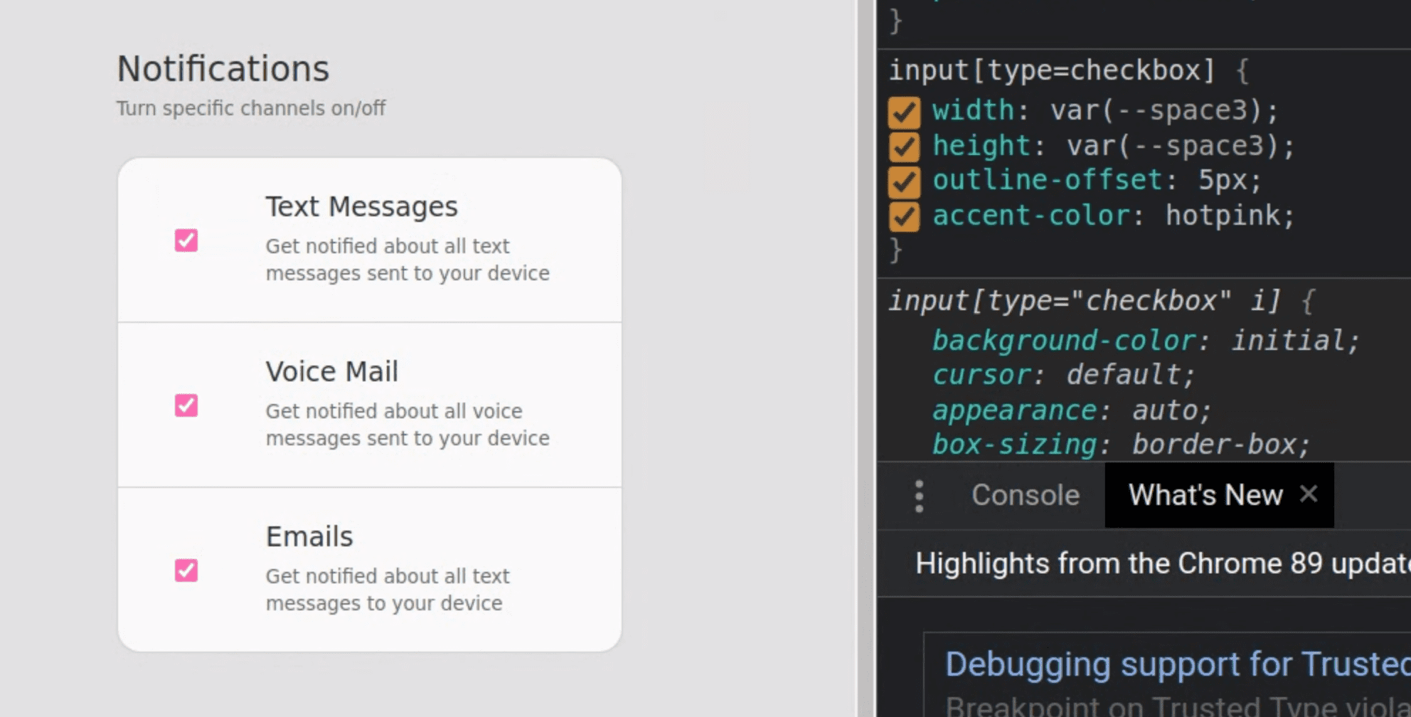
CSS accent-color
There's been recent
activity around
accent-color on form elements, being a single CSS style that can change the
tint color used in the browsers input element. Read more about it here on
GitHub. I've included it in my
styles for this component. As browsers support it, my checkboxes will be
more on theme with the pink and purple color pops.
input[type="checkbox"] {
  accent-color: var(--brand);
}
Color pops with fixed gradients and focus-within
Color pops most when it's used sparingly, and one of the ways I like to achieve that is through colorful UI interactions.
There are many layers of UI feedback and interaction in the above video, which help give personality to the interaction by:
- Highlighting context.
- Providing UI feedback of "how full" the value is in the range.
- Providing UI feedback that a field is accepting input.
To provide feedback when an element is being interacted with, CSS is using the
:focus-within
pseudo class to change the appearance of various elements, let's break down the
.fieldset-item, it's super interesting:
.fieldset-item {
  ...

  &:focus-within {
    background: var(--surface2);

    & svg {
      fill: white;
    }

    & picture {
      clip-path: circle(50%);
      background: var(--brand-bg-gradient) fixed;
    }
  }
}
When one of the children of this element has focus-within:
- The
.fieldset-itembackground is assigned a higher contrast surface color. - The nested
svgis filled white for higher contrast. - The nested
<picture>clip-pathexpands to a full circle and the background is filled with the bright fixed gradient.
Custom range
Given the following HTML input element, I'll show you how I customized its appearance:
<input type="range">
There's 3 parts to this element we need to customize:
Range element styles
input[type="range"] {
  /* style setting variables */
  --track-height: .5ex;
  --track-fill: 0%;
  --thumb-size: 3ex;
  --thumb-offset: -1.25ex;
  --thumb-highlight-size: 0px;

  appearance: none;         /* clear styles, make way for mine */
  display: block;
  inline-size: 100%;        /* fill container */
  margin: 1ex 0;            /* ensure thumb isn't colliding with sibling content */
  background: transparent;  /* bg is in the track */
  outline-offset: 5px;      /* focus styles have space */
}
The first few lines of CSS are the custom parts of the styles, and I hope that clearly labeling them helps. The rest of the styles are mostly reset styles, to provide a consistent foundation for building the tricky parts of the component.
Track styles
input[type="range"]::-webkit-slider-runnable-track {
  appearance: none; /* clear styles, make way for mine */
  block-size: var(--track-height);
  border-radius: 5ex;
  background:
    /* hard stop gradient:
        - half transparent (where colorful fill we be)
        - half dark track fill
        - 1st background image is on top
    */
    linear-gradient(
      to right,
      transparent var(--track-fill),
      var(--surface1) 0%
    ),
    /* colorful fill effect, behind track surface fill */
    var(--brand-bg-gradient) fixed;
}
The trick to this is "revealing" the vibrant fill color. This is done with the hard stop gradient on top. The gradient is transparent up to the fill percentage, and after that uses the unfilled track surface color. Behind that unfilled surface, is a full width color, waiting for transparency to reveal it.
Track fill style
My design does require JavaScript in order to maintain the fill style. There are CSS only strategies but they require the thumb element to be the same height as the track, and I wasn't able to find a harmony within those limits.
/* grab sliders on page */
const sliders = document.querySelectorAll('input[type="range"]')

/* take a slider element, return a percentage string for use in CSS */
const rangeToPercent = slider => {
  const max = slider.getAttribute('max') || 10;
  const percent = slider.value / max * 100;

  return `${parseInt(percent)}%`;
};

/* on page load, set the fill amount */
sliders.forEach(slider => {
  slider.style.setProperty('--track-fill', rangeToPercent(slider));

  /* when a slider changes, update the fill prop */
  slider.addEventListener('input', e => {
    e.target.style.setProperty('--track-fill', rangeToPercent(e.target));
  })
})
I think this makes for a nice visual upgrade. The slider works great without
JavaScript, the --track-fill prop is not required, it simply will not have a
fill style if not present. If JavaScript is available, populate the custom
property while also observing any user changes, syncing the custom property with
the value.
Here's a great
post on
CSS-Tricks by Ana
Tudor, that demonstrates a CSS only solution for
track fill. I also found this
range element very inspiring.
Thumb styles
input[type="range"]::-webkit-slider-thumb {
  appearance: none; /* clear styles, make way for mine */
  cursor: ew-resize; /* cursor style to support drag direction */
  border: 3px solid var(--surface3);
  block-size: var(--thumb-size);
  inline-size: var(--thumb-size);
  margin-top: var(--thumb-offset);
  border-radius: 50%;
  background: var(--brand-bg-gradient) fixed;
}
The majority of these styles are to make a nice circle.
Again you see the fixed background gradient there that unifies the
dynamic colors of the thumbs, tracks and associated SVG elements.
I separated the styles for the interaction to help isolate the box-shadow
technique being used for the hover highlight:
@custom-media --motionOK (prefers-reduced-motion: no-preference);

::-webkit-slider-thumb {
  …

  /* shadow spread is initally 0 */
  box-shadow: 0 0 0 var(--thumb-highlight-size) var(--thumb-highlight-color);

  /* if motion is OK, transition the box-shadow change */
  @media (--motionOK) {
    & {
      transition: box-shadow .1s ease;
    }
  }

  /* on hover/active state of parent, increase size prop */
  @nest input[type="range"]:is(:hover,:active) & {
    --thumb-highlight-size: 10px;
  }
}
The goal was an easy to manage and animated visual highlight for user feedback. By using a box shadow I can avoid triggering layout with the effect. I do this by creating a shadow that's not blurred and matches the circular shape of the thumb element. Then I change and transition it's spread size on hover.
If only the highlight effect was so easy on checkboxes…
Cross browser selectors
I found I needed these -webkit- and -moz- selectors to achieve cross browser
consistency:
input[type="range"] {
  &::-webkit-slider-runnable-track {}
  &::-moz-range-track {}
  &::-webkit-slider-thumb {}
  &::-moz-range-thumb {}
}
Custom Checkbox
Given the following HTML input element, I'll show you how I customized its appearance:
<input type="checkbox">
There's 3 parts to this element we need to customize:
Checkbox element
input[type="checkbox"] {
  inline-size: var(--space-sm);   /* increase width */
  block-size: var(--space-sm);    /* increase height */
  outline-offset: 5px;            /* focus style enhancement */
  accent-color: var(--brand);     /* tint the input */
  position: relative;             /* prepare for an absolute pseudo element */
  transform-style: preserve-3d;   /* create a 3d z-space stacking context */
  margin: 0;
  cursor: pointer;
}
The transform-style and position styles prepare for the pseudo-element we will introduce later
to style the highlight. Otherwise, it's mostly
minor opinionated style stuff from me. I like the cursor to be pointer, I like
outline offsets, default checkboxes are too tiny, and if accent-color is
supported, bring these
checkboxes into the brand color scheme.
Checkbox labels
It's important to provide labels for checkboxes for 2 reasons. The first is to represent what the checkbox value is used for, to answer "on or off for what?" Second is for UX, web users have become accustomed to interacting with checkboxes via their associated labels.
<input
  type="checkbox"
  id="text-notifications"
  name="text-notifications"
>
<label for="text-notifications">
  <h3>Text Messages</h3>
  <small>Get notified about all text messages sent to your device</small>
</label>
On your label, put a for attribute that points to a checkbox by ID: <label for="text-notifications">. On your checkbox, double up both the name and id to
ensure it's found with varying tools and tech, like a mouse or screenreader:
<input type="checkbox" id="text-notifications" name="text-notifications">.
:hover, :active and more come for free with the connection, increasing the
ways your form can be interacted with.
Checkbox highlight
I want to keep my interfaces consistent, and the slider element has a nice
thumbnail highlight that I'd like to use with the checkbox. The thumbnail was
able to use box-shadow and it's spread property to scale a shadow up and
down. However, that effect doesn't work here because our checkboxes are, and should
be, square.
I was able to achieve the same visual effect with a pseudo element, and an unfortunate amount of tricky CSS:
@custom-media --motionOK (prefers-reduced-motion: no-preference);

input[type="checkbox"]::before {
  --thumb-scale: .01;                        /* initial scale of highlight */
  --thumb-highlight-size: var(--space-xl);

  content: "";
  inline-size: var(--thumb-highlight-size);
  block-size: var(--thumb-highlight-size);
  clip-path: circle(50%);                     /* circle shape */
  position: absolute;                         /* this is why position relative on parent */
  top: 50%;                                   /* pop and plop technique (https://web.dev/centering-in-css#5-pop-and-plop) */
  left: 50%;
  background: var(--thumb-highlight-color);
  transform-origin: center center;            /* goal is a centered scaling circle */
  transform:                                  /* order here matters!! */
    translateX(-50%)                          /* counter balances left: 50% */
    translateY(-50%)                          /* counter balances top: 50% */
    translateZ(-1px)                          /* PUTS IT BEHIND THE CHECKBOX */
    scale(var(--thumb-scale))                 /* value we toggle for animation */
  ;
  will-change: transform;

  @media (--motionOK) {                       /* transition only if motion is OK */
    & {
      transition: transform .2s ease;
    }
  }
}

/* on hover, set scale custom property to "in" state */
input[type="checkbox"]:hover::before {
  --thumb-scale: 1;
}
Creating a circle pseudo-element is straightforward work, but placing it behind the element it's attached to was harder. Here's before and after I fixed it:
It's definitely a micro interaction, but important to me to keep the visual
consistency. The animation scaling technique is the same as we've been using in
other places. We set a custom property to a new value and let CSS transition it
based on motion preferences. The key feature here is translateZ(-1px). The
parent created a 3D space and this pseudo-element child tapped into it by
placing itself slightly back in z-space.
Accessibility
The YouTube video does a great demonstration of the mouse, keyboard and screenreader interactions for this settings component. I'll call out some of the details here.
HTML Element Choices
<form>
<header>
<fieldset>
<picture>
<label>
<input>
Each of these holds hints and tips to the user's browsing tool. Some elements provide interaction hints, some connect interactivity, and some help shape the accessibility tree that a screenreader navigates.
HTML Attributes
We can hide elements that are not needed by screenreaders, in this case the icon next to the slider:
<picture aria-hidden="true">
The above video demonstrates the screenreader flow on Mac OS. Notice how input focus moves straight from one slider to the next. This is because we've hidden the icon that may have been a stop on the way to the next slider. Without this attribute, a user would need to stop, listen and move past the picture which they may not be able to see.
The SVG is a bunch of math, let's add a <title> element for a free mouse hover
title and a human readable comment about what the math is creating:
<svg viewBox="0 0 24 24">
  <title>A note icon</title>
  <path d="M12 3v10.55c-.59-.34-1.27-.55-2-.55-2.21 0-4 1.79-4 4s1.79 4 4 4 4-1.79 4-4V7h4V3h-6z"/>
</svg>
Other than that, we've used enough clearly marked HTML, that the form tests really well across mouse, keyboard, video game controllers and screenreaders.
JavaScript
I've already covered how the track fill color was being managed from JavaScript,
so let's look at the <form> related JavaScript now:
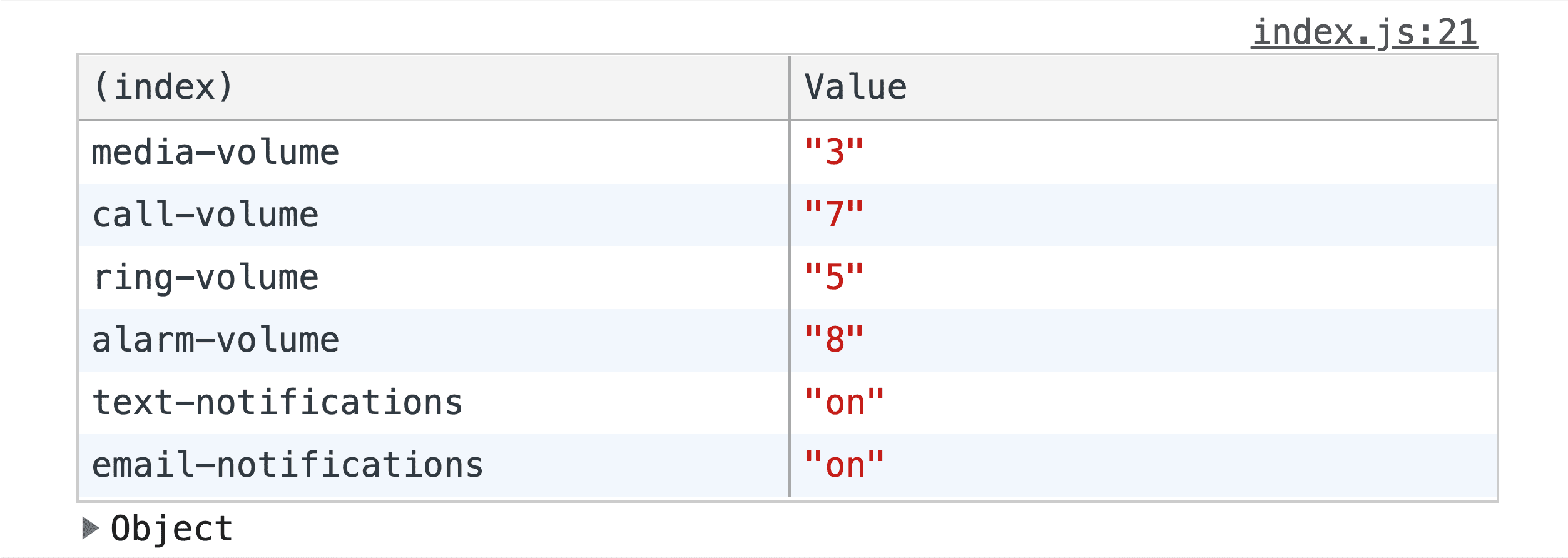
const form = document.querySelector('form');

form.addEventListener('input', event => {
  const formData = Object.fromEntries(new FormData(form));
  console.table(formData);
})
Everytime the form is interacted with and changed, the console logs the form as an object into a table for easy review before submitting to a server.
Conclusion
Now that you know how I did it, how would you?! This makes for some fun component architecture! Who's going to make the 1st version with slots in their favorite framework? 🙂
Let's diversify our approaches and learn all the ways to build on the web. Create a demo, tweet me links, and I'll add it to the Community remixes section below!

