A foundational overview of how to build a responsive, adaptive, and accessible 3D game menu.
In this post I want to share thinking on a way to build a 3D game menu component. Try the demo.
If you prefer video, here's a YouTube version of this post:
Overview
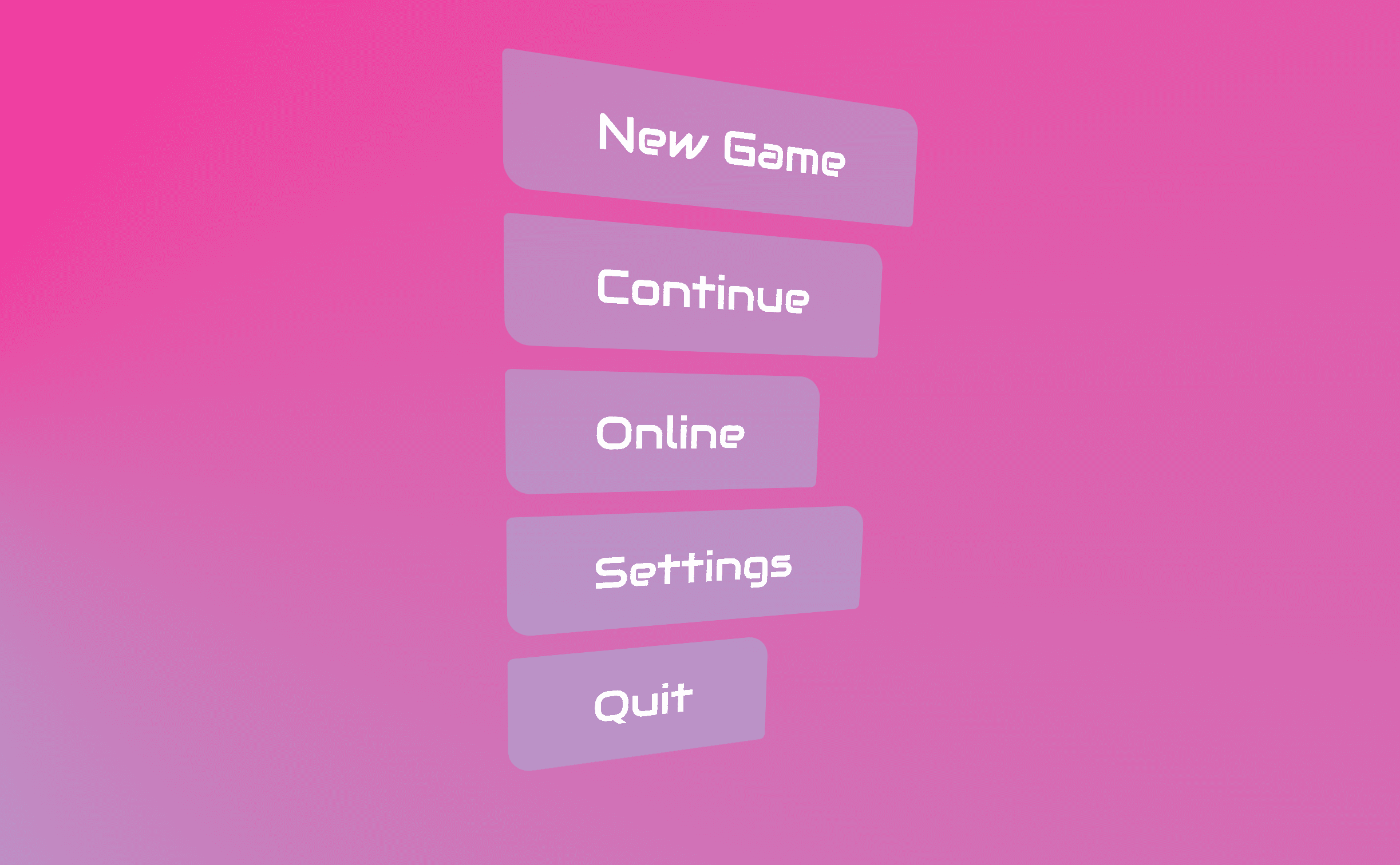
Video games often present users with a creative and unusual menu, animated and in 3D space. It's popular in new AR/VR games to make the menu appear to be floating in space. Today we'll be recreating the essentials of this effect but with the added flair of an adaptive color scheme and accommodations for users who prefer reduced motion.
HTML
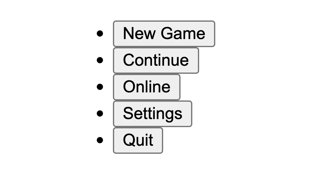
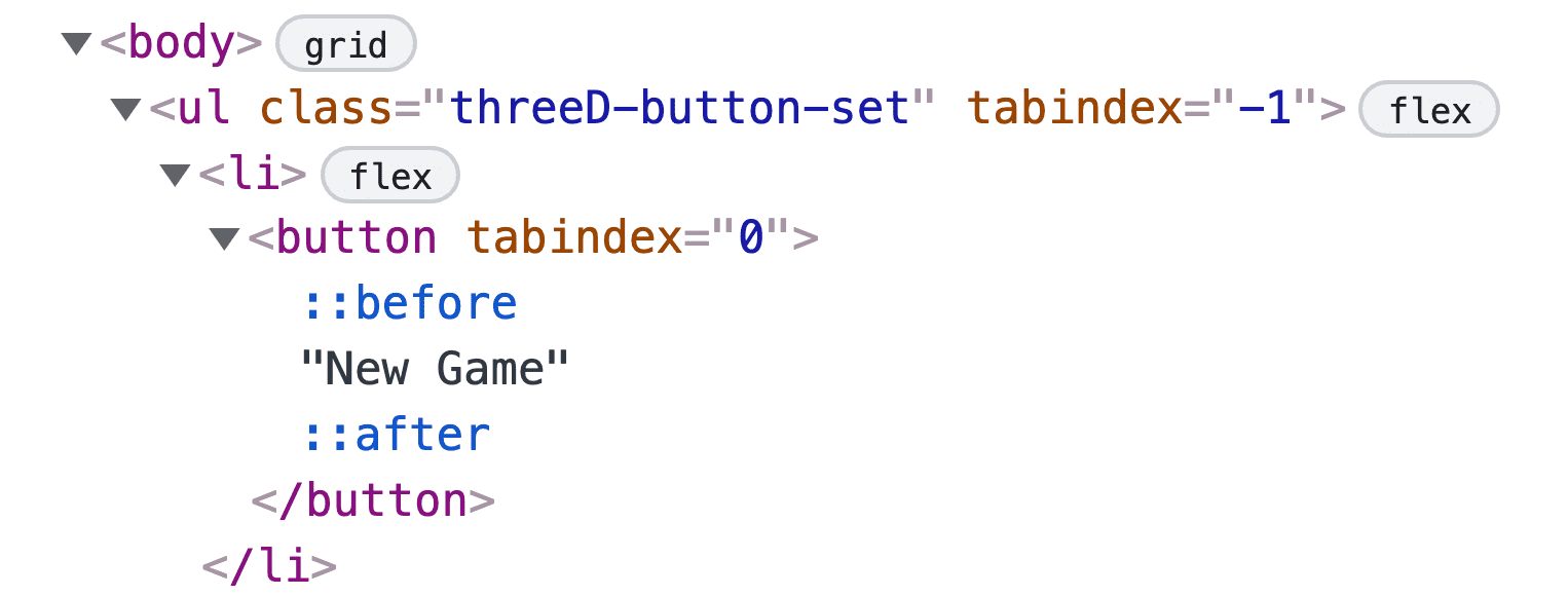
A game menu is a list of buttons. The best way to represent this in HTML is as follows:
<ul class="threeD-button-set">
  <li><button>New Game</button></li>
  <li><button>Continue</button></li>
  <li><button>Online</button></li>
  <li><button>Settings</button></li>
  <li><button>Quit</button></li>
</ul>
A list of buttons will announce itself well to screen reader technologies and works without JavaScript or CSS.

CSS
Styling the button list breaks down into the following high level steps:
- Setting up custom properties.
- A flexbox layout.
- A custom button with decorative pseudo-elements.
- Placing elements into 3D space.
Overview of custom properties
Custom properties help disambiguate values by giving meaningful names to otherwise random-looking values, avoiding repeated code and sharing values amongst children.
Below are media queries saved as CSS variables, also known as custom media. These are global and will be used throughout various selectors to keep code concise and legible. The game menu component uses motion preferences, system color scheme, and color range capabilities of the display.
@custom-media --motionOK (prefers-reduced-motion: no-preference);
@custom-media --dark (prefers-color-scheme: dark);
@custom-media --HDcolor (dynamic-range: high);
The following custom properties manage the color scheme and hold mouse positional values for making the game menu interactive to hover. Naming custom properties helps code legibility as it reveals the use case for the value or a friendly name for the result of the value.
.threeD-button-set {
  --y:;
  --x:;
  --distance: 1px;
  --theme: hsl(180 100% 50%);
  --theme-bg: hsl(180 100% 50% / 25%);
  --theme-bg-hover: hsl(180 100% 50% / 40%);
  --theme-text: white;
  --theme-shadow: hsl(180 100% 10% / 25%);

  --_max-rotateY: 10deg;
  --_max-rotateX: 15deg;
  --_btn-bg: var(--theme-bg);
  --_btn-bg-hover: var(--theme-bg-hover);
  --_btn-text: var(--theme-text);
  --_btn-text-shadow: var(--theme-shadow);
  --_bounce-ease: cubic-bezier(.5, 1.75, .75, 1.25);

  @media (--dark) {
    --theme: hsl(255 53% 50%);
    --theme-bg: hsl(255 53% 71% / 25%);
    --theme-bg-hover: hsl(255 53% 50% / 40%);
    --theme-shadow: hsl(255 53% 10% / 25%);
  }

  @media (--HDcolor) {
    @supports (color: color(display-p3 0 0 0)) {
      --theme: color(display-p3 .4 0 .9);
    }
  }
}
Light and dark theme background conic backgrounds
The light theme has a vibrant cyan to deeppink conic
gradient
while the dark theme has a dark subtle conic gradient. To see more about what
can be done with conic gradients, see conic.style.
html {
  background: conic-gradient(at -10% 50%, deeppink, cyan);

  @media (--dark) {
    background: conic-gradient(at -10% 50%, #212529, 50%, #495057, #212529);
  }
}
Enabling 3D perspective
For elements to exist in the 3D space of a web page, a viewport with
perspective
needs to be initialized. I chose to put the perspective on the body element
and used viewport units to create the style I liked.
body {
  perspective: 40vw;
}
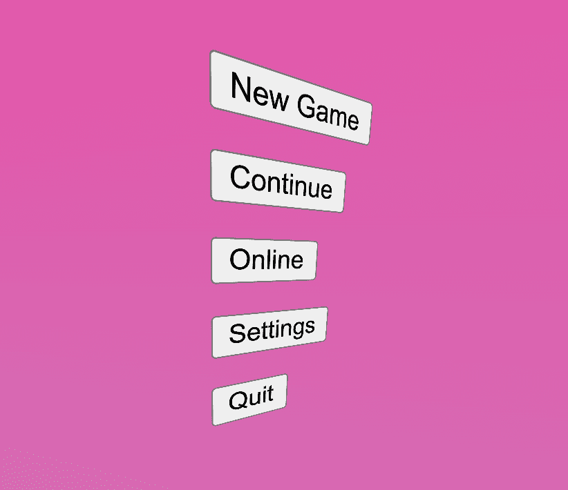
This is the type of impact perspective can have.
Styling the <ul> button list
This element is responsible for the overall button list macro layout as well as being an interactive and 3D floating card. Here's a way to achieve that.
Button group layout
Flexbox can manage the container layout. Change the default direction of flex
from rows to columns with flex-direction and ensure each item is the size of
its contents by changing from stretch to start for align-items.
.threeD-button-set {
  /* remove <ul> margins */
  margin: 0;

  /* vertical rag-right layout */
  display: flex;
  flex-direction: column;
  align-items: flex-start;
  gap: 2.5vh;
}
Next, establish the container as a 3D space context and set up CSS clamp()
functions to ensure the card doesn't rotate beyond legible rotations. Notice
that the middle value for the clamp is a custom property, these --x and --y
values will be set from JavaScript upon mouse
interaction later.
.threeD-button-set {
  …

  /* create 3D space context */
  transform-style: preserve-3d;

  /* clamped menu rotation to not be too extreme */
  transform:
    rotateY(
      clamp(
        calc(var(--_max-rotateY) * -1),
        var(--y),
        var(--_max-rotateY)
      )
    )
    rotateX(
      clamp(
        calc(var(--_max-rotateX) * -1),
        var(--x),
        var(--_max-rotateX)
      )
    )
  ;
}
Next, if motion is OK with the visiting user, add a hint to the browser that
this item's transform will be constantly changing with
will-change.
Additionally, enable interpolation by setting a transition on transforms. This
transition will occur when the mouse interacts with the card, enabling smooth
transitions to rotation changes. The animation is a constant running animation
that demonstrates the 3D space the card is within, even if a mouse can't or
isn't interacting with the component.
@media (--motionOK) {
  .threeD-button-set {
    /* browser hint so it can be prepared and optimized */
    will-change: transform;

    /* transition transform style changes and run an infinite animation */
    transition: transform .1s ease;
    animation: rotate-y 5s ease-in-out infinite;
  }
}
The rotate-y animation only sets the middle keyframe at 50% since the
browser will default 0% and 100% to the default style of the element. This
is shorthand for animations that alternate, needing to begin and end at the same
position. It's a great way to articulate infinite alternating animations.
@keyframes rotate-y {
  50% {
    transform: rotateY(15deg) rotateX(-6deg);
  }
}
Styling the <li> elements
Each list item (<li>) contains the button and its border elements. The
display style is changed so the item doesn't show a
::marker. The position style
is set to relative so the upcoming button pseudo-elements can position
themselves within the full area the button consumes.
.threeD-button-set > li {
  /* change display type from list-item */
  display: inline-flex;

  /* create context for button pseudos */
  position: relative;

  /* create 3D space context */
  transform-style: preserve-3d;
}

Styling the <button> elements
Styling buttons can be tough work, there's a lot of states and interaction types to account for. These buttons get complex quickly due to balancing pseudo-elements, animations and interactions.
Initial <button> styles
Below are the foundational styles that will support the other states.
.threeD-button-set button {
  /* strip out default button styles */
  appearance: none;
  outline: none;
  border: none;

  /* bring in brand styles via props */
  background-color: var(--_btn-bg);
  color: var(--_btn-text);
  text-shadow: 0 1px 1px var(--_btn-text-shadow);

  /* large text rounded corner and padded*/
  font-size: 5vmin;
  font-family: Audiowide;
  padding-block: .75ch;
  padding-inline: 2ch;
  border-radius: 5px 20px;
}

Button pseudo-elements
The borders of the button aren't traditional borders, they're absolute position pseudo-elements with borders.

These elements are crucial in showcasing the 3D perspective that's been established. One of these pseudo-elements will be pushed away from the button, and one will be pulled closer to the user. The effect is most noticeable in the top and bottom buttons.
.threeD-button button {
  …

  &::after,
  &::before {
    /* create empty element */
    content: '';
    opacity: .8;

    /* cover the parent (button) */
    position: absolute;
    inset: 0;

    /* style the element for border accents */
    border: 1px solid var(--theme);
    border-radius: 5px 20px;
  }

  /* exceptions for one of the pseudo elements */
  /* this will be pushed back (3x) and have a thicker border */
  &::before {
    border-width: 3px;

    /* in dark mode, it glows! */
    @media (--dark) {
      box-shadow:
        0 0 25px var(--theme),
        inset 0 0 25px var(--theme);
    }
  }
}
3D transform styles
Below transform-style is set to preserve-3d so the children can space
themselves out on the z axis. The transform is set to the --distance
custom property, which will be increased on hover and
focus.
.threeD-button-set button {
  …

  transform: translateZ(var(--distance));
  transform-style: preserve-3d;

  &::after {
    /* pull forward in Z space with a 3x multiplier */
    transform: translateZ(calc(var(--distance) / 3));
  }

  &::before {
    /* push back in Z space with a 3x multiplier */
    transform: translateZ(calc(var(--distance) / 3 * -1));
  }
}
Conditional animation styles
If the user is OK with motion, the button hints to the browser that the
transform property should be ready for change and a transition is set for
transform and background-color properties. Notice the difference in
duration, I felt it made for a nice subtle staggered effect.
.threeD-button-set button {
  …

  @media (--motionOK) {
    will-change: transform;
    transition:
      transform .2s ease,
      background-color .5s ease
    ;

    &::before,
    &::after {
      transition: transform .1s ease-out;
    }

    &::after    { transition-duration: .5s }
    &::before { transition-duration: .3s }
  }
}
Hover and focus interaction styles
The goal of the interaction animation is to spread the layers that made up the
flat appearing button. Accomplish this by setting the --distance variable,
initially to 1px. The selector shown in the following code example checks to
see if the button is being hovered or focused by a device that should see a
focus indicator, and not being activated. If so it applies CSS to do the
following:
- Apply the hover background color.
- Increase the distance .
- Add a bounce ease effect.
- Stagger the pseudo-element transitions.
.threeD-button-set button {
  …

  &:is(:hover, :focus-visible):not(:active) {
    /* subtle distance plus bg color change on hover/focus */
    --distance: 15px;
    background-color: var(--_btn-bg-hover);

    /* if motion is OK, setup transitions and increase distance */
    @media (--motionOK) {
      --distance: 3vmax;

      transition-timing-function: var(--_bounce-ease);
      transition-duration: .4s;

      &::after  { transition-duration: .5s }
      &::before { transition-duration: .3s }
    }
  }
}
The 3D perspective was still really neat for the reduced motion preference.
The top and bottom elements show the effect in a nice subtle way.
Small enhancements with JavaScript
The interface is usable from keyboards, screen readers, gamepads, touch and a mouse already, but we can add some light touches of JavaScript to ease a couple of scenarios.
Supporting arrow keys
The tab key is a fine way to navigate the menu but I'd expect the directional
pad or joysticks to move focus on a gamepad. The
roving-ux library often used for GUI
Challenge interfaces will handle arrow keys for us. The below code tells the
library to trap focus within .threeD-button-set and forward the focus to the
button children.
import {rovingIndex} from 'roving-ux'

rovingIndex({
  element: document.querySelector('.threeD-button-set'),
  target: 'button',
})
Mouse parallax interaction
Tracking the mouse and having it tilt the menu is intended to mimic AR and VR video game interfaces, where instead of a mouse you may have a virtual pointer. It can be fun when elements are hyper aware of the pointer.
Since this is a small extra feature, we'll put the interaction behind a query of
the user's motion preference. Also, as part of setup, store the button list
component into memory with querySelector and cache the element's bounds into
menuRect. Use these bounds to determine the rotate offset applied to the card
based on mouse position.
const menu = document.querySelector('.threeD-button-set')
const menuRect = menu.getBoundingClientRect()

const { matches:motionOK } = window.matchMedia(
  '(prefers-reduced-motion: no-preference)'
)
Next, we need a function that accepts the mouse x and y positions and return
a value we can use to rotate the card. The following function uses the mouse
position to detemine which side of the box it's inside of and by how much. The
delta is returned from the function.
const getAngles = (clientX, clientY) => {
  const { x, y, width, height } = menuRect

  const dx = clientX - (x + 0.5 * width)
  const dy = clientY - (y + 0.5 * height)

  return {dx,dy}
}
Lastly, watch the mouse move, pass the position to our getAngles() function
and use the delta values as custom property styles. I divided by 20 to pad the
delta and make it less twitchy, there may be a better way to do that. If you
remember from the beginning, we put the --x and --y props in the middle of a
clamp() function, this prevents the mouse position from overly rotating the
card into an illegible position.
if (motionOK) {
  window.addEventListener('mousemove', ({target, clientX, clientY}) => {
    const {dx,dy} = getAngles(clientX, clientY)

    menu.attributeStyleMap.set('--x', `${dy / 20}deg`)
    menu.attributeStyleMap.set('--y', `${dx / 20}deg`)
  })
}
Translations and directions
There was one gotcha when testing out the game menu in other writing modes and languages.
<button> elements have an !important style for writing-mode in the user
agent stylesheet. This meant the game menu HTML needed to change to accommodate
the desired design. Changing the button list to a list of links enables logical
properties to change the menu direction, as <a> elements don't have a browser
supplied !important style.
Conclusion
Now that you know how I did it, how would you‽ 🙂 Can you add accelerometer interaction to the menu, so tiling your phone rotates the menu? Can we improve the no motion experience?
Let's diversify our approaches and learn all the ways to build on the web. Create a demo, tweet me links, and I'll add it to the community remixes section below!
Community remixes
Nothing to see here yet!

