##### [The CSS Podcast - 008: Sizing Units](https://thecsspodcast.libsyn.com/tcp-css-podcast-episode-008)
The web is a responsive medium,
but sometimes you want to control its dimensions to improve the overall interface quality.
A good example of this is limiting line lengths to improve readability.
How would you do that in a flexible medium like the web?
For this case,
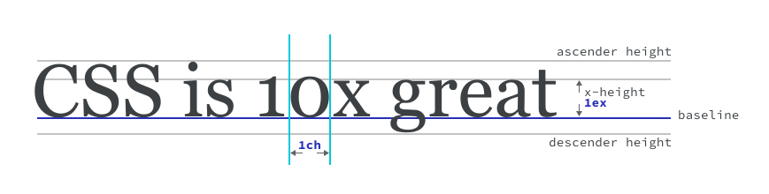
you can use a `ch` unit, which is equal to the width of a "0"
character in the rendered font at its computed size.
This unit lets you limit the width of text with a unit that's designed to size text,
which in turn,
allows predictable control regardless of the size of that text.
The `ch` unit is one of a handful of units that are helpful for specific contexts like this example.
## Numbers
Numbers are used to define `opacity`, `line-height` and even for color channel values in `rgb`.
Numbers are unitless integers (1, 2, 3, 100) and decimals (.1, .2, .3).
Numbers have meaning depending on their context.
For example, when defining `line-height`,
a number is representative of a ratio if you define it without a supporting unit:
p {
font-size: 24px;
line-height: 1.5;
}
In this example, `1.5` is equal to **150%** of the `p` element's **computed pixel font size** .
This means that if the `p` has a `font-size` of `24px`,
the line height will be computed as `36px`.
> [!NOTE]
> **Note:** It's a good idea to use a unitless value for `line-height`, rather than specifying a unit. As you learned in the [inheritance module](https://web.dev/learn/css/inheritance), `font-size` can be inherited. Defining a unitless `line-height` keeps the line-height relative to the font size. This provides a better experience than, say, `line-height: 15px`, which won't change and might look strange with certain font sizes.
Numbers can also be used in the following places:
- When setting values for filters: `filter: sepia(0.5)` applies a `50%` sepia filter to the element.
- When setting opacity: `opacity: 0.5` applies a `50%` opacity.
- In color channels: `rgb(50, 50, 50)`, where the values 0-255 are acceptable to set a color value. [See color lesson](https://web.dev/learn/css/color).
- To transform an element: `transform: scale(1.2)` scales the element by 120% of its initial size.
## Percentages
When using a percentage in CSS you need to know how the percentage is calculated.
For example,`width` is calculated as a percentage of the available width in the parent element.
div {
width: 300px;
height: 100px;
}
div p {
width: 50%;
}
In the preceding example, the width of `div p` is `150px`, assuming that the layout uses the default `box-sizing: content-box`.
If you set `margin` or `padding` as a percentage,
they will be a portion of the **parent element's width**,
regardless of direction.
div {
width: 300px;
height: 100px;
}
div p {
margin-top: 50%; /* calculated: 150px */
padding-left: 50%; /* calculated: 150px */
}
In the preceding example, both the `margin-top` and `padding-left` will compute to `150px`.
div {
width: 300px;
height: 100px;
}
div p {
width: 50%; /* calculated: 150px */
transform: translateX(10%); /* calculated: 15px */
}
If you set a `transform` value as a percentage,
it is based on the element with the transform set.
In this example, the `p` has a `translateX` value of `10%` and a `width` of `50%`.
First, calculate what the width will be: `150px` because it is **50% of its parent's width** .
Then, take `10%` of `150px`, which is `15px`.
> [!IMPORTANT]
> **Key term:** The transform property allows you alter an element's appearance and position by rotating, skewing, scaling and translating it. This can be done in a 2D and 3D space.
## Dimensions and lengths
If you attach a unit to a number, it becomes a dimension.
For example, `1rem` is a dimension.
In this context, the unit that is attached to a number is referred to in specifications as a dimension token.
Lengths are **dimensions that refer to distance** and they can either be absolute or relative.
### Absolute lengths
All absolute lengths resolve against the same base,
making them predictable wherever they're used in your CSS.
For example, if you use `cm` to size your element and then print,
it should be accurate if you compared it to a ruler. Note that physical units,
such as `cm` and `in`, won't reliably display at those sizes on screens due to
variations in pixel sizes. Physical units are best used for print style sheets
where they will be more reliable.
div {
width: 10cm;
height: 5cm;
background: black;
}
If you printed this page, the `div` would print as a 10x5cm black rectangle.
Keep in mind, CSS is used not only for digital content, but also to style print content.
Absolute lengths can really come in handy when designing for print.
| Unit | Name | Equivalent to |
|---|---|---|
| [cm](https://www.w3.org/TR/css-values-4/#cm) | Centimeters | 1cm = 96px/2.54 |
| [mm](https://www.w3.org/TR/css-values-4/#mm) | Millimeters | 1mm = 1/10th of 1cm |
| [Q](https://www.w3.org/TR/css-values-4/#q) | Quarter-millimeters | 1Q = 1/40th of 1cm |
| [in](https://www.w3.org/TR/css-values-4/#in) | Inches | 1in = 2.54cm = 96px |
| [pc](https://www.w3.org/TR/css-values-4/#pc) | Picas | 1pc = 1/6th of 1in |
| [pt](https://www.w3.org/TR/css-values-4/#pt) | Points | 1pt = 1/72th of 1in |
| [px](https://www.w3.org/TR/css-values-4/#px) | Pixels | 1px = 1/96th of 1in |
### Relative lengths
A relative length is calculated against a base value, much like a percentage.
The difference between these and percentages is that you can define sizes based
on a relevant base size, such as the default font size or window dimensions.
This means that CSS has units such as `ch` that use the font's size metrics as a
basis, and `vw` which is based on the width of the viewport (your browser
window). Relative lengths are particularly useful on the web due to its
responsive nature.
#### Font-size-relative units
CSS provides helpful units that are relative to the size of elements of rendered typography,
such as the size of the text itself (`em` units) or width of the typefaces characters (`ch` units).
| unit | relative to: |
|---|---|
| [`em`](https://www.w3.org/TR/css-values-4/#em) | Relative to the font size, that is, `1.5em` will be 50% larger than the base computed font size of its parent. (Historically, the height of the capital letter "M"). |
| [`rem`](https://www.w3.org/TR/css-values-4/#rem) | Font size of the root element (default is `16px`). |
| [`ex`](https://www.w3.org/TR/css-values-4/#ex) | Heuristic to determine whether to use the x-height, a letter "x", or `.5em` in the current computed font size of the element. |
| [`rex`](https://www.w3.org/TR/css-values-4/#rex) | The `ex` value of the root element. |
| [`cap`](https://www.w3.org/TR/css-values-4/#cap) | Height of the capital letters in the current computed font size of the element. |
| [`rcap`](https://www.w3.org/TR/css-values-4/#rcap) | The `cap` value of the root element. |
| [`ch`](https://www.w3.org/TR/css-values-4/#ch) | Average [character advance](https://www.w3.org/TR/css-values-4/#length-advance-measure) of a narrow glyph in the element's font (represented by the "0" glyph). |
| [`rch`](https://www.w3.org/TR/css-values-4/#rch) | The `ch` value of the root element. |
| [`ic`](https://www.w3.org/TR/css-values-4/#ic) | Average [character advance](https://www.w3.org/TR/css-values-4/#length-advance-measure) of a full width glyph in the element's font, as represented by the "水" (CJK water ideograph, U+6C34) glyph. |
| [`ric`](https://www.w3.org/TR/css-values-4/#ric) | The `ic` value of the root element. |
| [`lh`](https://www.w3.org/TR/css-values-4/#lh) | Line height of the element. |
| [`rlh`](https://www.w3.org/TR/css-values-4/#rlh) | Line `lh` value of the root element. |
#### Viewport-relative units
You can use the dimensions of the viewport (browser window) as a relative basis.
These units portion up the available viewport space.
| unit | relative to |
|---|---|
| [vw](https://www.w3.org/TR/css-values-4/#vw) | 1% of viewport's width. People use this unit to do cool font tricks, like resizing a header font based on the width of the page so as the user resizes, the font will also resize. |
| [vh](https://www.w3.org/TR/css-values-4/#vh) | 1% of viewport's height. You can use this to arrange items in a UI, if you have a footer toolbar for example. |
| [vi](https://www.w3.org/TR/css-values-4/#vi) | 1% of viewport's size in the root element's [inline axis](https://www.w3.org/TR/css-writing-modes-4/#inline-axis). Axis refers to writing modes. In horizontal writing modes like English, the inline axis is horizontal. In vertical writing modes like some Japanese typefaces, the inline axis runs top to bottom. |
| [vb](https://www.w3.org/TR/css-values-4/#vb) | 1% of viewport's size in the root element's [block axis](https://www.w3.org/TR/css-writing-modes-4/#block-axis). For the block axis, this would be the directionality of the language. Languages like English have a vertical block axis, since English language readers parse the page from top to bottom. A vertical writing mode has a horizontal block axis. |
| [vmin](https://www.w3.org/TR/css-values-4/#vmin) | 1% of the viewport's smaller dimension. |
| [vmax](https://www.w3.org/TR/css-values-4/#vmax) | 1% of the viewport's larger dimension. |
div {
width: 10vw;
}
p {
max-width: 60ch;
}
In this example, the `div` will be 10% of the viewport's width because `1vw` is **1% of the viewport width** .
The `p` element has a `max-width` of `60ch`
which means it can't exceed the width of 60 "0" characters in the calculated font and size.
#### Alternative viewport-relative units
The value of viewport-relative units remains the same as long as the viewport size does not change. However, mobile browsers commonly show or hide UI elements to show the most content possible on small screens, without changing the calculated size of the viewport. You can use alternatives to the viewport-relative units to account for these changes to the visible area.
| units | equivalent to |
|---|---|
| [`lvw`, `lvh`, `lvi`, `lvb`, `lvmin`, `lvmax`](https://www.w3.org/TR/css-values-4/#viewport-variants) | Large viewport units, relative to the viewport's visible space with all optional browser UI elements hidden. Equal to the non-variant viewport-relative units. Does not change as long as the viewport size does not change. |
| [`svw`, `svh`, `svi`, `svb`, `svmin`, `svmax`](https://www.w3.org/TR/css-values-4/#viewport-variants) | Small viewport units, relative to the viewport's visible space with all optional browser UI elements visible. Does not change as long as the viewport size does not change. |
| [`dvw`, `dvh`, `dvi`, `dvb`, `dvmin`, `dvmax`](https://www.w3.org/TR/css-values-4/#viewport-variants) | Dynamic viewport units, relative to the current visible space of the viewport. Changes as browser UI elements are shown or hidden. |
#### Container-relative units
You can use the dimensions of an element's [container](https://developer.mozilla.org/docs/Web/CSS/CSS_containment/Container_queries) as a relative basis. These units portion up the available container space. These are useful inside of container queries to set font sizes based on the space available.
| units | relative to |
|---|---|
| `cqw` | 1% of the container's width. |
| `cqh` | 1% of the container's height. |
| `cqi` | 1% of the container's inline size. |
| `cqb` | 1% of the container's block size. |
| `cqmin` | 1% of the container's smaller dimension. |
| `cqmax` | 1% of the container's larger dimension. |
> [!NOTE]
> **Objective:** By sizing text with relative units like `em` or `rem`, rather than an absolute unit, like `px`, the size of your text can respond to user preferences. This can include the system font size or parent element's font size, such as the ``. The base size of the `em` is the element's parent and the base size of the `rem` is the base font size of the document. If you don't define a `font-size` on your `html` element, this user-preferred system font size will be honoured if you use relative lengths, such as `em` and `rem`. If you use `px` units for sizing text, this preference will be ignored.
## Miscellaneous units
There are some other units which have been specified to deal with particular types of values.
### Angle units
In the [color module](https://web.dev/learn/css/color),
we looked at **angle units** ,
which are helpful for defining degree values,
such as the hue in `hsl`.
They are also useful for rotating elements within transform functions.
div {
width: 150px;
height: 150px;
transform: rotate(60deg);
}
Using the `deg` angle unit, you can rotate a `div` 90° on its center axis.
div {
background-image: url('a-low-resolution-image.jpg');
}
@media (-webkit-min-device-pixel-ratio: 2), (min-resolution: 192dpi) {
div {
background-image: url('a-high-resolution-image.jpg');
}
}
> [!NOTE]
> **Note:** Other angle units include `rad` (radians), `grad` (gradians), and `turn` units, which represent a part of an angle, where `1turn` = `360deg`, and `0.5turn` = `180deg`.
#### Resolution units
In the previous example the value of `min-resolution` is `192dpi`.
The `dpi` unit stands for **dots per inch**.
A useful context for this is detecting very high resolution screens,
such as Retina displays in a media query and serving up a higher resolution image.
### Check your understanding
Test your knowledge of sizing
Which of the following are valid dimensions?
cm Centimeters, a valid absolute dimension. ui User interface is not a dimension in CSS. in Inches, a valid absolute dimension. 8th Not a CSS dimension px Pixels, a valid absolute dimension. ch Character units, a valid relative dimension. ux User experience is not a dimension in CSS. em Letter 'M' units, a valid relative dimension. ex Letter 'x' units, a valid relative dimension. How are absolute and relative units different?
Absolute values can't change but relative units can Absolute values can change, but the base they calculate against can't. An absolute length is calculated against a single shared base value, where a relative unit is compared against a base value that can change. Relative units are more adaptive and fluid because of their contextual awareness, but there's a power and predictability to absolute units that can be foundational for certain designs. Viewport units are absolute.
True They may feel absolute, but they're relative to a viewport, which could be an iframe or webview, and isn't always representative of a device screen size. False They are relative to the document window they were created in, which may or may not be the same as a device screen.
## Resources
- [CSS Spec Values and Units Level 4](https://www.w3.org/TR/css-values-4)
- [Sizing and Units on MDN](https://developer.mozilla.org/docs/Learn/CSS/Building_blocks/Values_and_units)
- [All About Ems](https://learn.scannerlicker.net/2014/07/31/so-how-much-is-an-em/)
- [A percentages explainer](https://2019.wattenberger.com/blog/css-percents)